Showing posts with label girl pages. Show all posts

Tuesday, May 30, 2017

Saturday - A Gossamer Blue Layout

Aren't they sweet when they are asleep? 

Still working on my April Gossamer Blue kit.  It was full of pretty things, some very tropical type ephemera and stickers, alas, as  I've said before---not a lot of tropical stuff goes on in my everyday experiences!  But, there is still plenty to be created from this kit! 

For this page,I chose a patterned paper as my background, one filled with small typed text.  So it was still a "white" background, but it does have pattern in the way of all that typed and woven text.  The white did not compete with the couch color in the background of the photo and it allowed me to use some of the yummy pinks and aquas that were included in the April kit. 


After choosing the base paper I set about layering up some papers at the top of the page.  Didn't really want all nice straight edges, so I tore the papers and arranged them asymmetrically to soften the overall look.  Just to finish the top of the page, I added a small-ish strip of black and white striped paper.  (I love that paper--it's really a larger herringbone type pattern that I keep trimming off these striped pieces from!) 

Oh, I also added one of my favorite things, a scribbly penned border around the perimeter of the page.


With the top all set, I started tucking various pieces of papers under my photo of the sleeping princess, and I kept playing with that piece of ephemera with the Party, Sleep, Sun, Repeat on it, tucking it under, on top, beside until I was happy with its placement.  It seemed a little too square, so a nice pink tag added on the left side of the photo and layers offset that.  Then little star stickers, a golden geo-tag and arrow, wood veneer tab and camera, puffy hearts and gold sequins added small touches of sparkle and softness.  


A couple of phrase stickers with appropriate messages found a home in the lower right corner of the arrangement to really complete the photo block! 


I used a sticker for my title, and tucked in a few puffy floral stickers.  I still wanted to bring a bit of the gold sparkle to the top of the page, so I added some gold Stickles to the little white flowers, another sparkly gold geo-tag, as well as sprinkled just a couple of gold sequins about. 


Overall, the page design is pretty simple and I didn't want to over-do the softness with adding a ton of stickers, or die cuts.  I think just the few stickers keeping most of them close to the photo block, and just a little bit of sparkle was all that was necessary to make the page seem a little dream-like and yet keep it kind of cozy! 


Can't say it enough, just because you receive a kit that has a very definitive theme, doesn't mean that has to be the theme of the photos you use with it!  Look at color, twist the theme a little, ignore the palm print and use the other side... there are lots of ways to use that kit up! 

later,
Cheryl

Tuesday, May 23, 2017

More Pages from INSD...

Sorry, small break in blogging due to, well, I just wasn't feeling very good with the sudden upsurge in temp and humidity here and husband was on a "we are not running the air conditioning already" kick.  Yuk.  I don't do heat and humidity well.

But I'm back with the last of my pages to share from INSD weekend!  Below is a page that I did for the using up old stuff challenge "One More Time."  Papers are ancient Echo Park, Amy Tangerine, and Authentique.  Found and used a couple of old stickers from Basic Grey, chipboard pieces from MAMBI, as well as leftovers from past kit clubs.  I had tried for some time to use various gray-toned and printed papers... wasn't working for me, so I switched and went with blues! 


The next page was the second one for the Mood Board Challenge and I used the colors from the balloon print paper as my inspiration.   


I particularly loved the blue-y aqua in that first paper, along with a touch of pink and red!   Raided my stash again, even though that was not required for the challenge, it was great to put more older product to good use---love that!


This page was created specifically for the One More Time Challenge again, using old MME glittery papers from their Laundry Line collection and a piece from the very first Fancy Pants release!  Stamping, some sequins, wood veneer hearts, wound up thread, tags and a journaling spot cut in half completed the page. 


This last page is the only entry I did for another FB group over INSD weekend.  I got so wrapped up and was enjoying the challenges from the first group I was playing along with that I kind of never made it back to this group.  But I did so enjoy getting this page done.  I had struggled with the page due to the photo's bright pink background.  It would have been much easier to scrap if the photographer had used a soft white background.   I am happy with the results, and happy for the challenge of working with "brights!" 


There are a couple more pages from the weekend, but I think I will use them within the context of another topic...fixing or do-overs for pages.   Yeah, not so happy with a couple of pages, so I'll let them sit and go back to them in a bit.  I did take photos, so I can show a before and after of the make-overs.  That should be fun!! 

Glad to be back in the blog-o-sphere and back to playin' with paper!! 

best,
Cheryl

Thursday, May 11, 2017

INSD Page Recap Continued!

This set of pages that I created over INSD weekend had me digging through old, old photos!  Participating in the challenges in an online crop, sometimes means you are not (ah--um, clearing throat) quite prepared for what the challenges might be asking you to include.  At least I wasn't.  Which for some I guess could be frustrating; but for me, I found it exhilarating!  It made for a good reason for me to dig through a box of old photos, old supplies, and tools that honestly I like, I'm just too, um, lazy to get up and find and use!  LOL!

This is my now, well-over 30 year old daughter, as a cute little witch one Halloween.  See those little bats stamped at the top of the tag?  Cute, huh?!  I have stamps; I just don't often think of incorporating them onto my pages.  I tend to think of them for card making and forget about them when I am making scrapbook pages.  One of the other things to try and use was a geometric element.  I added the two triangle punches (in purple) at the top of the page, and it totally helped balance out that purple from the left side!


Bingo Challenge is a favorite of mine... use the supplies, photos, etc. noted in the "Bingo" squares, by column, row, or diagonally.  I had to use a 6x6 paper pad, a 5x7 photo or larger, acetate or acrylic shapes, squares or rectangles, and punches. 

The challenge for me on this next page as to use a 6x6 paper pad.  Not much of a challenge you say?  Well, it is for me!  I'm not a big fan of 6x6 pads.  The few that I have, I've had for  couple of years.  The other part of this challenge was to incorporate squares or rectangles in the page design.  Ahhh, cut those 6x6 papers into rectangles, outlined them and added stitch marks.  And what do you know?  I ended up really liking this page!  (I might even purchase another 6x6 pad or two.) 

 This one was created for the Inspiration Board challenge.  There were four papers pictured, we were to pick on to use as our inspiration when creating our page.  So I used one of the papers that had lots of triangles, reds, and blues (plus beige and I think there was a gold color.)  And this was my result. 

 It's ok, but it seems not quite done to me.  I hand cut, thank you very much, most of those little, bitty triangles and also used a couple of enamel shaped triangles.  And I used several of the colors from the same segment of the board.  Back to the page itself, though; I do like the borders, I like the tag cluster... but it just doesn't feel finished to me.  This one I will set aside and look at again (hopefully with fresh eyes) in a few days.  


My message would be, if you decide to participate in an on-line crop, or a challenge for that matter, don't get discouraged if you wind up not truly prepared for a challenge.  Use it as an opportunity to dig into photos left behind, or tools that you typically overlook.  And if you, like me looking at this last page, are not quite satisfied, set that page aside and look at it again later! 

Take a chance, try an on-line crop when you have the opportunity.  Nothing beats a real time, in person crop; but this was fun, challenging, and I actually got a tidy little stack of pages done! 

have yourself a scrappy day!
Cheryl


Wednesday, April 12, 2017

Another 27 Day Challenge Page!! And Being Mood Board Challenged...

I've said it before and here I go again... I do love these challenges.  Sparks me to dig out supplies I know I have but have sat unused, sometimes it helps me think a bit outside of my comfort zone, and at times---just having that date floating about in my head is what's good.  (I am very task---date---project oriented; it's that other half of my brain--not the creative side! ha ha!) 

The challenge this month was by way of using a mood board.  I know this sounds a kinda weird, but I am mood board challenged.  I always think they are pretty, but normally they don't move me toward a scrapbook page.  Um, as in, I have never used a mood board, e.v.e.r.  So here is the mood board... 


And I took away the pretty party banner, the colors aqua (lots of aqua) and yellow and the florals as my inspiration. 


I began by layering the photo between a frame and a bluish scrap of patterned paper and then piled that onto a postcard piece of paper ephemera.   All the layered pieces were going to be popped up off the page, but for the time being, I put them aside to work on the background.   Somewhere I have either yellow/white or aqua/white baker's twine for that tag, but darn if I can find it right now!!!  I'll tie that on when it turns up (sigh). 


 Next was to layer up a library card ephemera piece with stickers and a yellow/gold frame tucked behind and then fancied up a plain white tag with notebook looking paper and lots of clustered stickers.  Since the tag was white, I stuck another blue-aqua paper behind it and trimmed that closely.


Adding some color to a plain white card stock panel in my mood board colors of aqua and a few splotches of yellow/gold helps soften all that white and helps tie things together. 


After the watercolor was dry, the white cardstock was trimmed slightly and adhered to (whatelse) an aqua printed 12x12 piece (in a pattern I am not likely to use as a background--but the color was right!). 

The banner was hung below the popped up, layered, and stickered photo, tag, and library card.  I also added a small snippet of banner to the top left corner of the page and added a chipboard sticker there, as well as sprinkling on some pretty aqua chipboard hearts.  Added just a touch more color by adding a couple of puffy floral stickers to the banner.  The title was from the same sticker sheet as the puffy flowers. 


I used up a slew of stickers from an old Amy Tan sticker book and a bunch of ephemera pieces and cut-a-parts from past kits.  The banner is from Dear Lizzy---it was a whole page that you punched out this really long banner out of.  It's been in my stash for several years.  But goodness, I only used up about quarter of the banner on this layout (might be time to make some cards with banners on 'em...).

Yet, another challenge accepted and completed! 

happy scrappin'! 
Cheryl

Thursday, April 6, 2017

NOT a Boy Page!!! --- Jr. Spirit Squad!

I'm back!  Really did not plan on taking a several week break from the computer and blogging, but there it is.  I was happy to have my kids and grandkids come to visit last week (which took a week of prep to get ready for them! LOL!).   I've also had a bit of a relapse with regard to my RA which can make working with my hands difficult.  But enough on that... on to scrapbooking which always makes me feel better! 

I had multiple photos of my granddaughter from the half-time basketball game at which the "Junior" Spirit Squad performed.  Love the sunglasses the girls were sporting!  Love that sassy attitude that comes through! 


As usual I worked from the colors in the photos, finding the perfect blue arrow print along with the black and white print.  Those were cut into two angular sections and overlapped on a white background sheet. 


Because there was so much going on in the photos themselves and I wanted to use multiple photos, I chose not to layer them at all, but rather to arrange them in a tight configuration.  I did accent the photo arrangement with several small puffy stickers and one label sticker, placing those at the left, leading side. 


The title found its home at the right side of the photo arrangement and I added a border by way of another puffy sticker (snipped int two pieces) for the title to kind of sit upon.  And I also could not resist placing the sunglasses puffy sticker jauntily at the top of the title!


Many time when working with multiple photos, especially when there is a lot of activity going on in the photos, I find I am happier with the "less is more" tactic.  There are exceptions of course, but usually for me I am happier with the outcome if I do not over do it. 

A little outlining and some journaling completed the page and tha-a-a-a-a-at's all folks! 


I was happy to get these girls' first performance documented and I hope they have many more occasions to perform (and for me to scrap!). 

best!
Cheryl

Tuesday, March 21, 2017

Yes You Can! -- A Hip Kit Layout

Ha ha!  Sneaking a girl page in here amongst all the boy pages of late!   Here I used the last Hip Kit I received while researching various kit clubs.  I think this was the January kit. 

Both of my youngest grandchildren are taking swimming lessons this winter at their local "Y" and from the look of it, our Bella is loving it! 


I used one of the exclusive pattern papers as a base for a trimmed white cardstock panel.  The colors worked and the triangle pattern is not one of my favorites, but here peeking out as a border it highlight the color of the pool water and Bella's swimsuit and it worked out really well. 


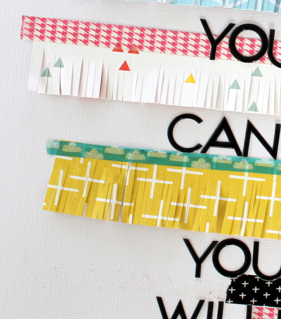
I used several strips of various patterned papers that came in the kit, cut them in slightly varying lengths, but in the same width.  Then I just sliced away with a regular old pair of scissors.  While I think the fringe scissors are a fine tool, but I before buying a tool I always apply my own little rule.  How often am I going to actually use this tool?  Can I get the same effect with a tool I already have and can I do it relatively easily?  And last, how much does the tool cost?  In this case,I find I can slice up some fringe with just my scissors. 


OK, after slicing up my paper strips into fringe-y strips, I adhered them to the white cardstock panel and added a piece of washi tape at the top of each strip.  I also added two pieces of washi at the lower right of the page and at the very top upper left corner, just to repeat the colors.  The couple of puffy hearts are from my stash (an old Heidi Swapp sticker set).  


 The photo was layered onto several odd cuts of papers, scraps and journaling blocks I am not likely to use--but the colors were right.  I did not heavily layer the photo because I thought it would make it appear heavy and I really wanted a light feel, so that it would kind of float (swimming pun--LOL) on top of the fringe-y layers. 


The title nestled quite nicely among the paper strips and washi (used a puffy Pink Paislee alpha) and I anchored the photo using a big pink ampersand. 


Quick and easy, this would be a good sort of payout design to use up scraps and leftovers.  Truthfully, I had made up the page with a different photo in mind, but didn't really care for it... all I had to do to change over to this photo was swap out the washi tape(s) to coordinate a bit better with Bella's swimsuit---that's when the pink ampersand came into play too! 

Nice to play with a girl page!  But this could just as easily be a boy's page, just by using colors other than pink, I think (now I'm just doing silly rhyming, which indeed signals I am done with saying anything meaningful here!!!

have a great scrappy day all!
 Cheryl

Monday, February 20, 2017

Kit Comparisons continued - My Personal Process for Choosing a Kit Club

And here we are with my last review!  I'm settled in with my morning coffee, I'll wait for you to grab yours--coffee, tea, how about some hot cocoa?  Ready?


Hip Kit
I chose to review them last, partly because they are hugely popular and already widely known.  Not really sure why that made a difference to me, but there you have it. 

I found the materials supplied in the kits to be very pretty, high quality.  The first kit contained marketplace products, however the second kit had quite a few exclusive papers.  While I am not in the market for exclusives, the papers were of high quality, both in color and paper weight, just not what I am personally looking for. 

Paper
Each kit contained eight sheets of patterned papers.  Not sure if they ever include solid cardstock sheets, but I did not see anything listed for the past several month's worth.  Once again, I'm OK with that...cardstock I've got and it is relatively easy to find.  As I already said, I was disappointed to receive several exclusive papers in one of the kits.  Papers were well coordinated with respect to color, but again each kit seemed very pastel to me.

Embellishments
Each kit contained an assortment of exclusive wood veneer pieces and a full embellishment or ephemera pack.  There is a variety of the sort of embellies included in the kits. One kit included a rubon sheet and full pack of metallic instagram frames, while another kit included a pack of mini tassels, a pack of sequins and a second set of Thickers words and phrases (besides the Thickers alpha as described below). 

Alphabets/Titling Options
Each kit contained a Thickers alphabet set, and as I said before one of the kit also contained a word/phrase set (which was included as an embellishment).  In former kits I did see sticker sheets (again included as an embellishment) that also had words and phrases easily integrated into titling options.

General
 A few too many exclusive papers for me, although to be fair I see that their current (February) kit papers are all marketplace papers.  Very pastel and a decidedly feminine feel to each of the kits.  It seemed like I would have to turn to the page designers' trick of turning photos to black and white to be able to make pretty pages.  I just don't scrap that way; I scrap real life--4x6--color photos.  Occasionally I might look at a photo and think this would look cool in black and white and print it that way, but not on an everyday basis.

The kits arrived in a timely fashion.  Their blog has many ideas--although not as many for 12x12 pages as I would like to see...I found many more ideas on you tube than on their blog.  Their facebook group has a big, big following but for the number of folks that follow it...not a lot of them seem to post their pages.

My favorite page created from a Hip Kit club collection...


As far as ideas in using a Hip Kit offering... check out you tube.  I found numerous examples of wonderfully creative pages done using Hip Kit collections.

Next time... The club I chose to join and why that club is a good fit for me.  Plus a review of questions and things you should think about when joining a club. 

Sunday, February 19, 2017

Kit Comparisons Continued - My Personal Approach to Choosing a Kit

Here we are at a look see at another kit club. 

Like I said before I only just received my second kit and am not anywhere near done with it.  But we will forge ahead anyway!  It was my own fault I did not get two kits in a row from them, I just did not hop on to the website in a timely enough fashion to place my order before they had sold out!


Gossamer Blue
The kits each seem to have a decidedly different perspective as it pertains to color, patterned paper and even embellishments.  Which means to me, that there is always something new to look forward to.   I had a very easy time making a variety of travel, girl, and a boy-ish page(s).   I did go to my stash for some alphabet stickers that seemed to work better with some pages, but other than that the only other thing I added was a doily and wood veneer car. 

Paper
In each kit I've received 7-10 patterned papers.  If the kit is sending 7 patterned papers, then it also contains 2-3 sheet of cardstock.  Now I have seen a kit or two which contained 10-11 patterned papers and no cardstock (which is still fine by me, I'd rather have the patterned paper any day).

The papers are incredibly well coordinated and most times I've had a hard time choosing which side of a given paper that I want to use more.

Embellishments
Each kit includes at least two full packs of die cuts or ephemera.  The things that change from kit to kit are offerings like enamel dots, washi tape, sticker sheets or chipboard.  There is usually an exclusive set of wood veneer and/or acrylic pieces.  In past kits I've seen partial packs of sequins, or mini pom poms, tassels, and even decorative paper clips.  Fun stuff, and it changes from one month to another.

This is another kit club that at times have included a stamp set---and as I said before I do love getting a stamp set! (There are stamp sets offered in their add-ons, if  they are a must for you.) 

Alphabet/Titling Options
In each of the two kits I've received there was either a Thickers alpha set or a puffy alpha set, plus at times the sticker sheet that may have been included also had phrases and words that could easily be used in forming a title.  In one of the kit I missed out on, there was a Thickers set with words and phrases and a sticker sheet with words and phrases, plus a mini alpha.  

General
Kits arrived without delay, no damages.  They have no membership requirements, as long as cancelling is done within the designated time frame.  The facebook page is not as active as some kit clubs, but still a friendly place.  Their blog is full of ideas, although I personally could do without so many planner or project life pages (sorry I am strictly a scrapbook page addict).  But I understand each of these (planners and project life) have taken on a lot of popularity.  Their designers are creative of course and each kit is well represented. 

One of my favorite pages created from a Gossamer Blue kit... The only add to this page was some vellum for layering. 


Next time, Hip Kit is up! 

Thursday, February 16, 2017

Gossamer Blue Layout -- p.s. i love you

Most of my journaling on my grandchildrens' pages is more like a little thought or note to them from me.  My little granddaughter is shall we say, a headstrong young lady, a little power house.  I wanted to recognize that but also remind her to show her wonderful heart and kindness, p.s. i love you, Nana. 


I had tried to do this page several times before using a color coordinated effort in blues and greens (like in her school jumper).  Uh, no...  it just didn't work.  But when I received the February Gossamer Blue kit and saw several black and white patterns, strong... yet softened by the p.s. i love you message, I thought I'd give it a shot.  BINGO!  I did add just a little really light pink watercolor and some splatters of pink, but other wise pretty much left the white card stock background, well pretty much plain white.


I cut and tore several pieces of the black and white patterns and lined them up against the left edge of the page and tucked in a piece of ruffled white tissue paper, again for softness. Then curled up the edges here and there and tucked in a couple of floral stickers to brighten up all that black and white.

The photo got treated to several layers of tissue paper, a piece of the black and white text and just a wee small amount of pink peeking out directly under the photo. 


I cut two banners and outlined them before tucking them up under the lower corner of the layered photo.  Then went to work on a little cluster consisting of a doily sticker (kind of flimsy so I put it on a circle cut out of a scrap of cardstock) and a small "pile" of hearts. I wanted that in place slightly touching the edge of the banners so it made a nice soft corner. 


Tucked in a bow shaped paper clip (from my pile of left over stuff), added my title and a few enamel dots and that seemed like just enough.  Oh, I almost forgot---didn't want the right side of the page ignored, so I cut a medium to large size photo corner and placed it up on the right side before I did my journaling. 

The note to Dear Bella went down the right side of the page and I was done!

See once I got a handle on the right papers, everything else came together.  It's all about the papers for me!


Maybe if you are fighting with a certain few photos, it's not that you've lost your mojo... maybe you just don't have the right papers in front of you!  Put those photos aside and try them again later with another set of monochromatic neutral papers... gold and white, black and white, kraft and white.

best to all!
Cheryl

Wednesday, February 15, 2017

Kit Comparison - My Personal Decision Making Process

OK, settled in with a cuppa something good to sip?  Here we go. 

For purposes of comparison, I am not counting plain cardstock used for a page base or for punching or making die cuts. 


Scrapbook Circle
This is a kit club I was totally unaware of until I heard mention of them on one of the facebook groups I belong to.  So I hopped on over to their website and took a look see at past kits they had offered, looked back through their blog and then checked out their facebook group.  Really loved the kit  that was currently being offered and jumped on it. 

It was really unlike many other kit clubs in that it was not all froth and pastel.  And I have grandsons to scrap for folks,  pastel and frothy goodness is nice, but doesn't bode well for football, wrestling, soccer and super heroes!!  I need a little bit of earthy goodness, a touch or two of bright primary color, you get the idea. 

Papers 
I received eight - ten patterned papers in each kit, sometimes a specialty paper such as a corrugated sheet, no solid color cardstock (which is fine for me--I have a ton of cardstock in my stash).  Papers were well coordinated without being too matchy-matchy (a difficult task sometimes). 

Embellishments
 Each kit contained two whole packs of embellishments such as die cuts, leather patches, chipboard, as well as partial packs of some items, such as a partial pack of sequins. Also included in each kit was an exclusive acrylic word or phrase and a separate assortment of small acrylic stars, hearts, etc.   Some kits contained a sheet of stickers, some did not.  Again, the items chosen for each kit were well coordinated with the patterns/theme of the papers.    Some goodies such as fibers or sequins came packaged in tiny decorative gift bags (which I gladly also used on my layouts). 

Alphabets

Some kits contained two choices of alphabets, usually Thickers or puffy alphas and a small typeset sheet that was a part of a larger sticker sheet.  Some kits contained a Thickers set that was words/phrases instead of an alphabet set; one kit contained an awesome mirror set of words, plus a sticker sheet with phrases and tiny alpha.  Truly all easily workable on my pages. 

General
Kits arrived on time, no shipping damage.  Their facebook group seemed at first a little odd to me in that not a lot of subscribers were posting, although more folks seem to be sharing their work now.  Their blog has awesome, useful ideas, created by some very supportive designers. 

Any questions you may pose are quickly answered and any issues seem to be easily and quickly acted on. 

I was really happy with their kit content, the variety between the kits (meaning not every kit looked too overly similar to every other kit).  In fact, happy enough that I stayed on with them for four month I think rather than just the two month kit trial I set for myself. 

The club has only a two-month membership requirement in order to have discounted membership available. 

My favorite page from one of the Scrapbook Circle kits I received...


The only additions from my stash were the gold alpha (My and Girl) and several big snowflakes punched from plain white cardstock.  (The pink-ish puffy sticker circles I think were from a prior Scrapbook Circle kit).

If you want a club that offers a variety in style and feel, includes a few more patterned papers than some (keep in mind you do not receive solid cardstock sheets -- which for me is fine)  and a comfortable quantity of embellishment and titling options, then this club would be a grand choice!  

Coming up:  Citrus Twist

best,
Cheryl 


Monday, February 13, 2017

Last Kit Club Under Review --- American Girl(s) Layout

I cannot tell you how excited I am to be getting to the end of my so-called research!  While it's been fun ordering kits from various clubs, it's also been kind of stressful.  I mean there is much to like about each club and I'm frustrated when I cannot seem to produce pages that maybe gives each club their due.  But that is what the process of choosing a kit club for yourself is really all about!  Choosing the right club, for you, at any given point in time. 

This page was created from Gossamer Blue (remember I did get only one kit from them---months ago---then I was such a slacker when it came time to order that they sold out of several kits before I went back to order).  But this time I ordered right away and am more than pleased to get their February collection! 


And even though I have protested before about great quantities of pink in various kits...well it is February after all, so I can deal.  Besides, the part I am enamored with is that there are contrasting patterns and colors!  Hurray!  Here, I used the darker floral on the bottom third of the age and the smaller lighter floral at the top.

To mat the photo of granddaughter and her very special American Girl doll, I used a black and white script print and die cut several groups of leaves from white card stock to kind of imitate a cut file.  (I don't have an electronic machine to use with cut files, so this was my way to get a little of that sort of look.) 


The embellishment pack included these neat striped pieces which I used at the seam between the two floral prints.  I also cut several of the black label in half lengthwise and used those along the border, as well as the small circle stickers.  The kit included words and phrases in sticker format and in the embellishment pack, so it was easy to select a few of those to accent the photo with.  Also used the cute xoxo die cut and a couple of hearts in a cluster at the lower right corner of the photo. 

Adding a piece of that striped embellishment, a couple of stickers, washi, and two more half pieces of the blank labels created a bit of interest at the top of the page. 


This kit included a shiny black puffy sticker alphabet set for my title.  I was torn between American Girl(s) or All She Wanted, but in the end went with American Girl(s).  If this page was a bit more holiday in feel, All She Wanted may have fit better.  Since there was that gap between the edge of the page and the beginning of the word Girl(s), I added a piece of washi to fill it in, then added a small piece at the opposite side of the page too.  My journaling was short, so it fit right on those blank labels! 


All in all, this page came together pretty quickly, both because the papers and embellishments were perfect fits and because I chose one of my old favorites in page layouts---using a darker pattern on the lower third, a lighter coordinating pattern on the upper two thirds --- covering the seam between them with a decorative border and using that border to anchor the title.  It's a nice to have old stand-bys at the ready when you haven't been at the old scrapbook table for a while! 


I'll be working with this kit and raiding my stash in the coming days and also compiling my results of the past months of kit research.  My decision has been made, but I do want to share how I made my choice.   I hope that my process helps some of to decide if you even want to join a kit club and how to go about choosing the one that is right for you. 

more to come! 

Cheryl

Wednesday, January 11, 2017

Magic Unicorn - A Hip Kit Page

The pink and pastel colors in the December Hip Kit (main kit only) were just right,  picking up all the colors of my granddaughter's ever so striking unicorn bike helmet!  She asked for unicorns for her 5th birthday and she got unicorns!


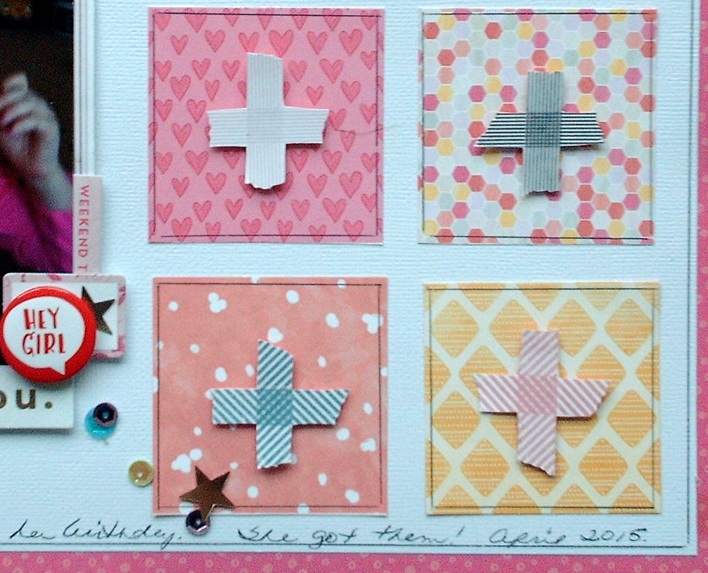
Do you ever get one of the those pages that has little 2-3 inch squares that are like miniaturized prints of entire pages?  Ever at a loss as to what to do with 'em?   There was a page like this in the kit; I used some on the Christmas tree created here Best Tree Ever page.    But, I had some squares left and decided that  I could use them as decorative elements down the right side of the page.  I cut out some of the washi criss-cross pattern paper and popped those up on top of the squares and outlined the squares for a little extra definition.  Since the little squares were outlined, I also took a moment to outline the white card stock. 


The white page was trimmed down slightly and layered on top of the hot pink patterned background, which was the same sheet the washi tape criss-cross pieces were cut from--just the opposite side.  I had cut the middle of the page out in order to be able to cut out those washi pattern pieces. 


Various cut pieces from the ephemera pack were layered up under the photo, along with a small polka dot gift bag (sorry--it came with little goodies in it from some kit or another---I just don't remember which one).  The title from a Thickers alphabet set which came in the kit lined up easily in place along the top edge of the layered photo. 

And since unicorns are magical, after all,  I just had to sprinkle some sequins and stars about!  A full pack of those were also included in the kit.


Now for a quick rundown---I am after all still running my kit comparison!  Hip Kit provided eight printed papers, a full pack of sequins, a partial pack of mini tassels, a Thickers alphabet set, and a Thickers foam word set, as well as a full ephemera pack.  I 've made four 12 x 12 pages and depending on what photos I turn up (need to coordinate with all this pink and pastel!!), I can probably make two more easily, but may need to supplement with an embellishment or two, we'll see.  And I kind of doubt if my cute little grandson will be making an appearance amongst all this pink... 

I ordered my second Hip Kit and I have one more Gossamer Blue kit to work in here somewhere, so thanks for bearing with me!  I know it's been a long road, but we are almost there!

best,
Cheryl