Showing posts with label Hip Kit. Show all posts

Tuesday, April 18, 2017

The Scraplift Twist

A note about scraplifting...

While I do very much agree that credit be given when lifting a page, I have just now spent Over An Hour surfing through old blog postings from a kit club where I am sure I got this page layout idea initially.  Do you think I can find that post and the person originating the design?  Well,   o.f.   c.o.u.r.s.e.   n.o.t.

The only reason this is on my mind, is that there was a recent posting on one of the sb fb groups I frequent calling out those that do not give credit where credit is due... not sure if this was in response to a particular design being used, or what.... I usually do not focus much on those conversations, but at the risk of offending someone, somewhere (who I cannot find in a timely fashion at this moment!!!), this is a page scraplifted, not once, but twice!!!  

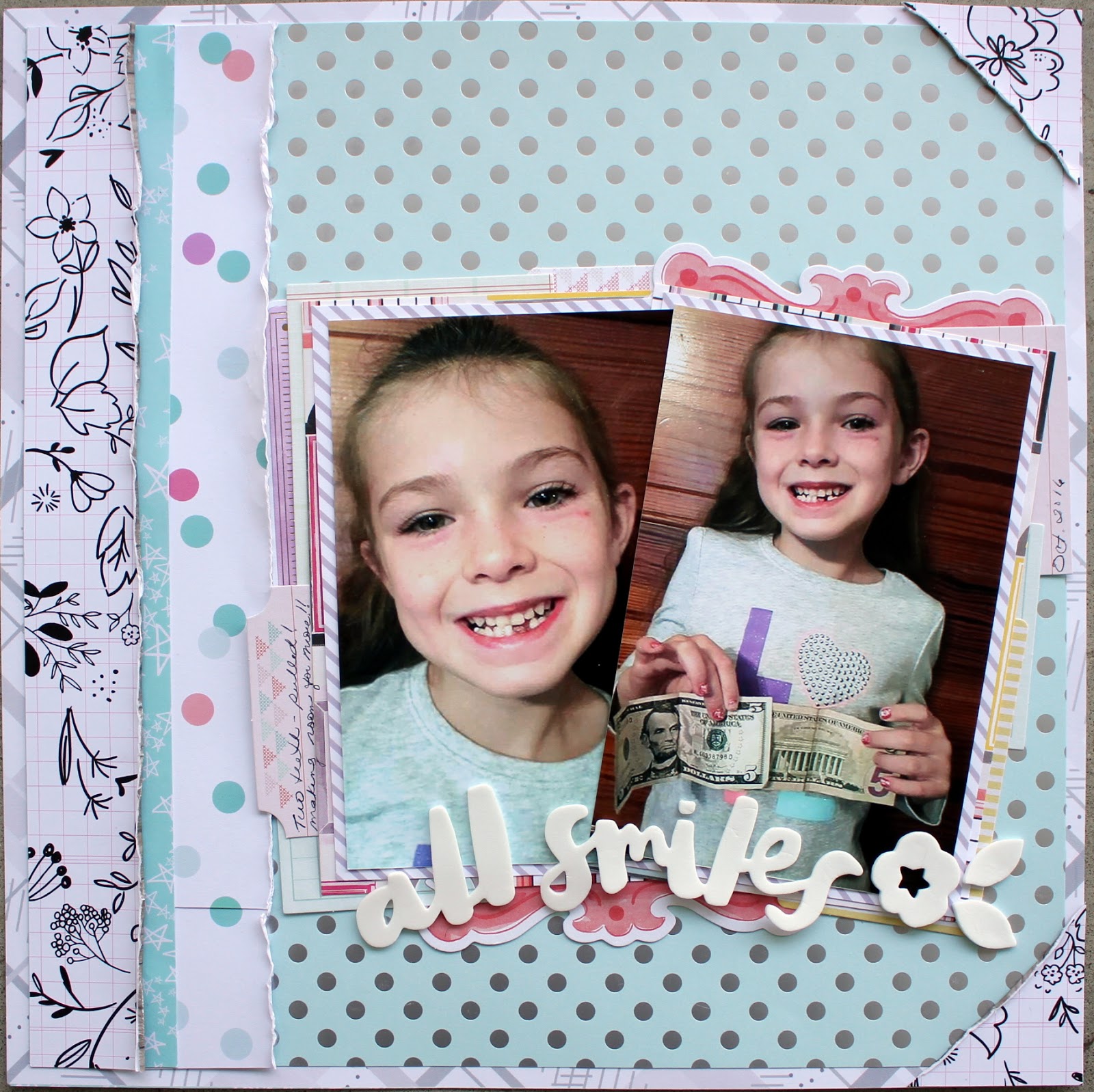
This is my most recent lift (even using some of the same papers as the original scrapper did), I just really like linear format the page takes on.  This page utilizes the same main design, but places the design elements at the bottom of the page, instead of across the top. 


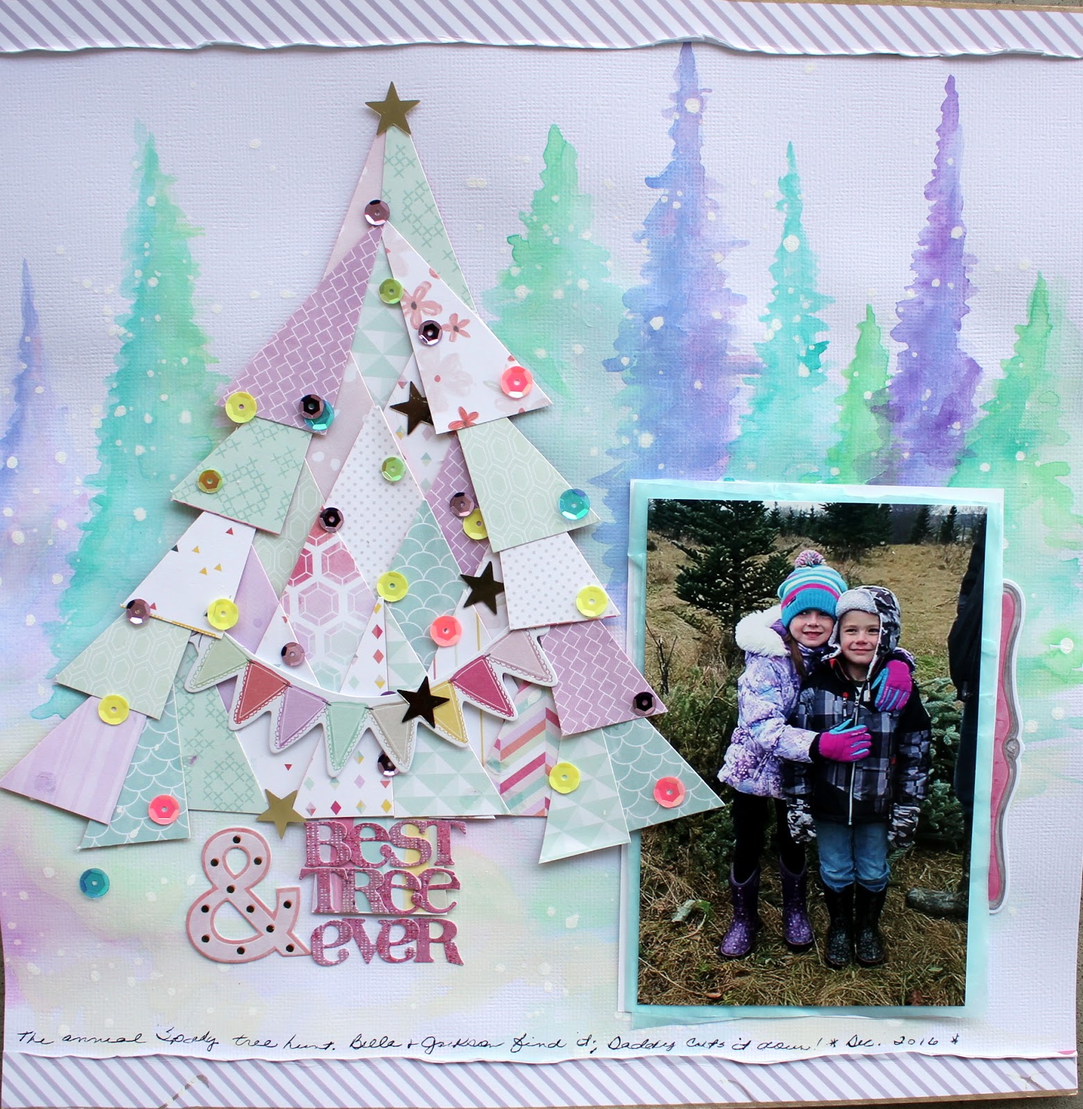
 This was my original take (on the scraplifted design).  The main design differences, as I recall, was instead of filling several of the metallic chipboard frames with cuts of paper and placing them,along with a smaller photo in frame across the horizontal paper layers --- I used the frames under my photo.  

I guess my point in all of this is it is sometimes next to impossible to locate and name the original creator of a page that has influenced you or that you are using as a basis for your own work. 

OK, having addressed the whole scraplifting thing, (being that now I have committed this twice!) the rest of the page details changed slightly in that I did not support the photo with layers of papers.  None, in fact. 


I also moved the title down below the photo elements, and  had added a layers of pale pink watercolor under the papers.  Instead of using a heart below the layered elements, I added a transparent piece of ephemera at the top left of the paper layers.  But the overall design remains the same, horizontal paper layers and a photo resting upon four chipboard frames.


I almost called the page done, but it seemed a bit floaty---the page un-defined. So I added a black and white striped piece of paper at the top and bottom of the page. 


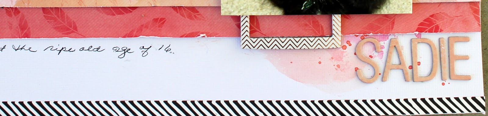
Also adding a small sliver of that black and white striped paper at the top edge of the paper layers, just to continue the black and white in one more spot and to help move the eye from left to right toward the photo and finally on to the title.  


I do love this layout, but given that it is sometimes so hard to give credit where it is deemed due, I will probably not use this particular design scheme again for fear of offending the original artist.  That doesn't mean I won't utilize frames under my photo, or a linear paper design...just not this particular look.  I truly do not wish to take the credit for design(s) that inspire me, but I also do not wish to spend an entire a afternoon searching through fb groups and kit club blogs for purposes of identification.


So, all this being said, I will more than likely continue to be inspired by others' work, but will have to save the page to a pinterest board or a private file with the creator's name and a date, just in case I ever need to reference that information. 

Do be inspired by others' work.  Do use page designs and ideas that work for you.  Do scraplift.  Do attempt to give credit where it is due.  Do not send a scraplifted page off for publishing purposes or as part of a design team call.

And that is all I have to say about that.

best to all!
Cheryl

Tuesday, March 21, 2017

Yes You Can! -- A Hip Kit Layout

Ha ha!  Sneaking a girl page in here amongst all the boy pages of late!   Here I used the last Hip Kit I received while researching various kit clubs.  I think this was the January kit. 

Both of my youngest grandchildren are taking swimming lessons this winter at their local "Y" and from the look of it, our Bella is loving it! 


I used one of the exclusive pattern papers as a base for a trimmed white cardstock panel.  The colors worked and the triangle pattern is not one of my favorites, but here peeking out as a border it highlight the color of the pool water and Bella's swimsuit and it worked out really well. 


I used several strips of various patterned papers that came in the kit, cut them in slightly varying lengths, but in the same width.  Then I just sliced away with a regular old pair of scissors.  While I think the fringe scissors are a fine tool, but I before buying a tool I always apply my own little rule.  How often am I going to actually use this tool?  Can I get the same effect with a tool I already have and can I do it relatively easily?  And last, how much does the tool cost?  In this case,I find I can slice up some fringe with just my scissors. 


OK, after slicing up my paper strips into fringe-y strips, I adhered them to the white cardstock panel and added a piece of washi tape at the top of each strip.  I also added two pieces of washi at the lower right of the page and at the very top upper left corner, just to repeat the colors.  The couple of puffy hearts are from my stash (an old Heidi Swapp sticker set).  


 The photo was layered onto several odd cuts of papers, scraps and journaling blocks I am not likely to use--but the colors were right.  I did not heavily layer the photo because I thought it would make it appear heavy and I really wanted a light feel, so that it would kind of float (swimming pun--LOL) on top of the fringe-y layers. 


The title nestled quite nicely among the paper strips and washi (used a puffy Pink Paislee alpha) and I anchored the photo using a big pink ampersand. 


Quick and easy, this would be a good sort of payout design to use up scraps and leftovers.  Truthfully, I had made up the page with a different photo in mind, but didn't really care for it... all I had to do to change over to this photo was swap out the washi tape(s) to coordinate a bit better with Bella's swimsuit---that's when the pink ampersand came into play too! 

Nice to play with a girl page!  But this could just as easily be a boy's page, just by using colors other than pink, I think (now I'm just doing silly rhyming, which indeed signals I am done with saying anything meaningful here!!!

have a great scrappy day all!
 Cheryl

Friday, February 24, 2017

Dream Big -- A 27-Day Challenge Page

I know I've said it before, but I do love playing along with challenges and my favorite FB group hosts a new challenge each month (plus a tic-tac-toe challenge which is equally fun). 

This month's challenge was to:  1) create a page about someone you love, 2) begin your journaling with "I",  3) use at least three different patterned papers, 4) include gemstones or glitter,  and 5) include a heart. 

And here's my page...


I used pieces and parts from two different Hip Kit collections on this (the December and January kits). 

My little granddaughter absolutely adores her big brother...and here I just left her a note to remind her of this and that she should dream as big as he does. 


The photo got layered with various gray and black and white paper pieces and then presented on a bed of these bright and shiny little instax photo frames.  I picked out all the silver frames for this and love the pop and lift they give to the photo. 

One of the instax frames even supplied just the right place for my title.  I loved that! 


Once the title was in place, I tucked in a couple of die cuts (the feather and another blue-y green-y one under the top right frame) and used the heart shaped blue green die cut at the base of the photo stack. 


When the die cuts were in place, I found my case full of gemstones (from way back when--gosh those are old--great to use some up!!) and added both blue and green gems.  Splattered just a little bit of black paint and did some outlining.


Happy with the page, and happy to be reminded of gemstones (stuck in my stash for -- well you don't really want to know how long I've had them do you?!).  I highly recommend playing along with a challenge group... you get something done, you are reminded to use things tucked away in months (years) past, and it's just plain fun!

have a super, scrappy weekend!
Cheryl

Monday, February 20, 2017

Kit Comparisons continued - My Personal Process for Choosing a Kit Club

And here we are with my last review!  I'm settled in with my morning coffee, I'll wait for you to grab yours--coffee, tea, how about some hot cocoa?  Ready?


Hip Kit
I chose to review them last, partly because they are hugely popular and already widely known.  Not really sure why that made a difference to me, but there you have it. 

I found the materials supplied in the kits to be very pretty, high quality.  The first kit contained marketplace products, however the second kit had quite a few exclusive papers.  While I am not in the market for exclusives, the papers were of high quality, both in color and paper weight, just not what I am personally looking for. 

Paper
Each kit contained eight sheets of patterned papers.  Not sure if they ever include solid cardstock sheets, but I did not see anything listed for the past several month's worth.  Once again, I'm OK with that...cardstock I've got and it is relatively easy to find.  As I already said, I was disappointed to receive several exclusive papers in one of the kits.  Papers were well coordinated with respect to color, but again each kit seemed very pastel to me.

Embellishments
Each kit contained an assortment of exclusive wood veneer pieces and a full embellishment or ephemera pack.  There is a variety of the sort of embellies included in the kits. One kit included a rubon sheet and full pack of metallic instagram frames, while another kit included a pack of mini tassels, a pack of sequins and a second set of Thickers words and phrases (besides the Thickers alpha as described below). 

Alphabets/Titling Options
Each kit contained a Thickers alphabet set, and as I said before one of the kit also contained a word/phrase set (which was included as an embellishment).  In former kits I did see sticker sheets (again included as an embellishment) that also had words and phrases easily integrated into titling options.

General
 A few too many exclusive papers for me, although to be fair I see that their current (February) kit papers are all marketplace papers.  Very pastel and a decidedly feminine feel to each of the kits.  It seemed like I would have to turn to the page designers' trick of turning photos to black and white to be able to make pretty pages.  I just don't scrap that way; I scrap real life--4x6--color photos.  Occasionally I might look at a photo and think this would look cool in black and white and print it that way, but not on an everyday basis.

The kits arrived in a timely fashion.  Their blog has many ideas--although not as many for 12x12 pages as I would like to see...I found many more ideas on you tube than on their blog.  Their facebook group has a big, big following but for the number of folks that follow it...not a lot of them seem to post their pages.

My favorite page created from a Hip Kit club collection...


As far as ideas in using a Hip Kit offering... check out you tube.  I found numerous examples of wonderfully creative pages done using Hip Kit collections.

Next time... The club I chose to join and why that club is a good fit for me.  Plus a review of questions and things you should think about when joining a club. 

Wednesday, February 15, 2017

A Hip Kit Layout -- I'm A Pepper

My daughter and son-in-law made a long weekend of it when she had to travel recently to Texas (a frequent trip for her).  One of the day trips they made was to Waco where they took in a museum at the old Dr. Pepper bottling plant.  (She does love Dr. Pepper!)  Anyway, I was happy to make a page for her! 


Everything except the alpha came from the January Hip Kit. I mixed a bit of  peach and pink spray mists with my texture paste before applying it to a plain 12x12 white piece of cardstock.  Once the texture paste was dry, I just laid down a few different widths of rectangular strips.  Slid the photo into place and tucked a couple of die cuts behind it.   


I used one of the wood veneers pieces at the lower right corner of the photo and tucked in another die cut that had just the right saying on it (and it fit in there just perfectly!). 


I often add a few small cut pieces of papers to repeat the colors or patterns and draw the eye in.  Although now I am thinking I may just go back to this one and add a few staples....


The only thing I went outside of the kit for was the alpha set.  I used a multi colored set from my stash that I just felt coordinated better with the colors in the photo. 


I added some loose outlining, black paint splatters, and my journaling and that, as they say,is all she wrote!  (I know, truly a bad pun...) 


Over all, even though I've struggled with this kit, I am happy with how this page turned out.  I think I've struggled with the kit, just because most of my photos just don't seem to go very well with the papers.  I'll maybe put the kit aside and once the weather begins to warm up a bit, perhaps some nice spring-y photos will work better.  Or, who knows I may stumble across just the right pack of pictures (that does happen, ya know?). 

best to all,
Cheryl

Wednesday, February 1, 2017

Kit Comparisions - Down to the Wire!!!

So, after many phone calls, pricing questions, frustrating misquotes, un-informed sales people, etc., etc., I finally have real internet!!!  Ta-da!  The issues were where we are physically located, how long were we bound to our original choices, how much would our current bill actually come down and on and on...  It is a wonderful thing to not have to worry about how much data does one thing or another chew up! 

Now, to get back on track here.  I have received my second Hip Kit collection and I haven't even killed off the first kit I got!  Now please do not take my next comment wrong... the kit contained pretty papers, a nice Thickers set, a complete embellishment pack, a partial pack of cute little tassels... I'm just not feeling it though and have struggled with the couple of pages I did put together. 

After going through the papers, I decided to use the window printed paper and fussy cut a bunch out to layer across the page.  And I suppose I could have just used a photo that coordinated color-wise and ignored the window design... But there is something in me that just could not do that.  I chose to go with a photo of ... wait for it.... a window!  


This sort of print is not usually a favorite of mine, due to it's specificity.  But I was determined to cut out the cute little windows and use them as a part of the page design.  I also tore a panel off of  the grid pattern paper as a home for the windows and photo to reside on.  It provided some subtle pattern, rather than a straight white background. 

Since the photo has some stronger tones as compared to the papers, I outlined both the photo and the grid paper with a black marker.  


Tucked in a few strips of patterned papers and a couple of the die cut ephemera.  Fussy cut a couple little florals to use along with die cut flowers, then tied together two of the mini tassels and tucked those under one of the floral bundles. 


The alphabet I chose is a Thickers set I grabbed recently at Hobby Lobby.  I loved the mixed patterns and the size of them for this page.  And the title itself?  Well, I had to go with the song title, had to! 


Overall, it's one of those pages that I struggled with, but now that it's done, I'm ok with it.  Not jumping up and down, but the main thing is the page is done.  It accurately captures the spirit, my memories of the street scene, it doesn't feel over-done, nor is it plain.  Sometimes this is how the page gets scrapped folks! 


There are enough supplies left in my December Hip Kit to do a couple more pages, but since I've struggled with this one, and the January kit has been sitting here for a couple of weeks already, I'm moving on. 

While I have thoroughly enjoyed the process of working through the five or six kit clubs that I was going to choose between, I will be relieved (kind of) to actually choose a club to continue on with!  Not that I won't probably stray from time to time and buy a kit a la carte, when another club's offering is too tempting to pass up!

scrap on, my pretty paper friends!

Cheryl


Wednesday, January 11, 2017

Magic Unicorn - A Hip Kit Page

The pink and pastel colors in the December Hip Kit (main kit only) were just right,  picking up all the colors of my granddaughter's ever so striking unicorn bike helmet!  She asked for unicorns for her 5th birthday and she got unicorns!


Do you ever get one of the those pages that has little 2-3 inch squares that are like miniaturized prints of entire pages?  Ever at a loss as to what to do with 'em?   There was a page like this in the kit; I used some on the Christmas tree created here Best Tree Ever page.    But, I had some squares left and decided that  I could use them as decorative elements down the right side of the page.  I cut out some of the washi criss-cross pattern paper and popped those up on top of the squares and outlined the squares for a little extra definition.  Since the little squares were outlined, I also took a moment to outline the white card stock. 


The white page was trimmed down slightly and layered on top of the hot pink patterned background, which was the same sheet the washi tape criss-cross pieces were cut from--just the opposite side.  I had cut the middle of the page out in order to be able to cut out those washi pattern pieces. 


Various cut pieces from the ephemera pack were layered up under the photo, along with a small polka dot gift bag (sorry--it came with little goodies in it from some kit or another---I just don't remember which one).  The title from a Thickers alphabet set which came in the kit lined up easily in place along the top edge of the layered photo. 

And since unicorns are magical, after all,  I just had to sprinkle some sequins and stars about!  A full pack of those were also included in the kit.


Now for a quick rundown---I am after all still running my kit comparison!  Hip Kit provided eight printed papers, a full pack of sequins, a partial pack of mini tassels, a Thickers alphabet set, and a Thickers foam word set, as well as a full ephemera pack.  I 've made four 12 x 12 pages and depending on what photos I turn up (need to coordinate with all this pink and pastel!!), I can probably make two more easily, but may need to supplement with an embellishment or two, we'll see.  And I kind of doubt if my cute little grandson will be making an appearance amongst all this pink... 

I ordered my second Hip Kit and I have one more Gossamer Blue kit to work in here somewhere, so thanks for bearing with me!  I know it's been a long road, but we are almost there!

best,
Cheryl

Friday, December 30, 2016

Let's Talk Kit Club Stuff! -- Hip Kit Club

Ready for a little kit chat? 

I'm working with Hip Kit right now.  My first kit with them.  And here's the rundown.  You get 8-10 papers; most were recent releases, a couple were Hip Kit exclusives.  There was a partial package of teeny tassels, a full pack of die cut ephemera, a full pack of  mixed sequins, and two packs of Thickers (one alpha and one word/phrase set) in the main kit. 

The papers were well coordinated.  Very pretty mix.  Very pastel.  V.e.r.y.  V.e.r.y.  pastel.   I like pastels, really I do.  I have a granddaughter, so pastels will work for my girly pages.  We'll have to see what else we can do with my V.e.r.y. V.e.r.y. pastel kit.  But for now I'll do the girly thing!


This is where I caution folks to look into a kit club's history before making a commitment.  I would rather order a la carte and pay a bit more for a single girly kit that I want to use for my girl, but subscribe to a club that gives me a more diverse selection of supplies. 

This is my first kit with Hip Kit, and I'll have a go with a second kit before making a final determination.  Lots of folks are extremely happy with the club, their selections, and their service,  so I remain open-minded and ready to scrap!

I have already made a holiday page, and for this one I wanted to use strips of several of the patterned papers trimmed and edges curled so a bit of each would show and I wanted the base to be that lovely silver polka dot paper. 


I also wanted lots of layers behind the photo, but didn't want to repeat all the papers I'd already used.  This is where getting an entire pack of die cut ephemera in your kit comes in handy... I used a bunch of these pieces as the layers under my photo. 

Since my page was all about the loss of granddaughter's two lower teeth (and as a result of the tooth fairy's excessive generosity becuase she had to have the teeth pulled), I used the words "all" and "smiles" from the Thickers pack.  It fit!


I added the two corner pieces and my journaling and called it finished.  Sometimes less is more.  Anything else I placed on the page was just too much and it seemed distracting.


So far, a complicated page with a watercolor background, and a straight paper layered page.  I am finding Hip Kit to be well coordinated, making it easy to pull pages together.  The kit is a bit heavy on pastels, so am looking forward to the next kit to see if their selection/style varies a bit.  Their exclusive papers are well made; loved getting two sets of Thickers (I just adore Thickers, so of course I loved getting TWO sets!).  And from what I hear and see their attention to customer service is exemplary.

On to the next!
Cheryl


Saturday, December 24, 2016

Choosing a Kit Club - Problem Colors?

Oh!  Let's do have a small chat about holiday papers and kit clubs, so grab a cup of tea or mug of hot chocolate and come sit a spell with me, whilst I prattle on about your/our choices (or lack there-of) in holiday goodies and kit clubs! 


Before this begins to sound like nothing more than whining...the thing with kit clubs is...  you give your decision making choices over to those developing the kits. And you have to decide up front if this is ok with you.  For the most part I am having fun with this...kind of like getting a surprise every month!  


I must confess, my taste runs more to the traditional side when it comes to holiday themed papers.  And while I don't care for bright, kelly greens and fire engine reds; I do like touches of the old red and green.  So when I perused almost all of the kit clubs various offerings for the month of November, what did I see?  Lots of pastels...  lots and lots of pastels in each and every club.  And this can be pretty, but I do wish there was more to choose from between the clubs.  A bit of red and green and metallic golds for us more traditional types.   

The good news for me in getting things that are say not my normal choice, is that it forces me out of my comfort zone.  It can lead to a more creative take on what might otherwise be just a standard page.  Nothing wrong with that!!!  And everything right!!!


I started this page thinking about how to construct a tree out of the various squares printed on one of the papers in my December Hip Kit.  After cutting the squares into triangles and reassembling in the shape of a tree...it looked a bit too quilted and structured, so I used the little sliced off pieces from cutting the squares into triangles and tucked them in along the outside edges of the tree.  Ah, much better, don't you think? 


The tree was assembled before the background was done, so I could put it down and pick it up while I was painting the trees.  Just watercolors and some white mist or watered down craft paint dripped about to create snow.   

While the background was drying, I starting "decorating" my tree with sequins and the little die cut banner (included  in the kit) and layered up some tissue paper and patterned paper under my photo. 


With the background dry,  the tree could be adhered to the page with pop dots and the photo slid in under one of the "boughs", and the title formed the tree trunk!  I did wind up using an older Basic Grey alpha set just because the colors went so well (and it is truly time to use up this older stash stuff!). 

Even with all the pastel papers, and even if your taste runs to the more traditional, using a kit club might just inspire (or push you a bit) to a new creative look for what other wise might have been a more um, predictable layout! 


Let's have a cup of cheer and a little unpredictability!!! 

best to all!
Cheryl