Showing posts with label Gossamer Blue Kit. Show all posts

Tuesday, May 30, 2017

Saturday - A Gossamer Blue Layout

Aren't they sweet when they are asleep? 

Still working on my April Gossamer Blue kit.  It was full of pretty things, some very tropical type ephemera and stickers, alas, as  I've said before---not a lot of tropical stuff goes on in my everyday experiences!  But, there is still plenty to be created from this kit! 

For this page,I chose a patterned paper as my background, one filled with small typed text.  So it was still a "white" background, but it does have pattern in the way of all that typed and woven text.  The white did not compete with the couch color in the background of the photo and it allowed me to use some of the yummy pinks and aquas that were included in the April kit. 


After choosing the base paper I set about layering up some papers at the top of the page.  Didn't really want all nice straight edges, so I tore the papers and arranged them asymmetrically to soften the overall look.  Just to finish the top of the page, I added a small-ish strip of black and white striped paper.  (I love that paper--it's really a larger herringbone type pattern that I keep trimming off these striped pieces from!) 

Oh, I also added one of my favorite things, a scribbly penned border around the perimeter of the page.


With the top all set, I started tucking various pieces of papers under my photo of the sleeping princess, and I kept playing with that piece of ephemera with the Party, Sleep, Sun, Repeat on it, tucking it under, on top, beside until I was happy with its placement.  It seemed a little too square, so a nice pink tag added on the left side of the photo and layers offset that.  Then little star stickers, a golden geo-tag and arrow, wood veneer tab and camera, puffy hearts and gold sequins added small touches of sparkle and softness.  


A couple of phrase stickers with appropriate messages found a home in the lower right corner of the arrangement to really complete the photo block! 


I used a sticker for my title, and tucked in a few puffy floral stickers.  I still wanted to bring a bit of the gold sparkle to the top of the page, so I added some gold Stickles to the little white flowers, another sparkly gold geo-tag, as well as sprinkled just a couple of gold sequins about. 


Overall, the page design is pretty simple and I didn't want to over-do the softness with adding a ton of stickers, or die cuts.  I think just the few stickers keeping most of them close to the photo block, and just a little bit of sparkle was all that was necessary to make the page seem a little dream-like and yet keep it kind of cozy! 


Can't say it enough, just because you receive a kit that has a very definitive theme, doesn't mean that has to be the theme of the photos you use with it!  Look at color, twist the theme a little, ignore the palm print and use the other side... there are lots of ways to use that kit up! 

later,
Cheryl

Tuesday, May 2, 2017

Beautiful - Mix Up the Kits

I already talked a bit about the tropical nature of the April kit, but I wanted to present another way to make use of a kit that perhaps isn't quite your cup of tea.  Something that Gossamer Blue does quite well is that while each kit has its own theme or feel to it, each kit seems to have pieces or designs or colors that work really well with earlier kits.  And that's the way I went in this layout; I used bits from each of the March and April kits, plus some things from my stash.


Now I am not going to say that this went together 1-2-3.  Because it didn't.  Boy, did it ever NOT want to work the first three times.  I tried three different backgrounds, and had my photos heavily layered.  It just wasn't working for me.  Way too busy... too much going on in the photos to have lots of paint and colors in the background or under the photos.  So I pulled it all apart...all except for the first layer of papers under the photos. 


Then using watercolor paper, I applied a very thin wash of pink and aqua watercolors and forced myself to stop right there.  (Which is kind of hard to do, cuz it's fun to keeping sloshing about in those pretty little pans of color!!) 

And even though I didn't want too much going on behind the photos, in order to add at least some color and pattern, I cut up short strips of papers, pieces of tags and ephemera, and applied those at the left edge of the paper.  Just for a little more interest, I added a tabbed piece and a label. 


Since there was pattern and color at the left of the layout, I glued a few of the same papers together and cut them into a large photo corner type piece for the upper right side of the page. 

Next was to add a bit more detail in the way of just a couple of text stickers to the photo block, then some black paint splatters, a few enamel dots and wood veneer hearts. 

Last was to add my title, which was pulled from a sticker sheet, and my journaling. 


Finally, after three attempts, I got a page I am happy with.  A splash of color and pattern, but still lots of open space for those busy, busy photos.


I guess the message is... if at first (or second or even third) you don't succeed, try, try again!

best,
Cheryl

Friday, April 28, 2017

SWIM! -- A Gossamer Blue Kit Layout

Back to scrapbooking!!!!   Yeah!!!!    After a mini card making marathon...guilt took over after seeing the prices on greeting cards!  I really felt guilty, I have paper, stamps, ink, stickers.  I just needed to redirect and make up some cards.  But now back to our regularly scheduled programming! 

This was made from my most recent Gossamer Blue kit.  The April kit was full of tropical feel embellishments and sorry, this is always where I have issues with scrapbooking companies and kit clubs.  Tropical is pretty, but truly folks, not everyone gets to take tropical vacations!  In Wisconsin, swim lessons at the Y are as tropical as this Nana's pages are ever gonna get LOL! 


I was determined to use some of that tropical yummy stuff and chose one of the photos my daughter had posted on FB of the grandkids at their swim lesson.  I was equally determined to use one of the card stocks provided in the kit, but the solid color just seemed too harsh...too aqua.  The aqua just took over and the photo looked even darker.  After applying a coat of gesso (not quite to the edges), I used some of my new Distress Oxide inks from Tim Holtz to add a watercolor look . 


After the background was dry, I trimmed down my photo to eliminate a lot of the background busy-ness and started tucking tags and other embellishment pieces behind it.  Loved those palm leaf die cuts!  I also used a few of the palm leaf stickers, puffy stickers, and the adventure label. 


After trimming a bit off one side of the page and distressing that edge of the cardstock, I tucked a strip of luscious aqua striped paper underneath and added a couple, few tiny staples.   


The opposite side of the page got a little tear and curling back of the edges.  Then slid a piece of that same striped aqua paper under the tear so that it just peeked out at you.   The title was placed nice and close to the photo arrangement and I couldn't help but to stick on those two cute gold sparkly hearts!


The upper left corner got folded back and I stuck just a small square of another aqua and green pattern behind the fold. 


This was fun for many reasons...getting to play with the new Distress Oxide inks, using up those tropical type embellishments, and I found my aqua baker's twine!!!

I did not do any journaling to speak of, I may just add names, date and a love you and leave it at that this time.  Every page doesn't need a lecture or thought from Nana, but it always needs a love you!!

best,
Cheryl

Thursday, April 6, 2017

NOT a Boy Page!!! --- Jr. Spirit Squad!

I'm back!  Really did not plan on taking a several week break from the computer and blogging, but there it is.  I was happy to have my kids and grandkids come to visit last week (which took a week of prep to get ready for them! LOL!).   I've also had a bit of a relapse with regard to my RA which can make working with my hands difficult.  But enough on that... on to scrapbooking which always makes me feel better! 

I had multiple photos of my granddaughter from the half-time basketball game at which the "Junior" Spirit Squad performed.  Love the sunglasses the girls were sporting!  Love that sassy attitude that comes through! 


As usual I worked from the colors in the photos, finding the perfect blue arrow print along with the black and white print.  Those were cut into two angular sections and overlapped on a white background sheet. 


Because there was so much going on in the photos themselves and I wanted to use multiple photos, I chose not to layer them at all, but rather to arrange them in a tight configuration.  I did accent the photo arrangement with several small puffy stickers and one label sticker, placing those at the left, leading side. 


The title found its home at the right side of the photo arrangement and I added a border by way of another puffy sticker (snipped int two pieces) for the title to kind of sit upon.  And I also could not resist placing the sunglasses puffy sticker jauntily at the top of the title!


Many time when working with multiple photos, especially when there is a lot of activity going on in the photos, I find I am happier with the "less is more" tactic.  There are exceptions of course, but usually for me I am happier with the outcome if I do not over do it. 

A little outlining and some journaling completed the page and tha-a-a-a-a-at's all folks! 


I was happy to get these girls' first performance documented and I hope they have many more occasions to perform (and for me to scrap!). 

best!
Cheryl

Wednesday, March 22, 2017

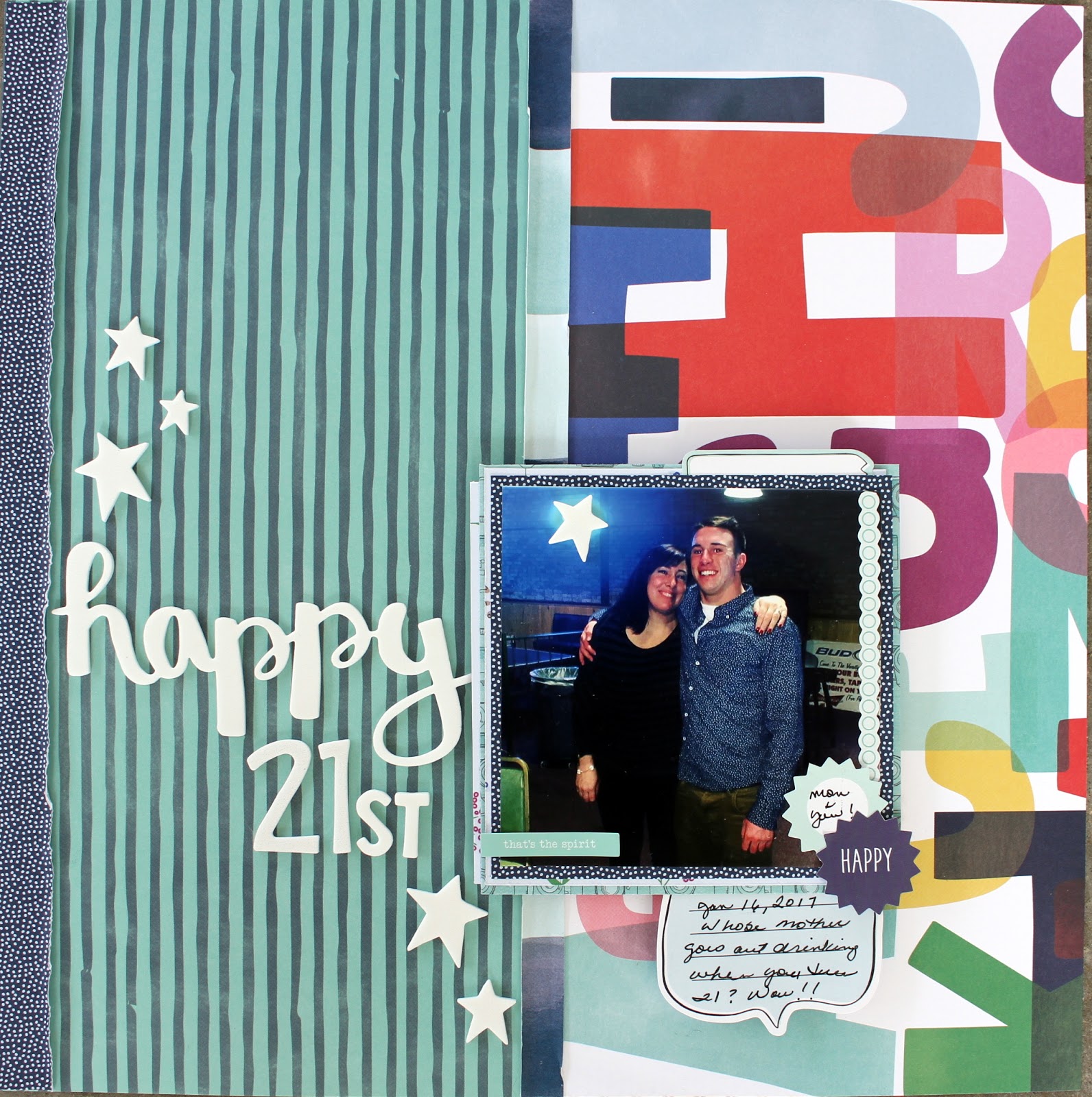
Happy 21st --- A Boy Page!

Oh Boy  (silly pun intended) I had been waiting for my March Gossamer Blue kit to get this photo scrapped.  My eldest grandson turned 21!  His mom and his uncle took a little road trip to his college town to take him out on the town on his special day!  (Thank you to Uncle Matthew for taking the photo!)  I just knew when I saw the sneaks that the papers in this kit were going to work out perfectly for my (one and only) photo of this most important occasion.   


After cutting the two larger printed panels, I used one of the branding strips and sliced another strip of the navy/white dotted paper and layered those at the left edge of the page and over the seam between the two larger panels.  Curling up the edges of the paper strips provides some needed texture, without adding yet more pattern. 


I used lots of layers under the photo, but only allowed teeny slivers of color to peek out. because I just felt that with all that pattern going on---well I didn't want it to get too busy.  The photo got popped way up (I stuck a thick slice of cardboard under it) and tucked in a couple few little stickers (one of which had my journaling on). 


Two little sunburst stickers were the perfect color and size for the lower right corner, leading into the journaling sticker. 


The kit contained a wonderful Thickers phrase set which supplied the happy and the stars---but I did use some additional letters from my stash for the 21st.  Loved how the white popped against the background! 


So, a "guys" type birthday page!  A fun, happy page to make which went together really quickly.  Gotta love that too. 


Tip #1; use large panels of large, bold prints rather than relying on embellishments and coordinate at least one of the colors in those prints to your focal point (in my case, it was the navy blue in grandson's shirt).  Tip #2; use starbursts or thought bubbles, bold type print, and bold embellishments sparingly (as in the use of several stars here and the happy 21st. 

Happy 21st Jacob!  Nana loves you! 


Sunday, February 19, 2017

Kit Comparisons Continued - My Personal Approach to Choosing a Kit

Here we are at a look see at another kit club. 

Like I said before I only just received my second kit and am not anywhere near done with it.  But we will forge ahead anyway!  It was my own fault I did not get two kits in a row from them, I just did not hop on to the website in a timely enough fashion to place my order before they had sold out!


Gossamer Blue
The kits each seem to have a decidedly different perspective as it pertains to color, patterned paper and even embellishments.  Which means to me, that there is always something new to look forward to.   I had a very easy time making a variety of travel, girl, and a boy-ish page(s).   I did go to my stash for some alphabet stickers that seemed to work better with some pages, but other than that the only other thing I added was a doily and wood veneer car. 

Paper
In each kit I've received 7-10 patterned papers.  If the kit is sending 7 patterned papers, then it also contains 2-3 sheet of cardstock.  Now I have seen a kit or two which contained 10-11 patterned papers and no cardstock (which is still fine by me, I'd rather have the patterned paper any day).

The papers are incredibly well coordinated and most times I've had a hard time choosing which side of a given paper that I want to use more.

Embellishments
Each kit includes at least two full packs of die cuts or ephemera.  The things that change from kit to kit are offerings like enamel dots, washi tape, sticker sheets or chipboard.  There is usually an exclusive set of wood veneer and/or acrylic pieces.  In past kits I've seen partial packs of sequins, or mini pom poms, tassels, and even decorative paper clips.  Fun stuff, and it changes from one month to another.

This is another kit club that at times have included a stamp set---and as I said before I do love getting a stamp set! (There are stamp sets offered in their add-ons, if  they are a must for you.) 

Alphabet/Titling Options
In each of the two kits I've received there was either a Thickers alpha set or a puffy alpha set, plus at times the sticker sheet that may have been included also had phrases and words that could easily be used in forming a title.  In one of the kit I missed out on, there was a Thickers set with words and phrases and a sticker sheet with words and phrases, plus a mini alpha.  

General
Kits arrived without delay, no damages.  They have no membership requirements, as long as cancelling is done within the designated time frame.  The facebook page is not as active as some kit clubs, but still a friendly place.  Their blog is full of ideas, although I personally could do without so many planner or project life pages (sorry I am strictly a scrapbook page addict).  But I understand each of these (planners and project life) have taken on a lot of popularity.  Their designers are creative of course and each kit is well represented. 

One of my favorite pages created from a Gossamer Blue kit... The only add to this page was some vellum for layering. 


Next time, Hip Kit is up! 

Thursday, February 16, 2017

Gossamer Blue Layout -- p.s. i love you

Most of my journaling on my grandchildrens' pages is more like a little thought or note to them from me.  My little granddaughter is shall we say, a headstrong young lady, a little power house.  I wanted to recognize that but also remind her to show her wonderful heart and kindness, p.s. i love you, Nana. 


I had tried to do this page several times before using a color coordinated effort in blues and greens (like in her school jumper).  Uh, no...  it just didn't work.  But when I received the February Gossamer Blue kit and saw several black and white patterns, strong... yet softened by the p.s. i love you message, I thought I'd give it a shot.  BINGO!  I did add just a little really light pink watercolor and some splatters of pink, but other wise pretty much left the white card stock background, well pretty much plain white.


I cut and tore several pieces of the black and white patterns and lined them up against the left edge of the page and tucked in a piece of ruffled white tissue paper, again for softness. Then curled up the edges here and there and tucked in a couple of floral stickers to brighten up all that black and white.

The photo got treated to several layers of tissue paper, a piece of the black and white text and just a wee small amount of pink peeking out directly under the photo. 


I cut two banners and outlined them before tucking them up under the lower corner of the layered photo.  Then went to work on a little cluster consisting of a doily sticker (kind of flimsy so I put it on a circle cut out of a scrap of cardstock) and a small "pile" of hearts. I wanted that in place slightly touching the edge of the banners so it made a nice soft corner. 


Tucked in a bow shaped paper clip (from my pile of left over stuff), added my title and a few enamel dots and that seemed like just enough.  Oh, I almost forgot---didn't want the right side of the page ignored, so I cut a medium to large size photo corner and placed it up on the right side before I did my journaling. 

The note to Dear Bella went down the right side of the page and I was done!

See once I got a handle on the right papers, everything else came together.  It's all about the papers for me!


Maybe if you are fighting with a certain few photos, it's not that you've lost your mojo... maybe you just don't have the right papers in front of you!  Put those photos aside and try them again later with another set of monochromatic neutral papers... gold and white, black and white, kraft and white.

best to all!
Cheryl

Monday, February 13, 2017

Last Kit Club Under Review --- American Girl(s) Layout

I cannot tell you how excited I am to be getting to the end of my so-called research!  While it's been fun ordering kits from various clubs, it's also been kind of stressful.  I mean there is much to like about each club and I'm frustrated when I cannot seem to produce pages that maybe gives each club their due.  But that is what the process of choosing a kit club for yourself is really all about!  Choosing the right club, for you, at any given point in time. 

This page was created from Gossamer Blue (remember I did get only one kit from them---months ago---then I was such a slacker when it came time to order that they sold out of several kits before I went back to order).  But this time I ordered right away and am more than pleased to get their February collection! 


And even though I have protested before about great quantities of pink in various kits...well it is February after all, so I can deal.  Besides, the part I am enamored with is that there are contrasting patterns and colors!  Hurray!  Here, I used the darker floral on the bottom third of the age and the smaller lighter floral at the top.

To mat the photo of granddaughter and her very special American Girl doll, I used a black and white script print and die cut several groups of leaves from white card stock to kind of imitate a cut file.  (I don't have an electronic machine to use with cut files, so this was my way to get a little of that sort of look.) 


The embellishment pack included these neat striped pieces which I used at the seam between the two floral prints.  I also cut several of the black label in half lengthwise and used those along the border, as well as the small circle stickers.  The kit included words and phrases in sticker format and in the embellishment pack, so it was easy to select a few of those to accent the photo with.  Also used the cute xoxo die cut and a couple of hearts in a cluster at the lower right corner of the photo. 

Adding a piece of that striped embellishment, a couple of stickers, washi, and two more half pieces of the blank labels created a bit of interest at the top of the page. 


This kit included a shiny black puffy sticker alphabet set for my title.  I was torn between American Girl(s) or All She Wanted, but in the end went with American Girl(s).  If this page was a bit more holiday in feel, All She Wanted may have fit better.  Since there was that gap between the edge of the page and the beginning of the word Girl(s), I added a piece of washi to fill it in, then added a small piece at the opposite side of the page too.  My journaling was short, so it fit right on those blank labels! 


All in all, this page came together pretty quickly, both because the papers and embellishments were perfect fits and because I chose one of my old favorites in page layouts---using a darker pattern on the lower third, a lighter coordinating pattern on the upper two thirds --- covering the seam between them with a decorative border and using that border to anchor the title.  It's a nice to have old stand-bys at the ready when you haven't been at the old scrapbook table for a while! 


I'll be working with this kit and raiding my stash in the coming days and also compiling my results of the past months of kit research.  My decision has been made, but I do want to share how I made my choice.   I hope that my process helps some of to decide if you even want to join a kit club and how to go about choosing the one that is right for you. 

more to come! 

Cheryl

Sunday, September 25, 2016

Kit Clubs and Reclaiming My Scrappy Mojo!

Somewhere along the way, not quite sure how, I neglected to post this layout...  And I do like this page, so I am happy to be able to share it now; especially since after having been away for a week, I had a difficult time getting my scrappy thing going again.   


Finding this page really made me think about that, how being away from scrapping for even as little as a week, made producing a page I was actually happy with, kind of troublesome. 

Oh, after we got back I got right back to scrapping... I had ordered a set of Prima Oil Crayons and I was in a hurry to play with them.  But, after putting together three different layouts, and then taking said layouts back apart again, I came to the conclusion I should switch gears.  So I opened up the kit from Scrapbook Circle that I had received right before we left and set about making some pages. 

Working straight from the kit made my transition back to scrapping go so-o-o-o-o-o much smoother!  I felt relieved of the pressure to "be creative" and just sliced, punched, and glued my way to my happy scrappy place.   Now, rest assured I will get back to playing with those crayons, but when confronted with a bit of a break in the scrapping mojo, working with the tried and true seemed like a better choice (for me anyway).  And it worked! 

Now, for details on the "found" page!  Papers are from the June Gossamer Blue kit.  The adds from outside the kit are the Thickers, the flair badge, the little diagonal striped banner, and a scrap of vellum.  Instead of layering up the photo, I placed several patterned papers vertically over a couple of horizontal banner.  This created a sort of L-shape and a nice little corner for my title.  After I fussy cut the clouds from one of the papers, and did some outlining, I was done!  

As I have said before, I was really very happy with the Gossamer Blue kit and was looking forward to my second kit (their September kit).  Ah-h-h-h, but I procrastinated too long and they sold out.   So this is the last of the Gossamer Blue layouts, at least until their October offering is available.  Since I have to wait a few more weeks for a second Gossamer Blue kit, I'll work with my September Scrapbook Circle kit and then skip around and move on to Citrus Twist for a bit.  Nice to have scrappy options! 

Thank you kit clubs...for making helping me reclaim my scrapping mojo!! And thank you kit clubs for options, always nice to have options.    

best to all
Cheryl

Tuesday, September 13, 2016

Making a Page With Kit Leftovers

How about a page that came together because of an embellishment? 

The little acetate pieces were the impetus for the entire page!  Their shape mimicked the windmill blades in my mind.  The colors of those little acetate pieces dictated the colors to be used for the page.  Pastel, soft and quiet. 

The little pink tabs came in the kit, each printed with a word or two...but none really fit with my travel photos, however I did like the pale pink color. So they just got tucked in such that the words didn't show. 


In this case I used one of the papers in the kit for the background since it was mostly white, with a bit of printing at the left edge.  The branding strips were trimmed into long skinny banners and the one or two larger chunks of printed paper that were left got layered under the photo.  There is nothing hugely striking about the page---it is calming and still, allowing the photo to be center stage. 

The only add from outside the kit was a scrap of green (cut into two short banners) and the chipboard heart. 

Next up is a page using strips of paper at the edge of the page. 


Another page showing the use of watercolor on the white background to help unify the page and tie the colors and photo together rather than the use of printed papers. 


Looking through these page samples, the one common denominator leaving a good amount of white space.  (White space = open space, it could have been a colored background---I just happened to use white.)

This open space could be less, if you were working with more than one photo--but it would be more difficult to have enough papers left for layering.  In that case your leftovers could be used in small strips under your photos or along one edge of your page, depending upon the size and shape of your leftover pieces. 

The point is, a technique for getting the most from my kit(s), before relegating things to my stash, is to gather those little pieces and parts together and see if there is enough to either surround a photo, layer underneath a photo, or line up along the edge of a page.  Now I am not always successful at this.  In fact I have a layout that I am going to take apart, cuz it's    just.  not.  happening.  When I get that one put together again in a happier arrangement, well that can/will be a whole other conversation.   And I'll have that conversation, it's ok to me to shows one of my "yuck" pages ... and compare it to one that I find more pleasing to look at. 

But for today, try and use all those little "schnibblets" left lying about your workspace to make just one more page before you call a kit done.  It can't hurt, you can always take it apart, but if you are successful, you'll have one more page done AND finish off a kit feeling that you have spent your money on that kit wisely! 

best to all,
Cheryl


Friday, September 9, 2016

How Many Pages Can You Get Out of a Kit? - Tallying Up the Pages!

So I've pretty much killed the Scrapbook Circle August kit.  I have no 12 x12 papers or even strips that are 12 inches in length.  No larger chunks of paper that could be used for photo layering, no cut-a-parts left.  I do have a few of the white puffy heart stickers, one of the leather badge embellishments and a good portion of chipboard alphas and seven completed pages! 

You can see more from this kit on previous posts, but here's the last three. 


I did use some plain white cardstock as a page background and a piece of older Basic Grey (even though I cleaned out a substantial amount of papers before we moved, I saved a stack of Basic Grey "antiqued" or mottled solid color papers because they make great backgrounds--I use them as though they were solid color cardstocks). 


And I did use some alternate alpha stickers for some titles, as well as some wood veneer pieces, a doily or two, a small sticker or tab, and vellum for layering.  I also made use of the stencil provided in the kit and paints, sprays and colored pencil.  (Loved getting a stencil with a great all-over pattern like this wonky triangle!). 

Oh, and I totally scrap-lifted a page idea from the Scrapbook Circle blog. 


Now, not having a working sewing machine did stop me from stitching all along these cut strips, and I did add the cut-a-part words from the provided strip of them; but the overall design---a straight scrap-lift!  I appreciate having creative and straightforward page ideas to peruse and the Scrapbook Circle blog does a great job! 

The September kit that is on its way to me is totally different in both color and in design.  I can't wait to get a hold of this next one!  Another good sign of a good kit club.  You finish everything off, and are feeling done and over it...and w.h.a.t.?  You glimpse the next coming kit and can't wait to get it! 

Seven pages done with the August Scrapbook Circle kit.  Hoping to get the new kit later in the coming week, fingers crossed! 

Nine pages done with the June Gossamer Blue kit.  The Gossamer Blue September kit looks divine as well and their add-ons are really hard for me to pass over this month--but I am not testing those, so am forcing myself to not look at them!! The unfortunate thing is that both Gossamer Blue and Scrapbook Circle have included the very same sticker sheet in their September kits.  H-mmmm, may have to start a give-away stack. 

Here's how the clubs stack up so far:

Scraptastic                   Kit #1    9 pages          Kit #2:  4 pages
Studio Calico               Kit #1    5 pages          Kit #2:  4 pages
Gossamer Blue            Kit #1    9 pages
Scrapbook Circle         Kit #1    7 pages

More to come!  Yippee!  More to come! 
Cheryl


Monday, September 5, 2016

What to do With Kit Club Leftovers? or How Did She Squeeze 9 Pages Out of a Kit?

When you get toward the end of a kit, you are left with weird little scraps of paper that of course you just can't bear to throw away.  OK, maybe some of you can toss 'em, but I tend to feel like I have to squeeze every last little ounce of goodness out of a kit, like a lemon.  I do want my money's worth!

So here's a page using my leftover pieces and parts from the Gossamer Blue kit.


I did end up totally screwing up a perfectly lovely gray wood-grain print paper by thinking I would add a layer of gesso as a base for a photo stack.  Uck.  Major, major ugly resulted from that experiment.  But did I throw it away, um, nope.  I cut off pieces to use elsewhere.  Like here tucked under the photo as an additional layer. 

The flowers were what was left from fussy cutting one corner from a sheet of paper.  The remainder of that sheet was a pale gray polka dot and it got used as a layering piece for another page and the opposite side was used on yet another page under another photo.  I had a bit of the black polka dot (the reverse side is the pink polka dot--tucked a strip of that under the bottom edge of the photo) and punched a scalloped circle, sliced it in half and tucked amongst the flowers. 

Still felt the photo needed a something more layered under it, so I reached for vellum!  I've been using more vellum under my photos lately to add in the feel of more layers and to soften colors or prints.  Also tucked in a stray half of a doily that was lollygagging about on my desk. 

The photo and floral sections were actually assembled off of the page, so that once I could see what I had, I could decide where to place it on the page and what to do with the plain white cardstock base.

Decided to use some watercolors on the white cardstock to pick up the greens and pinks from the flowers and the grid print that is under the photo.

Once the watercolor was dry, I could move the assembled photo block and florals into place and could move onto title construction and placement.  Since I was focusing on the greens and pinks, I used two different sets of Thickers to include both colors.  Added some messy penned borders around the edges of the page; used the last of the included pink enamel dots and finally added one of the last of my old chipboard hearts from Making Memories ( I think I have two left :<). 

And that, is one way to use up every little thing from a kit. 

P.S.  I still have the light blue puffy alpha stickers and some peachy pink enamel dots...  just sayin'

Cheryl 


Tuesday, August 23, 2016

How to Pick a Kit Club; the research continues

Since starting my little study on picking out a kit club, I am learning loads about my personal preferences and shopping preferences.  Like, feminine versus masculine paper and embellishment designs (I actually find it easier to work with more masculine or generic patterns rather than floral no matter how pretty I find the pattern to be)! ...

Now I have a granddaughter to scrap for and she LOVES pink, so some feminine pinks are a must, but I don't need entire kits (or kit club) devoted to girl-ish goodies.  I need a balance.  And I have found that Gossamer Blue provides a happy mix.  Now that being said, I have only been working with one kit from them...I'll be ordering another soon (goodie-goodie!). 


This is my latest page from the Gossamer Blue kit.  And it's from pretty much the tail end of the supplies I received.  I did a total of 9 pages with the kit and wished I could have kept going.  Now that, to me, is the sign of a good kit!  I even screwed up a big piece of one of the papers smearing gesso all over it and trying to use it as a background...trust me it was a hot mess!!! But I still was able to get 9 pages done...9!  Woo-Hoo!  (She says trying to high-five herself--ok that's never gonna get photographed!) 

So far, I am gobb-smacked with Gossamer Blue.  My only criticism would be that they have a very quiet FB group.  I feel a bit pushy, posting my pages there.  Not a lot of chatter.  I mean I've received very kind remarks and all, there just aren't many others posting pages.  And I like to have a spot to chat it up with other scrapping fiends (um, I mean friends).  So, we'll see.  I can't make that my over-riding decision buster.  But on to the layout...

I added a bit of vellum, but everything else is from the kit.   I even used a piece of packaging (that small piece of light gold diagonal stripe).  Could have done a little ink splattering, but decided to keep it very clean and went without. 

It's a simple page design, sure.  But every page I put in the kids' or my own  albums are not show stoppers.  Nor, do they need to be.  In fact, I don't think each page in any album should be over-the-top.  Wouldn't that get tiresome to look at after a while? 

Just can't wait to get my next Gossamer Blue kit, and I've already ordered my first kit from Scrapbook Circle, so I'll have some more comparisons coming soon!

Lesson #1 in picking a kit club?  Pick what you are going to work with, not just one that carries pretty stuff.  If you aren't going to have a use for it...regardless how pretty it is, what's the point?

later,
Cheryl

Thursday, August 18, 2016

How Diverse Can a Kit Be? (not being politically correct here folks)

So it appears that it's a good thing I am "researching" various scrapbook kit clubs.  Scraptastic will no longer offer their monthly scrapbook kit club.  The August kit will the last one. 

Here's my list of kit clubs I am thinking about and will (if I have not already done so) order an a la carte kit (or two) to work with. 

Scraptastic
Studio Calico
Gossamer Blue
Citrus Twist
Hip Kits
Scrapbook Circle

 Currently looking at (playing with and very much enjoying) Gossamer Blue. 


I posted a couple of pages that were very girl-y in feel from the Gossamer Blue kit I received.  But what I liked was that I found I could easily make a travel themed page from the same kit!  This is what I mean when I say a kit is diverse.  I want my kit(s) to be able to be used for multiple subjects, multiple themes.   

The only adds to this page were the couple scraps of green print paper, the title alpha set,  the wood veneer car and the little yellow banner up top.  Everything else was included in the main kit!  Love!

One more travel page created with this kit.


This was another of those,"love this paper, don't want to change it at all" pages that went together super fast.  In fact, this paper was one of the reasons I chose to order the June kit first to play with (um, I mean research).   And absolutely everything was included in the kit.  Gotta love it! 

I'll have to tally up and see just how many pages I end up with from the kit.  I fully expect to use each and every piece of paper, so we'll see how far I get.

best!
Cheryl