OK, settled in with a cuppa something good to sip? Here we go.
For purposes of comparison, I am not counting plain cardstock used for a page base or for punching or making die cuts.
Scrapbook Circle
This is a kit club I was totally unaware of until I heard mention of them on one of the facebook groups I belong to. So I hopped on over to their website and took a look see at past kits they had offered, looked back through their blog and then checked out their facebook group. Really loved the kit that was currently being offered and jumped on it.
It was really unlike many other kit clubs in that it was not all froth and pastel. And I have grandsons to scrap for folks, pastel and frothy goodness is nice, but doesn't bode well for football, wrestling, soccer and super heroes!! I need a little bit of earthy goodness, a touch or two of bright primary color, you get the idea.
Papers
I received eight - ten patterned papers in each kit, sometimes a specialty paper such as a corrugated sheet, no solid color cardstock (which is fine for me--I have a ton of cardstock in my stash). Papers were well coordinated without being too matchy-matchy (a difficult task sometimes).
Embellishments
Each kit contained two whole packs of embellishments such as die cuts, leather patches, chipboard, as well as partial packs of some items, such as a partial pack of sequins. Also included in each kit was an exclusive acrylic word or phrase and a separate assortment of small acrylic stars, hearts, etc. Some kits contained a sheet of stickers, some did not. Again, the items chosen for each kit were well coordinated with the patterns/theme of the papers. Some goodies such as fibers or sequins came packaged in tiny decorative gift bags (which I gladly also used on my layouts).
Alphabets
Some kits contained two choices of alphabets, usually Thickers or puffy alphas and a small typeset sheet that was a part of a larger sticker sheet. Some kits contained a Thickers set that was words/phrases instead of an alphabet set; one kit contained an awesome mirror set of words, plus a sticker sheet with phrases and tiny alpha. Truly all easily workable on my pages.
General
Kits arrived on time, no shipping damage. Their facebook group seemed at first a little odd to me in that not a lot of subscribers were posting, although more folks seem to be sharing their work now. Their blog has awesome, useful ideas, created by some very supportive designers.
Any questions you may pose are quickly answered and any issues seem to be easily and quickly acted on.
I was really happy with their kit content, the variety between the kits (meaning not every kit looked too overly similar to every other kit). In fact, happy enough that I stayed on with them for four month I think rather than just the two month kit trial I set for myself.
The club has only a two-month membership requirement in order to have discounted membership available.
My favorite page from one of the Scrapbook Circle kits I received...
The only additions from my stash were the gold alpha (My and Girl) and several big snowflakes punched from plain white cardstock. (The pink-ish puffy sticker circles I think were from a prior Scrapbook Circle kit).
If you want a club that offers a variety in style and feel, includes a few more patterned papers than some (keep in mind you do not receive solid cardstock sheets -- which for me is fine) and a comfortable quantity of embellishment and titling options, then this club would be a grand choice!
Coming up: Citrus Twist
best,
Cheryl
Showing posts with label Scrapbook Circle. Show all posts
Wednesday, February 15, 2017
Tuesday, January 3, 2017
Winter Traditions -- A Scrapook Circle Layout
For this page, I made use of pastel prints included in the November Scrapbook Circle kit. While the kit also had some very traditional colors of the season, I did want to make good use of the pretty pastels.
I was still enamored with more of a straight paper approach, so no watercolors, paints, mists, or even splatters. Printed paper, tissue paper, some punched snowflakes, cute little tabs, as well as some stickers make up the layers behind the photo.
To continue the tree theme, I used almost all the various tree stickers, placing some on either side of the photo, along with an acetate snowflake and a sprinkling of sequins.
We also received those fuzzy mini pom poms and once they were glued onto two pieces of bakers twine, they made two cute little buntings to hang below the photo and the title.
One more tree sticker, the be bright sticker, a couple few more sequins and a few slices of patterned paper make up the cluster at the bottom of the page.
Two pieces of patterned paper (the same papers used to layer beneath the photo) cut into banner shapes provided a base for my title (part acetate words and part sticker!). Adding sequins and the other little pom pom bunting piece kind of finished this area of the page.
Once I added the scribbly outlining and my journaling, the page was complete!
The pastels worked I think because our Miss Bella was wearing a lavender and aqua coat, had aqua, turquoise and pink in her hat and Mr. Jackson was wearing mostly neutrals. Adding that one little Beautiful and Bright sticker picked up on his dark jacket. There you have it, my take on a traditional subject done in non-traditional pastel colors.
So be traditional, in a non-traditional sort of way~
best,
Cheryl
I was still enamored with more of a straight paper approach, so no watercolors, paints, mists, or even splatters. Printed paper, tissue paper, some punched snowflakes, cute little tabs, as well as some stickers make up the layers behind the photo.
To continue the tree theme, I used almost all the various tree stickers, placing some on either side of the photo, along with an acetate snowflake and a sprinkling of sequins.
We also received those fuzzy mini pom poms and once they were glued onto two pieces of bakers twine, they made two cute little buntings to hang below the photo and the title.
One more tree sticker, the be bright sticker, a couple few more sequins and a few slices of patterned paper make up the cluster at the bottom of the page.
Two pieces of patterned paper (the same papers used to layer beneath the photo) cut into banner shapes provided a base for my title (part acetate words and part sticker!). Adding sequins and the other little pom pom bunting piece kind of finished this area of the page.
Once I added the scribbly outlining and my journaling, the page was complete!
The pastels worked I think because our Miss Bella was wearing a lavender and aqua coat, had aqua, turquoise and pink in her hat and Mr. Jackson was wearing mostly neutrals. Adding that one little Beautiful and Bright sticker picked up on his dark jacket. There you have it, my take on a traditional subject done in non-traditional pastel colors.
So be traditional, in a non-traditional sort of way~
best,
Cheryl
Tuesday, December 27, 2016
Choosing a Kit Club - Pure Scrapbooking
Ah, touches of traditional deep green and red, wood grain print papers, and splashes of snowflakes... a much more straightforward holiday page. Lately I've been using a lot of plain white cardstock for my backgrounds, adding color by way of banners and photo layers, watercolors and mists. So here I opted to use two of the papers as my background and a cheery red and white candy cane striped branding strip along the seam.
Papers and goodies are from the November Scrapbook Circle kit. The kit provided an entire pack of acetate embellishments; here I used the gifts and the mistletoe. Also included was a package of washi strips and I made use of several of them by tearing them and placing them at the top corner of the page and repeating them along the candy cane seam. The washi strips also provided the wording on the red and green labels (also included in the kit).
About the only thing I went outside the kit for was the Thickers alpha, the doily and ribbon, and the punched snowflakes. It's always kind of nice to be able to create your entire page from the main kit!
I used two more of the labels among the paper layers under the photo, tucked in some tabs,a few punched snowflakes for a punch of white and tied on a scrap of dotted swiss sheer ribbon above the mistletoe acetate.
This is something Scrapbook Circle does exceedingly well. They provide ample embellishments, their section of papers always seems to allow for both feminine and more masculine pages; or in this case pastel holiday pages and a more traditional take. Love this!
No paints, mists, texture paste... just straight scrapbooking! It was a good day, Elfie says so!
happy scrappin'
Cheryl
Papers and goodies are from the November Scrapbook Circle kit. The kit provided an entire pack of acetate embellishments; here I used the gifts and the mistletoe. Also included was a package of washi strips and I made use of several of them by tearing them and placing them at the top corner of the page and repeating them along the candy cane seam. The washi strips also provided the wording on the red and green labels (also included in the kit).
About the only thing I went outside the kit for was the Thickers alpha, the doily and ribbon, and the punched snowflakes. It's always kind of nice to be able to create your entire page from the main kit!
I used two more of the labels among the paper layers under the photo, tucked in some tabs,a few punched snowflakes for a punch of white and tied on a scrap of dotted swiss sheer ribbon above the mistletoe acetate.
This is something Scrapbook Circle does exceedingly well. They provide ample embellishments, their section of papers always seems to allow for both feminine and more masculine pages; or in this case pastel holiday pages and a more traditional take. Love this!
No paints, mists, texture paste... just straight scrapbooking! It was a good day, Elfie says so!
happy scrappin'
Cheryl
Thursday, December 22, 2016
Challenge Page! Use a 3x4 card, Pkging Technique, and Snowflakes/Stars
Took a small blogging break whilst wrapping, buying, card making and addressing...you know. the usual stuff this time of year, right?!
But I really wanted to share this page and how it was created from a tic, tac, toe challenge on one of my favorite FB groups (Mercy Tiara's 27 Day Challenge). Tic, Tac Toe? This means, that you choose your challenge off a tic, tac, toe grid. Sound fun? It is!!
My choice was a straight run across the grid; use a 3x4 card, the packaging technique to apply a color wash, and include stars or snowflakes on the page.
I worked with supplies from both the October and November Scrapbook Circle kits. The October kit included gorgeous gold metallic printed 3x4 cards, and the November kit had that gold metallic winter word in sticker form! I did pull out a gold Thickers set to complete my title on the diagonal on that shiny gold printed card!
The background was created using cellophane packaging, and watercolors in shades of lavender, aqua, and pink. While the background dried, I cut out those cute little houses from a leftover piece of paper from the November kit, and punched a few extra large snowflakes.
Once my background was dry, I splattered a bit of paint about, as well as some metallic gold spray mist and then began layering papers under my photo. The layered photo lined up nicely with the gold title card, but it just needed a wee bit more shiny golden goodness. Oh good, I still had another golden card and tucked most of it under the photo on the opposite side of the title.
Once the line-up was done, it was time to tuck in a few pops of color, using a few more stickers and, a sprinkling of pretty sequins from the November kit and some of the puffy circle stickers included in the October kit. The last thing to be done was to tuck in those punched snowflakes. I like to add things like this at the end, as I can see more clearly where the page needs more depth, or that nice splash of white.
So, 3x4 card (check), watercolor packaging technique (check), and snowflakes or stars (check!).
Please do try some of the various challenges going on via your favorite FB groups. It really is fun, it gets you out of a rut, and it gets another page done!!
Please enjoy this holiday season with family and friends! Be safe, be happy, but mostly... be calm!
Merry Christmas!
Cheryl
But I really wanted to share this page and how it was created from a tic, tac, toe challenge on one of my favorite FB groups (Mercy Tiara's 27 Day Challenge). Tic, Tac Toe? This means, that you choose your challenge off a tic, tac, toe grid. Sound fun? It is!!
My choice was a straight run across the grid; use a 3x4 card, the packaging technique to apply a color wash, and include stars or snowflakes on the page.
I worked with supplies from both the October and November Scrapbook Circle kits. The October kit included gorgeous gold metallic printed 3x4 cards, and the November kit had that gold metallic winter word in sticker form! I did pull out a gold Thickers set to complete my title on the diagonal on that shiny gold printed card!
The background was created using cellophane packaging, and watercolors in shades of lavender, aqua, and pink. While the background dried, I cut out those cute little houses from a leftover piece of paper from the November kit, and punched a few extra large snowflakes.
Once my background was dry, I splattered a bit of paint about, as well as some metallic gold spray mist and then began layering papers under my photo. The layered photo lined up nicely with the gold title card, but it just needed a wee bit more shiny golden goodness. Oh good, I still had another golden card and tucked most of it under the photo on the opposite side of the title.
Once the line-up was done, it was time to tuck in a few pops of color, using a few more stickers and, a sprinkling of pretty sequins from the November kit and some of the puffy circle stickers included in the October kit. The last thing to be done was to tuck in those punched snowflakes. I like to add things like this at the end, as I can see more clearly where the page needs more depth, or that nice splash of white.
So, 3x4 card (check), watercolor packaging technique (check), and snowflakes or stars (check!).
Please do try some of the various challenges going on via your favorite FB groups. It really is fun, it gets you out of a rut, and it gets another page done!!
Please enjoy this holiday season with family and friends! Be safe, be happy, but mostly... be calm!
Merry Christmas!
Cheryl
Saturday, December 10, 2016
Creating Joy - How to Coordinate Kit Club Papers
So, a little off the topic of how to choose a kit club, but important anyway. Let's say you've chosen a kit club and you can't afford to buy the add-ons each month, AND you get a kit that although you love the papers, they are just not playing nice with each other!
You can always use little pieces as I did on the "About You" page, but this time the papers all "individually" went with my photo; it just too much of same size prints, too much of just one color...
I chose to cut the papers into two inch squares and quilt them together.
My original intent was to actually sew the squares down. But my little sewing machine threw a hissy fit; and I need to wind a new bobbin and change the (now bent) needle. Just do not have the patience right now to do that, so I moved on and decided to outline each square.
See I loved these papers and they do well together, so now I am thinking forward on more ways to put them together. It's funny how things work out, huh?!
I crumpled some plain white cardstock and used some flat white cardstock, as well as a piece of the corrugated red that came in the kit; tucked in part of a doily, a couple of the tabs (also included) and a few silvery die cut pine srigs (I cut those).
The Joy title was cut from the papers, and just to make the squares a little more interesting, I used several more of the included tabs and pretty much called it done.
This has been a fun page to make, but now I have to go wrangle up a new needle, and fight with a little pink sewing machine (LOL)!
best,
Cheryl
You can always use little pieces as I did on the "About You" page, but this time the papers all "individually" went with my photo; it just too much of same size prints, too much of just one color...
I chose to cut the papers into two inch squares and quilt them together.
My original intent was to actually sew the squares down. But my little sewing machine threw a hissy fit; and I need to wind a new bobbin and change the (now bent) needle. Just do not have the patience right now to do that, so I moved on and decided to outline each square.
See I loved these papers and they do well together, so now I am thinking forward on more ways to put them together. It's funny how things work out, huh?!
I crumpled some plain white cardstock and used some flat white cardstock, as well as a piece of the corrugated red that came in the kit; tucked in part of a doily, a couple of the tabs (also included) and a few silvery die cut pine srigs (I cut those).
The Joy title was cut from the papers, and just to make the squares a little more interesting, I used several more of the included tabs and pretty much called it done.
This has been a fun page to make, but now I have to go wrangle up a new needle, and fight with a little pink sewing machine (LOL)!
best,
Cheryl
Tuesday, November 22, 2016
Winter Wonderland - A Scrapbook Circle Page
Yep, that's me...let's just jump from a summer scrapbook page right on over to a snow-filled winter page!
My November Scrapbook Circle kit contained some snowy, some Christmas-y elements but many with pinks and teals as the color scheme. And then I remembered this photo my daughter facebooked right after their trip to visit us in Kentucky last spring. It had been 60-some degrees here, but the day after they got home....snow! That's how it is in Wisconsin!
The teal color of my granddaughter's winter jacket got me pulling out the little teal, aqua and pink snowflakes, the Wonderland portion of the page title...it's really what set the page in motion. I just followed along!
I layered a strip of snowball (at least that's what it reminded me of) paper down the right side of the page and started tucking in tabs all along it's interior edge. Bent the edge here and there on the snowball paper and outlined it to separate it a bit and differentiate it from all the rest of the white of the page. To balance and to repeat, I added a triangle hand cut from the same snowball paper in the upper left corner and outlined that as well.
The photo got layered onto a teal and pink plaid pattern paper, along with more tabs and two pieces of crumpled and flattened tracing paper.
To add my title, I chose "Wonderland" from the sticker set that was included the kit and the "in March" which was made using letters from the stickers set that originally spelled out other wintry words.
Next was to add just a few embellishments by way of a couple of banner stickers and some snowflake stickers (again, on the sticker sheet that was included), plus two extra large punched snowflakes that got tucked in with the photo layers. I also used the back side of an arrow embellishment to counter balance the black of granddaughter's snow pants.
Last, I outlined the page and added just a quick comment at the bottom of the page.
Once I got all those tabs to stay where I wanted (can you say sticky fingers?!), the remainder of the page went together quickly. And I love that it is cool and crisp; and that I even managed to use stickers (something that I just don't do a lot of--for some weird reason I rather like fussy cutting things, what is w.r.o.n.g. with me!!!)
have a great scrappy day,
Cheryl
My November Scrapbook Circle kit contained some snowy, some Christmas-y elements but many with pinks and teals as the color scheme. And then I remembered this photo my daughter facebooked right after their trip to visit us in Kentucky last spring. It had been 60-some degrees here, but the day after they got home....snow! That's how it is in Wisconsin!
The teal color of my granddaughter's winter jacket got me pulling out the little teal, aqua and pink snowflakes, the Wonderland portion of the page title...it's really what set the page in motion. I just followed along!
I layered a strip of snowball (at least that's what it reminded me of) paper down the right side of the page and started tucking in tabs all along it's interior edge. Bent the edge here and there on the snowball paper and outlined it to separate it a bit and differentiate it from all the rest of the white of the page. To balance and to repeat, I added a triangle hand cut from the same snowball paper in the upper left corner and outlined that as well.
The photo got layered onto a teal and pink plaid pattern paper, along with more tabs and two pieces of crumpled and flattened tracing paper.
To add my title, I chose "Wonderland" from the sticker set that was included the kit and the "in March" which was made using letters from the stickers set that originally spelled out other wintry words.
Next was to add just a few embellishments by way of a couple of banner stickers and some snowflake stickers (again, on the sticker sheet that was included), plus two extra large punched snowflakes that got tucked in with the photo layers. I also used the back side of an arrow embellishment to counter balance the black of granddaughter's snow pants.
Last, I outlined the page and added just a quick comment at the bottom of the page.
Once I got all those tabs to stay where I wanted (can you say sticky fingers?!), the remainder of the page went together quickly. And I love that it is cool and crisp; and that I even managed to use stickers (something that I just don't do a lot of--for some weird reason I rather like fussy cutting things, what is w.r.o.n.g. with me!!!)
have a great scrappy day,
Cheryl
Tuesday, November 15, 2016
Do You Ever Do-Over a Page?
I confess, I do make page do-overs. Sometimes. While in my head, I justify not making over a page with the whole "the page is done, the photos are scrapped, move on" thing. Sometimes, I just cannot get beyond NOT liking the result and out comes my trimmer and scissors to take the page apart.
Which is what happened here.
But since I hate to lead off with the page I didn't like, here is the "after" page.
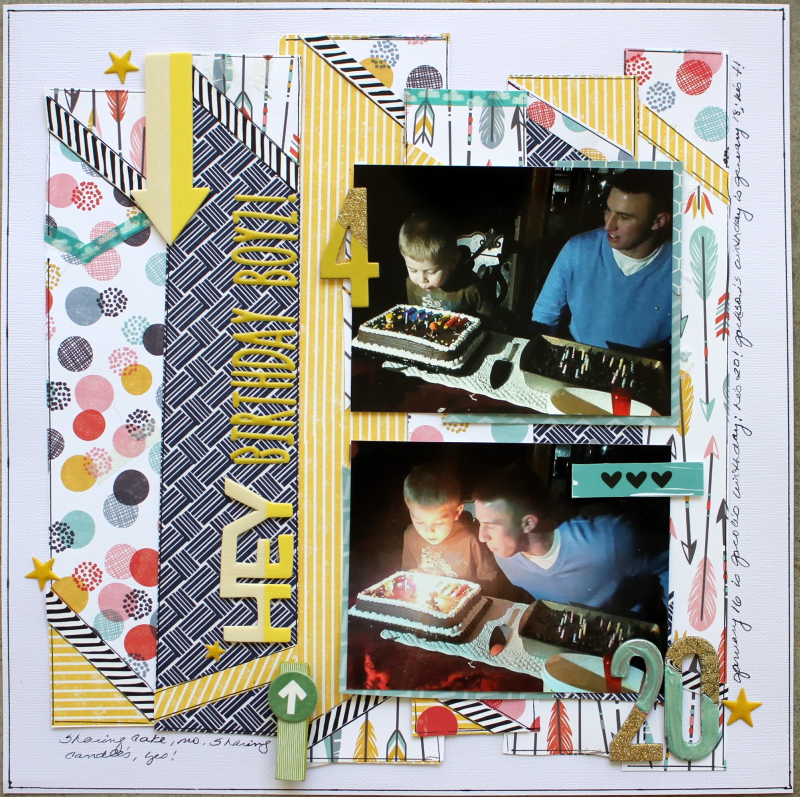
This was the page "before". See what I mean. It just misses on so many levels. The vellum (or tracing paper in this case), the papers---which I re-used---but here it was too much, in too big pieces that just seemed to fight each other for attention. It felt like I just threw the stuff on the page just to get the photos done. Hate that!
As you can see, I used the very same papers, but cut them into strips and did more mini layers at the end of each strip to tie the papers and patterns together. On one hand the after page is busier, but to my eyes, it is more coordinated and less of a distraction to the photos. And I removed one photo...really didn't want to , but I will probably use that photo on a different page. There's more than one subject, so it can go in another album.
Papers and embellishments came from the October Scrapbook Circle kit. (Which sadly I will be discontinuing as of December, so I can finish off my comparison of kit clubs.)
Detail shots of the "after" page are here.
I did paint the 2 and the 0 because they had a printed portion on them that conflicted too much with all the rest of the patterns going on.
These are the close-ups of the paper strips with their mini layers at top and bottom.
I also chose different letter stickers for the "Birthday Boyz" title, using the golden yellow to tie that color in a bit more.
And while not what I originally had in mind for the page, I am much happier with this result than the original page.
So, if at first you don't succeed.... cut that baby up and try it again! What can it hurt?
best,
Cheryl
Which is what happened here.
But since I hate to lead off with the page I didn't like, here is the "after" page.
This was the page "before". See what I mean. It just misses on so many levels. The vellum (or tracing paper in this case), the papers---which I re-used---but here it was too much, in too big pieces that just seemed to fight each other for attention. It felt like I just threw the stuff on the page just to get the photos done. Hate that!
As you can see, I used the very same papers, but cut them into strips and did more mini layers at the end of each strip to tie the papers and patterns together. On one hand the after page is busier, but to my eyes, it is more coordinated and less of a distraction to the photos. And I removed one photo...really didn't want to , but I will probably use that photo on a different page. There's more than one subject, so it can go in another album.
Papers and embellishments came from the October Scrapbook Circle kit. (Which sadly I will be discontinuing as of December, so I can finish off my comparison of kit clubs.)
Detail shots of the "after" page are here.
I did paint the 2 and the 0 because they had a printed portion on them that conflicted too much with all the rest of the patterns going on.
These are the close-ups of the paper strips with their mini layers at top and bottom.
I also chose different letter stickers for the "Birthday Boyz" title, using the golden yellow to tie that color in a bit more.
And while not what I originally had in mind for the page, I am much happier with this result than the original page.
So, if at first you don't succeed.... cut that baby up and try it again! What can it hurt?
best,
Cheryl
Tuesday, November 8, 2016
How to Love Your Kit Club --- Even if You Aren't Loving All of It!!!!
The Challenge: When you subscribe to a kit club, you are inevitably going to receive a kit or at least parts of a kit that you don't like. Such was the case with last month's Scrapbook Circle kit. While I loved portions of it, there was this paper...a very popular paper among other scrappers, just not me, I guess. It had multi-colored (kind of a quilt pattern) leaves in repeat pattern.
I'm not much of a repeat pattern fan, unless I can cut things out and use them as accents (which I did here), or it's a subtle pattern that can be used as a background paper. But even cutting them out, the colors were just a bit much for me.
What to do, what to do? I tried scattering them about; I tried piling them up; I tried a thin coating of gesso. But then there was this one 3x5 project life type card with pretty gold outlined leaves, actually several cards were included, but only one with these gorgeous golden leaves. So I painted them lightly with watered down Heidi Swapp mists and then thought well why not try this over the patterned leaves. Voila! I even added some straight gold to the leaves. Loved that the pattern showed through, but not so strongly.
And I was off then, in the hunt for my gold metallic thread to sew the leaves down into place.
Then it was just a matter of layering up that photo and comping up with a title. Now remember, this was the kit that came without an alpha set...I have other Thickers and stickers, but am still trying to keep working within the kit. Since I was using a white cardstock base, I used the "capture" from the included Thickers pack (in keeping with my aversion to white halo borders -- this looked ok to me on a white background).
The photo corners at opposite sides of the page are cut from the backside of the leaf patterned paper. Added some splatters from the Heidi Swapp gold and peach, then cut a couple of hearts from the heart cross-stitch pattern paper and tucked the remainder under the photo as one of its layering pieces.
That was it--almost all my time was spent trying to figure out how to use those leaves! Once that was accomplished the page was a snap to finish. (It did take a bit of time to hand sew the leaves in place, but that's OK. I stitched while watching TV!)
My thing here is, try something new with a paper you are not in love with. What can it hurt? It might even turn out pretty, well, shiny and golden and pretty!
best,
Cheryl
I'm not much of a repeat pattern fan, unless I can cut things out and use them as accents (which I did here), or it's a subtle pattern that can be used as a background paper. But even cutting them out, the colors were just a bit much for me.
What to do, what to do? I tried scattering them about; I tried piling them up; I tried a thin coating of gesso. But then there was this one 3x5 project life type card with pretty gold outlined leaves, actually several cards were included, but only one with these gorgeous golden leaves. So I painted them lightly with watered down Heidi Swapp mists and then thought well why not try this over the patterned leaves. Voila! I even added some straight gold to the leaves. Loved that the pattern showed through, but not so strongly.
And I was off then, in the hunt for my gold metallic thread to sew the leaves down into place.
Then it was just a matter of layering up that photo and comping up with a title. Now remember, this was the kit that came without an alpha set...I have other Thickers and stickers, but am still trying to keep working within the kit. Since I was using a white cardstock base, I used the "capture" from the included Thickers pack (in keeping with my aversion to white halo borders -- this looked ok to me on a white background).
The photo corners at opposite sides of the page are cut from the backside of the leaf patterned paper. Added some splatters from the Heidi Swapp gold and peach, then cut a couple of hearts from the heart cross-stitch pattern paper and tucked the remainder under the photo as one of its layering pieces.
That was it--almost all my time was spent trying to figure out how to use those leaves! Once that was accomplished the page was a snap to finish. (It did take a bit of time to hand sew the leaves in place, but that's OK. I stitched while watching TV!)
My thing here is, try something new with a paper you are not in love with. What can it hurt? It might even turn out pretty, well, shiny and golden and pretty!
best,
Cheryl
Thursday, November 3, 2016
Diversity within a Kit Club -- No, Not the Political Kind!!
I am NOT talking diversity, as in ethnicity here folks! I am talking about how many looks or types of pages can be easily made from one kit!
Here, my Scrapbook Circle kit provided me with a nice vintage vibe for an old photo of my parents, circa 1948.
I just loved the feel of those peach and pink florals on that green background...combine that with a touch of black and white and a bit more peach.... oooooh yummy!
Before I did anything, I decided approximately where my photo was going to go and used water plus spray mist on cellophane technique for added some areas of color. Not a lot, just a bit of peachy pinky color that would peek out from under my photo. And once that was done, I added a few splatters of peachy pink too!
The photo itself was layered with crumpled tracing paper (my substitute for vellum, since I am out), a scrap of some light green patterned paper (that I had tested my little sewing machine out on), and a slim strip of the striped paper.
I hand cut the border pieces since I wanted a slightly irregular edge on them, layered them up and curled and bent the edges. Then added the striped piece (truly they are piece-s just spliced together) and fussy cut a few floral bunches to use as supporting embellishments and to tie the border into the photo portion of the page.
Took the opportunity to use a few of the chipboard pieces included in the kit down the left side of the photo.
Once the photo was in place, it was easy to line up a few of the chipboard pieces. But now I was stymied as for a title...I decided to use the smile chipboard piece as the title, so it went to the top of the stack! I did have to alter it slightly, it came with the hashtag symbol and this being a much more vintage page...the hashtag was just not appropriate. I just trimmed that off and lightly sanded the edge.
This page came together pretty quickly. The papers coordinated beautifully and the page design is just a matter of border pieces, so I was done in no time! The border at the top was cut by hand again to allow for a slightly irregular edge and after bending up the edges, all I added was a doily piece and a few small fussy cut flowers.
Other than my tracing paper, I used a few enamel dots from my stash and that odd piece of green patterned paper--not even sure you can see it. And I still have another piece or two (or three) of paper yet to be used, more chipboard pieces, sequins and other goodies. So far, this kit has provided me with a back to school page, a baby page, my little superhero page and now a vintage vibe page. I'm thinking the diversity here is pretty good, huh?!
Experiment with a test kit or two...see what kind of "diversity" you can achieve!
have a great and scrappy day!
Cheryl
Here, my Scrapbook Circle kit provided me with a nice vintage vibe for an old photo of my parents, circa 1948.
I just loved the feel of those peach and pink florals on that green background...combine that with a touch of black and white and a bit more peach.... oooooh yummy!
Before I did anything, I decided approximately where my photo was going to go and used water plus spray mist on cellophane technique for added some areas of color. Not a lot, just a bit of peachy pinky color that would peek out from under my photo. And once that was done, I added a few splatters of peachy pink too!
The photo itself was layered with crumpled tracing paper (my substitute for vellum, since I am out), a scrap of some light green patterned paper (that I had tested my little sewing machine out on), and a slim strip of the striped paper.
I hand cut the border pieces since I wanted a slightly irregular edge on them, layered them up and curled and bent the edges. Then added the striped piece (truly they are piece-s just spliced together) and fussy cut a few floral bunches to use as supporting embellishments and to tie the border into the photo portion of the page.
Took the opportunity to use a few of the chipboard pieces included in the kit down the left side of the photo.
Once the photo was in place, it was easy to line up a few of the chipboard pieces. But now I was stymied as for a title...I decided to use the smile chipboard piece as the title, so it went to the top of the stack! I did have to alter it slightly, it came with the hashtag symbol and this being a much more vintage page...the hashtag was just not appropriate. I just trimmed that off and lightly sanded the edge.
This page came together pretty quickly. The papers coordinated beautifully and the page design is just a matter of border pieces, so I was done in no time! The border at the top was cut by hand again to allow for a slightly irregular edge and after bending up the edges, all I added was a doily piece and a few small fussy cut flowers.
Other than my tracing paper, I used a few enamel dots from my stash and that odd piece of green patterned paper--not even sure you can see it. And I still have another piece or two (or three) of paper yet to be used, more chipboard pieces, sequins and other goodies. So far, this kit has provided me with a back to school page, a baby page, my little superhero page and now a vintage vibe page. I'm thinking the diversity here is pretty good, huh?!
Experiment with a test kit or two...see what kind of "diversity" you can achieve!
have a great and scrappy day!
Cheryl
Tuesday, November 1, 2016
Learning to Overcome Embellishment Phobia -- a Scrapbook Circle Layout
I said, I am embellishment challenged. I love them...I just don't tend to use lots of them on a page, at one time, together even. I think I've been this way ever since I read a post on the old Two Peas board that someone said that pages with lots of embellishments, "looked like someone had vomited embellishments all over a page". That's just gross. And it was one of those statements that someone makes who is looking to provoke...but it was such a gross thing to say, it's stuck with me for y.e.a.r.s.
But I have made it a mission lately to overcome this phobia or weirdness of mine and learn to use all these lovely things that arrive in our kits.
I used a page from Jennifer McCurtrey on the Scrapbook Blog as my inspiration!
http://www.scrapbookcircle.com/blog
There's really not much to talk about...it was really was such a simple matter to sit and piece these pretty little chipboard pieces together, kind of like a scrapbook puzzle! So here's some close ups.
Not quite sure how often I will use this particular technique, but it sure did make a dent in my embellishments!
The items I used from outside the kit are the scraps I cut the photo corner triangles from and the floral gems (gosh I've been hoarding those for years, glad to see some on a page finally!).
I will probably always struggle a bit with using lots of embellishment pieces on a page, but I'm working on it! And enjoying it!
best,
Cheryl
But I have made it a mission lately to overcome this phobia or weirdness of mine and learn to use all these lovely things that arrive in our kits.
I used a page from Jennifer McCurtrey on the Scrapbook Blog as my inspiration!
http://www.scrapbookcircle.com/blog
There's really not much to talk about...it was really was such a simple matter to sit and piece these pretty little chipboard pieces together, kind of like a scrapbook puzzle! So here's some close ups.
Not quite sure how often I will use this particular technique, but it sure did make a dent in my embellishments!
The items I used from outside the kit are the scraps I cut the photo corner triangles from and the floral gems (gosh I've been hoarding those for years, glad to see some on a page finally!).
I will probably always struggle a bit with using lots of embellishment pieces on a page, but I'm working on it! And enjoying it!
best,
Cheryl
Tuesday, October 25, 2016
Scrapbook Circle -- The Other Part of "That" Problem Paper!!
The most difficult part of this page for me was locating a black and white photo! I really had my heart set on using a black and white photo for this page and I just do not often think about turning my photos to black and white when I send them to print. I have a few, and as luck would have it this super old photo of my daughter (now in her 30's) had never been scrapped! Perfect!
Here's where that other part of problematic (for me anyway) paper came back into play. On this layout, I cut off the medium pink and even a portion of the pale pink. Just enough to be able to fussy cut some flowers from the backside and to mat another photo. The striped border was cut from a branding strip.
And I used some scraps of papers laying about on my desk to crumple up and lay under my photo. The flowers I had fussy cut got tucked here and there around the photo and I used the two wood veneer painted hearts from the package provided in the kit (from Pink Paislee). The wood and painted hearts appeared a bit stark next to the florals, so I glued on a few smaller floral pieces, as well as some words and phrases (all still from the scraps of the back side of the "problem" paper!). Placing several foam dots under the photo helped keep the photo and accompanying layers level.
I also took the opportunity to add several of the chipboard pieces out of the set that came in our kit and sprinkled a chosen few of the sequins from the kit with a punched heart (or two or three).
I used my mini sewing machine to secure a little bundle of paper strips, a punched heart and washi tape before adhering it to the upper left edge of the page.
I always get so nostalgic when I dig out old photos of my kids to scrap, so I may be feeling a bit of this when I say that I adore this page! Since this kit did not include an alphabet set (my one negative about this particular kit), I used the gold glitter "loved" word from the Thickers set that was provided. Overall I am sure that I will make good use of the words that come in that set for titles.
And it surely works well on this page. (Can you tell how smitten I am with this one?!)
I always get so sentimental when I work with these old photos of my kids and my journaling tends to reflect that as well; so when I do any lengthy journaling, it usually takes the form of a letter to them which goes on the back of the scrapbook page. It's just not for everyday reading. And I kind of smile to myself thinking that they may only find these love notes well after I am gone to dust. I don't know why, but that thought makes me happy.
Don't just sigh and put that paper you're not crazy about into your stash. Work with it, cut it, glaze it, paint it....You might end up with something you love!
best,
Cheryl
Here's where that other part of problematic (for me anyway) paper came back into play. On this layout, I cut off the medium pink and even a portion of the pale pink. Just enough to be able to fussy cut some flowers from the backside and to mat another photo. The striped border was cut from a branding strip.
And I used some scraps of papers laying about on my desk to crumple up and lay under my photo. The flowers I had fussy cut got tucked here and there around the photo and I used the two wood veneer painted hearts from the package provided in the kit (from Pink Paislee). The wood and painted hearts appeared a bit stark next to the florals, so I glued on a few smaller floral pieces, as well as some words and phrases (all still from the scraps of the back side of the "problem" paper!). Placing several foam dots under the photo helped keep the photo and accompanying layers level.
I also took the opportunity to add several of the chipboard pieces out of the set that came in our kit and sprinkled a chosen few of the sequins from the kit with a punched heart (or two or three).
I used my mini sewing machine to secure a little bundle of paper strips, a punched heart and washi tape before adhering it to the upper left edge of the page.
I always get so nostalgic when I dig out old photos of my kids to scrap, so I may be feeling a bit of this when I say that I adore this page! Since this kit did not include an alphabet set (my one negative about this particular kit), I used the gold glitter "loved" word from the Thickers set that was provided. Overall I am sure that I will make good use of the words that come in that set for titles.
And it surely works well on this page. (Can you tell how smitten I am with this one?!)
I always get so sentimental when I work with these old photos of my kids and my journaling tends to reflect that as well; so when I do any lengthy journaling, it usually takes the form of a letter to them which goes on the back of the scrapbook page. It's just not for everyday reading. And I kind of smile to myself thinking that they may only find these love notes well after I am gone to dust. I don't know why, but that thought makes me happy.
Don't just sigh and put that paper you're not crazy about into your stash. Work with it, cut it, glaze it, paint it....You might end up with something you love!
best,
Cheryl
Sunday, October 23, 2016
A Scrapbook Circle Kit Page -- What Do You Do With "That" Paper?
OK, we are back on the subject of kit clubs and talking a little bit about what you do when you get "that" paper. You know the one, the paper that is just well, designed differently, or designed with perhaps an assortment of colors that don't work with your photos.
I received just this sort of paper (Simple Stories, Reset Girl collection) in my October Scrapbook Circle kit. While the colors worked on the paper, they just did not go well with any photo I dropped on top of it. The design itself was very strong and downplaying any of the colors just wasn't going to work. So what do you do?
Well, step one would be to turn the that paper over and see if the "B" side is more to your liking. Often I prefer the "B" side. But sometimes even the using the other side isn't going to work out very well either. In my case, I had an almost identical pattern on another sheet of the kit paper. So, on to step two; which would be to check the kit club for their ideas and see how their design team treated it. Which is where I started... one designer had cut off a section of the paper and... wait! Stop right there! Cut off a section of the paper?! Duh!
I sliced off the sections of color that did not work for me, in this case that was a whopping three of the five sections of the paper. I replaced only one of the sections, by tracing and cutting it out of another piece with a more appropriate color for my layout. And not to worry, I'll use the reserved pieces I cut off on another page!
While I liked this better than the colors I had cut off, it still didn't look quite right so I added a strip of black and white chevron pattern. Ahhhhh, much better. Did a bunch of messy outlining around each color section and the perimeter of the page and went to work layering up papers under my superhero's photo.
Layered up some cut pieces of patterned papers (and the little yellow striped bag that some of our goodies came packaged in), as well as a gray piece from my stash which I crumpled up and smoothed back out (to add volume and a bit of height without having to use pop dots).
Another dilemma came up at this point because this was the first kit I'd received that did not include an alphabet of any kind. We did get a set of Thickers that contained various words that given the appropriate photo, could be used as titles and I did used one of these along with some of my own Thickers alphas to create my title. The plus signs were part of the Thickers set and the gold stars were included, along with some pretty sequins which again, I'll likely use on another layout.
I added a tab from my stash and a red painted heart, splattered a bit of black ink and placed my journaling along the diagonal lines of the printed papers.
So happy to have used a paper that at first look, I thought I'd be putting into my stash rather than using!
The moral of this story...don't give up right way on what might be a difficult paper to use. Take another look at it to see what doesn't work for you. Try the "B" side, check out the kit club's blog to see how their design team used the paper. And, while you might not fully use their idea, it may inspire a method for using that problem paper.
Now to use that "other" piece...
Cheryl
I received just this sort of paper (Simple Stories, Reset Girl collection) in my October Scrapbook Circle kit. While the colors worked on the paper, they just did not go well with any photo I dropped on top of it. The design itself was very strong and downplaying any of the colors just wasn't going to work. So what do you do?
Well, step one would be to turn the that paper over and see if the "B" side is more to your liking. Often I prefer the "B" side. But sometimes even the using the other side isn't going to work out very well either. In my case, I had an almost identical pattern on another sheet of the kit paper. So, on to step two; which would be to check the kit club for their ideas and see how their design team treated it. Which is where I started... one designer had cut off a section of the paper and... wait! Stop right there! Cut off a section of the paper?! Duh!
I sliced off the sections of color that did not work for me, in this case that was a whopping three of the five sections of the paper. I replaced only one of the sections, by tracing and cutting it out of another piece with a more appropriate color for my layout. And not to worry, I'll use the reserved pieces I cut off on another page!
While I liked this better than the colors I had cut off, it still didn't look quite right so I added a strip of black and white chevron pattern. Ahhhhh, much better. Did a bunch of messy outlining around each color section and the perimeter of the page and went to work layering up papers under my superhero's photo.
Layered up some cut pieces of patterned papers (and the little yellow striped bag that some of our goodies came packaged in), as well as a gray piece from my stash which I crumpled up and smoothed back out (to add volume and a bit of height without having to use pop dots).
Another dilemma came up at this point because this was the first kit I'd received that did not include an alphabet of any kind. We did get a set of Thickers that contained various words that given the appropriate photo, could be used as titles and I did used one of these along with some of my own Thickers alphas to create my title. The plus signs were part of the Thickers set and the gold stars were included, along with some pretty sequins which again, I'll likely use on another layout.
I added a tab from my stash and a red painted heart, splattered a bit of black ink and placed my journaling along the diagonal lines of the printed papers.
So happy to have used a paper that at first look, I thought I'd be putting into my stash rather than using!
The moral of this story...don't give up right way on what might be a difficult paper to use. Take another look at it to see what doesn't work for you. Try the "B" side, check out the kit club's blog to see how their design team used the paper. And, while you might not fully use their idea, it may inspire a method for using that problem paper.
Now to use that "other" piece...
Cheryl
Subscribe to:
Posts (Atom)