I didn't disappear...I've been under the weather and so, it appears, has my laptop. I left the poor infected baby with my daughter this past week who has been doing her best to rid it of a particularly stubborn malware. Hopefully we'll have this situation licked soon.
In the meantime, I thought I better use this small window of opportunity to get a layout posted...
Another page of my eldest grandson's graduation album here. Jacob and Jessica at the Powder Puff football game last year at homecoming.
I used some snips and left over pieces from the page I did of him ready to go to the dance (um, yeah I don't scrap in chronological order so... just happened to have the pieces laying about on my desk.) Also used another piece of denim printed paper from Authentique, and several cuts from Basic Grey's Clippings line. Added two wood veneer words (from Studio Calico), and a couple of stickers from the Clippings kit, a staple here and there and the title (which was also the alpha from the clippings kit). The last thing I did was add the penwork around the photo and paper layers and the journaling.
Even with his goofy buzz cut, he was still a pretty darn good lookin' kid (not that Nana is biased at all...)!
ok, back to the Packer game, now...
Cheryl
Sunday, September 28, 2014
Saturday, September 20, 2014
Having acquiesced to the fact that the weather now has a definite chill in it, football is in full swing, and the leaves are even beginning to change, I might as well go all the way and post a pumpkin pickin' layout!
She was all dressed for Sunday afternoon football here in Wisconsin and I had such a hard time getting papers/colors to work with the Packers colors and yet make it about picking out a pumpkin. (Packer colors are a wee bit hard to ignore, so going with just orange wasn't going to cut it! And, rather than fight the colors and the theme(s), I figured I had to try to find a way to make the colors work together.
I was working from my stash on this one. Pulled out some Basic Grey, an old travel collection called Wander, for the colors. The B side of the papers had some of the dark hunter green and gold, but it wasn't so in your face, green and gold. The distressed background paper; yep, another oldie, from the Paper Loft this time. I kept several of their papers when I did my big purge--because they had such great distressed looking papers--just loved those.
Once the papers and photos were arranged, I went digging for embellishments and picked out several pieces from a pad of Simple Stories Snap collection, a couple of orange felt flowers and some wood grain buttons. The little October tab is from a Crate Paper ephemera pack and I also used a wood veneer camera, plus a couple of banner and label type stickers from My Minds Eye and Jillibean Soup. Title letters are from October Afternoon and Cosmo Cricket Tiny Type.
And there she was, our little Pumpkin Pickin' Packer, out on Sunday afternoon to pick out her pumpkin then home in time for the big game, or a nap, whichever.
Cheryl
(who is kind of getting a taste for some pumpkin bread, go figure)
She was all dressed for Sunday afternoon football here in Wisconsin and I had such a hard time getting papers/colors to work with the Packers colors and yet make it about picking out a pumpkin. (Packer colors are a wee bit hard to ignore, so going with just orange wasn't going to cut it! And, rather than fight the colors and the theme(s), I figured I had to try to find a way to make the colors work together.
I was working from my stash on this one. Pulled out some Basic Grey, an old travel collection called Wander, for the colors. The B side of the papers had some of the dark hunter green and gold, but it wasn't so in your face, green and gold. The distressed background paper; yep, another oldie, from the Paper Loft this time. I kept several of their papers when I did my big purge--because they had such great distressed looking papers--just loved those.
Once the papers and photos were arranged, I went digging for embellishments and picked out several pieces from a pad of Simple Stories Snap collection, a couple of orange felt flowers and some wood grain buttons. The little October tab is from a Crate Paper ephemera pack and I also used a wood veneer camera, plus a couple of banner and label type stickers from My Minds Eye and Jillibean Soup. Title letters are from October Afternoon and Cosmo Cricket Tiny Type.
And there she was, our little Pumpkin Pickin' Packer, out on Sunday afternoon to pick out her pumpkin then home in time for the big game, or a nap, whichever.
Cheryl
(who is kind of getting a taste for some pumpkin bread, go figure)
Tuesday, September 16, 2014
Not really a football layout, in that none of these boys were playing.... Jacob and friends were in the eighth grade and had gone to the high school game and apparently thought they would show their team spirit by painting "R. A. M. S." on their tummies... h-mmmm kind of at a loss for words on this one.
Anyhow, I decided to post this layout since we were at my daughters this past weekend for her birthday and Jacob and his dorm-mate, Colin came for dinner. The young man sporting the "S" in the photo stopped by briefly... his last day home. "Tofur" (his nickname) was leaving that same afternoon to begin his career with the Marines. We wish him God speed and hope that he remains safe and sound wherever his life in the service takes him.
I used a (Heidi Swapp) stencils and some gesso for a quick (and messy) background on a distressed blue background paper. Trimmed it down a bit to center it on navy blue tone on tone paper. Then just layered the photo with several blue and taupe patterned papers, as well as a kraft colored tag. I did adhere the papers together, but also used my Tim's Tiny Attacher to staple a few of the layers. Added washi tape, some wood veneer chevrons, a couple of punched arrows, and some large silver star sequins.
I wanted the title to fit in a box type formation and the navy blue letters were going to be too large if I used only those, so I mixed in another font in a lighter shade of blue. Kind of like the look of using two slightly different shades of the same color. Gonna have to try and remember to try this again.
all the best,
Cheryl
Anyhow, I decided to post this layout since we were at my daughters this past weekend for her birthday and Jacob and his dorm-mate, Colin came for dinner. The young man sporting the "S" in the photo stopped by briefly... his last day home. "Tofur" (his nickname) was leaving that same afternoon to begin his career with the Marines. We wish him God speed and hope that he remains safe and sound wherever his life in the service takes him.
I used a (Heidi Swapp) stencils and some gesso for a quick (and messy) background on a distressed blue background paper. Trimmed it down a bit to center it on navy blue tone on tone paper. Then just layered the photo with several blue and taupe patterned papers, as well as a kraft colored tag. I did adhere the papers together, but also used my Tim's Tiny Attacher to staple a few of the layers. Added washi tape, some wood veneer chevrons, a couple of punched arrows, and some large silver star sequins.
I wanted the title to fit in a box type formation and the navy blue letters were going to be too large if I used only those, so I mixed in another font in a lighter shade of blue. Kind of like the look of using two slightly different shades of the same color. Gonna have to try and remember to try this again.
all the best,
Cheryl
Friday, September 12, 2014
O.K. I give Mr. Weatherman... It's fall. I wimped out and turned the heat on.
And since I am giving in to fall, today I am posting a football layout done for Jacob's graduation album. It was from last year's homecoming game. His mom gave almost all of the senior boys on the team their requested goofy buzz cuts. (Hence that shaved stripe down the middle of his head.)
This was also their last football game of the season and the senior boys last football game. After the game, we all waited by the gate and welcomed them all off the field. That's his Uncle Matthew in the background, Jacob is holding little Jackson and then that's stepdad Nick in there too.
This is a totally scrap-lifted layout from Tonya Gibbs at Psychomoms Scrapbooks Blogspot. http://psychomomscrapbooks.blogspot.com/search?updated-max=2014-06-05T03:00:00-04:00&max-results=7&start=21&by-date=false
I used the backside of an old Creative Imaginations paper for it's royal blue tone-on-tone pattern for then I dug around looking for masculine patterns in blue tones. What ended up on the page was quite the mish mash of old Basic Grey (Boxer and Vagabond), Creative Imaginations (can't remember the name, but it was a 4th of July, Americana print), Echo Park (A Boy's Life) and Authentique.
I heartily recommend watching Tonya's video as she created her layout. While I used different papers, I really followed her layout almost to the letter. Loved, loved, loved this layout and the video. It would totally work for scrapping any sport; baseball, basketball, soccer, volleyball...and of course football.
Goodbye summer, hello fall.
And since I am giving in to fall, today I am posting a football layout done for Jacob's graduation album. It was from last year's homecoming game. His mom gave almost all of the senior boys on the team their requested goofy buzz cuts. (Hence that shaved stripe down the middle of his head.)
This was also their last football game of the season and the senior boys last football game. After the game, we all waited by the gate and welcomed them all off the field. That's his Uncle Matthew in the background, Jacob is holding little Jackson and then that's stepdad Nick in there too.
This is a totally scrap-lifted layout from Tonya Gibbs at Psychomoms Scrapbooks Blogspot. http://psychomomscrapbooks.blogspot.com/search?updated-max=2014-06-05T03:00:00-04:00&max-results=7&start=21&by-date=false
I used the backside of an old Creative Imaginations paper for it's royal blue tone-on-tone pattern for then I dug around looking for masculine patterns in blue tones. What ended up on the page was quite the mish mash of old Basic Grey (Boxer and Vagabond), Creative Imaginations (can't remember the name, but it was a 4th of July, Americana print), Echo Park (A Boy's Life) and Authentique.
I heartily recommend watching Tonya's video as she created her layout. While I used different papers, I really followed her layout almost to the letter. Loved, loved, loved this layout and the video. It would totally work for scrapping any sport; baseball, basketball, soccer, volleyball...and of course football.
Goodbye summer, hello fall.
Thursday, September 11, 2014
Today is September 11.
Thirteen years later and I still cannot find sufficient words.
I've collected photos from this date and other historical days with the intent of putting together an album one day--not necessarily dedicated to 9/11, but more about my thoughts and memories of having lived during this time period in history. Because we forget that this is history---and I want my grandchildren and great grandchildren to know more than what gets printed in a text book.
I was nine when JFK was killed and I remember watching the funeral on TV and hearing that cadence, seeing the rider-less horse. It was only a couple of years later that I remember watching our space program---watched each launch and held my breath during it's take-off and then again when the capsule would re-enter earth's orbit and finally splash down.... oh, it was thrilling.
But this is where I will start.
Today is September 11....
Cheryl
Thirteen years later and I still cannot find sufficient words.
I've collected photos from this date and other historical days with the intent of putting together an album one day--not necessarily dedicated to 9/11, but more about my thoughts and memories of having lived during this time period in history. Because we forget that this is history---and I want my grandchildren and great grandchildren to know more than what gets printed in a text book.
I was nine when JFK was killed and I remember watching the funeral on TV and hearing that cadence, seeing the rider-less horse. It was only a couple of years later that I remember watching our space program---watched each launch and held my breath during it's take-off and then again when the capsule would re-enter earth's orbit and finally splash down.... oh, it was thrilling.
But this is where I will start.
Today is September 11....
Cheryl
Sunday, September 7, 2014
A small homemade enamel dot update... I bought some cheapie "melty" beads at Walmart (yea, I succumbed due to the low price I heard about and went into Walmart). And they did NOT melt well at all. At, all. Awful. I went back to Michaels and bought the name brand Perler beads and they melted great. (So I've added aqua, darker turquoise and lime green to my cache of enamel dots, hurray!) ok, moving on,
It's getting cooler at night, something about the air that feels fall-ish, and I hear the geese honking overhead. But, bear with me while I indulge myself yet with a few more layouts that speak to me of summer.
Really wanted a soft, light summery feel to this page. Didn't want to over power the softness of the flowers or the bright clear colors, so I chose a white cardstock background and added some textural interest by using modeling paste and a honeycomb stencil. Pattered papers are from the super saver 8-1/2x11 $5 packs of Maggie Holmes and Amy Tangerine that I had purchased a while back (except the top piece, that's a scrap of Basic Grey from maybe Lime Rickey?...maybe.) Added some buttons, cut a couple of banners.
The sticker that says Pure Goodness is from a Maggie Holmes sticker book and the tag and "best" is from a Heidi Swapp ephemera pack. I added a flower and some hot pink pearls, stamped the date (did the multiple stamping thing) and thought I better stop before I over work things. (Me? over work something---do too much of a good thing...uhh yea, I do that, so I stopped).
here's to making that summer feeling last a little while longer...
Cheryl
It's getting cooler at night, something about the air that feels fall-ish, and I hear the geese honking overhead. But, bear with me while I indulge myself yet with a few more layouts that speak to me of summer.
Really wanted a soft, light summery feel to this page. Didn't want to over power the softness of the flowers or the bright clear colors, so I chose a white cardstock background and added some textural interest by using modeling paste and a honeycomb stencil. Pattered papers are from the super saver 8-1/2x11 $5 packs of Maggie Holmes and Amy Tangerine that I had purchased a while back (except the top piece, that's a scrap of Basic Grey from maybe Lime Rickey?...maybe.) Added some buttons, cut a couple of banners.
The sticker that says Pure Goodness is from a Maggie Holmes sticker book and the tag and "best" is from a Heidi Swapp ephemera pack. I added a flower and some hot pink pearls, stamped the date (did the multiple stamping thing) and thought I better stop before I over work things. (Me? over work something---do too much of a good thing...uhh yea, I do that, so I stopped).
here's to making that summer feeling last a little while longer...
Cheryl
Wednesday, September 3, 2014
There have been quite a number of items posted on pinterest about making your own enamel dots. After reading different versions, I decided on baking perler beads. Perler beads are a children's craft item and can be found at Walmart (although I have a healthy aversion to shopping there), Michael's, and various online sites. I bought a small set I found on clearance that had three colors of blue, two shades of yellow and an orange in the set.
I found that the hardest part was snipping the little devils in half so as to get a smaller enamel dot. But even with my RA, it was very do-able (even if I did have to chase a few that launched themselves right off the end of the scissors and shot across the room--much to the surprise of the cat). I stacked a few of them to get a larger size, left some as they were and cut a bunch down.
Since I didn't have any parchment paper to bake them on, I used my Teflon craft sheet (folded in half to fit it on my baking sheet (I used an old baking sheet though--just in case). Set the oven to 300 degrees and the timer to 15 minutes.
Just like baking cookies, the length of baking time will differ depending on your oven, how many beads you have on a baking sheet and how many are stacked. The good news is, even if I did leave them in longer to melt the double stacked ones more--the smaller ones did not seem to burn. There was no noxious odor and no residue left on my Teflon craft mat.
And this is what the blue ones looked like after baking...
Pretty easy... I'll probably make more... now the hardest thing will be to decide what colors to do next.
Of course I hade to use a couple on a layout right away... Papers are from Dear Lizzy, the Lucky Charm collection as well as the noted sticker and the little hearts sticker in the middle of the doily. Kind-a don't remember where the "Special" die dut came from--it was laying in one of the little dishes on my desk, a leftover or cast-off from another page. The "Life is Sweet" sticker came from Jillibean Soup and the fabric yo-yo's were part of a $.99 pack of nine of them... Two received a decorative fabric covered brad through the center and the third one got a white flower shaped button to cover the center. Title letters are Thickers, but they were too, too yellow; so I dabbed on some Picket Fence white distress stain to tone the yellow down, and that worked quite nicely. A piece or two of black striped washi tape and my own homemade enamel dots finished the page.
So, what colors are next? Could use some red, black, gray, pink of course, light green, bright green, dark green, brown, oh white too...
I found that the hardest part was snipping the little devils in half so as to get a smaller enamel dot. But even with my RA, it was very do-able (even if I did have to chase a few that launched themselves right off the end of the scissors and shot across the room--much to the surprise of the cat). I stacked a few of them to get a larger size, left some as they were and cut a bunch down.
Since I didn't have any parchment paper to bake them on, I used my Teflon craft sheet (folded in half to fit it on my baking sheet (I used an old baking sheet though--just in case). Set the oven to 300 degrees and the timer to 15 minutes.
Just like baking cookies, the length of baking time will differ depending on your oven, how many beads you have on a baking sheet and how many are stacked. The good news is, even if I did leave them in longer to melt the double stacked ones more--the smaller ones did not seem to burn. There was no noxious odor and no residue left on my Teflon craft mat.
And this is what the blue ones looked like after baking...
Pretty easy... I'll probably make more... now the hardest thing will be to decide what colors to do next.
Of course I hade to use a couple on a layout right away... Papers are from Dear Lizzy, the Lucky Charm collection as well as the noted sticker and the little hearts sticker in the middle of the doily. Kind-a don't remember where the "Special" die dut came from--it was laying in one of the little dishes on my desk, a leftover or cast-off from another page. The "Life is Sweet" sticker came from Jillibean Soup and the fabric yo-yo's were part of a $.99 pack of nine of them... Two received a decorative fabric covered brad through the center and the third one got a white flower shaped button to cover the center. Title letters are Thickers, but they were too, too yellow; so I dabbed on some Picket Fence white distress stain to tone the yellow down, and that worked quite nicely. A piece or two of black striped washi tape and my own homemade enamel dots finished the page.
So, what colors are next? Could use some red, black, gray, pink of course, light green, bright green, dark green, brown, oh white too...
Sunday, August 31, 2014
Clinging to images of summer here. The weather is warm yet, humid even, but there is that feeling of fall that is in the air. I'm not ready for pumpkins and football and Halloween-ie things yet so I'm just going to concentrate on scrapping summery moments for a little while longer.
I don't know why, but I just love the back view of both of the little grandies in the one photo. Something about them sitting side by side, driving their jeep up the drive way.
I used paper from American Crafts XOXO collection. At first glance, I wasn't sure about the papers (I had purchased a collection pack at Tuesday Morning mostly for the pack of Thickers it contained). But it turns out I really like the "B" side of most all of the papers, so I really am excited about my $3.99 find!
Mercy Tiara inspired me to use what she calls a de-constructed layout for this page. No layers under the photos, just arranged everything around the photos. Embellishments are truly a mish mash of collections...buttons from a pack of American Crafts that I got on clearance, dimensional "Hello There" sticker is from Crate Paper, their On Trend collection. Stickers are from Amy Tangerine and Heidi Swapp. And finally, the two little arrows are die cut. I spattered on some Heidi Swapp Velvet Black ink and then added some black Stickles to a few of the ink splatters. Title letters are black glittered Thickers--the ones that enticed me to buy the collection pack to begin with.
Funny how one thing leads to another, isn't it?!
I don't know why, but I just love the back view of both of the little grandies in the one photo. Something about them sitting side by side, driving their jeep up the drive way.
I used paper from American Crafts XOXO collection. At first glance, I wasn't sure about the papers (I had purchased a collection pack at Tuesday Morning mostly for the pack of Thickers it contained). But it turns out I really like the "B" side of most all of the papers, so I really am excited about my $3.99 find!
Mercy Tiara inspired me to use what she calls a de-constructed layout for this page. No layers under the photos, just arranged everything around the photos. Embellishments are truly a mish mash of collections...buttons from a pack of American Crafts that I got on clearance, dimensional "Hello There" sticker is from Crate Paper, their On Trend collection. Stickers are from Amy Tangerine and Heidi Swapp. And finally, the two little arrows are die cut. I spattered on some Heidi Swapp Velvet Black ink and then added some black Stickles to a few of the ink splatters. Title letters are black glittered Thickers--the ones that enticed me to buy the collection pack to begin with.
Funny how one thing leads to another, isn't it?!
Saturday, August 30, 2014
This morning I was standing in my kitchen crying like I'd lost my best friend. We are moving our boy, Jacob into his college dorm today. Nana and Boppa are really along for the use of the truck (an excuse to see our boy in his new dorm digs). I was up early to bake his favorite chocolate chip cookies and was having so many conflicted feelings; so proud of the young man he has become, but at the same time really just wanting him to still be that little boy whose eyes lit up when he'd run into my house.
But there you go, they grow up, as they should. (I am taking deep breathes now to get over the crying thing, so as not to embarrass him this morning...)
This page was done for his graduation albums. I have larger school photos, but those will be in my albums... I wanted not to use up so many pages for each of his school pictures, so I used the wallet size to be able to combine the high school years on one page.
Used two papers from an old Basic Grey line (I think it was called Recess) and some pieces of Echo Park (A Boy's Life). Also used some black and white text printed gaffer's tape from 7 Gypsies, stickers from a high school pack I had picked up years ago, black diagonal striped washi tape, and a decorative square paper clip. I placed the photos in a four square pattern (was a little concerned about the senior photo, since it is finished differently than the others, but at least I didn't cut off the top of his head placing the "senior" sticker on there!).
I do hope he looks back on his high school years with fond memories and I hope he makes new memories at college. (Just still kinda wish he was running in my door with that big goofy smile, yelling "Nana, I'm here to see you!")
All for today.
Cheryl
But there you go, they grow up, as they should. (I am taking deep breathes now to get over the crying thing, so as not to embarrass him this morning...)
This page was done for his graduation albums. I have larger school photos, but those will be in my albums... I wanted not to use up so many pages for each of his school pictures, so I used the wallet size to be able to combine the high school years on one page.
Used two papers from an old Basic Grey line (I think it was called Recess) and some pieces of Echo Park (A Boy's Life). Also used some black and white text printed gaffer's tape from 7 Gypsies, stickers from a high school pack I had picked up years ago, black diagonal striped washi tape, and a decorative square paper clip. I placed the photos in a four square pattern (was a little concerned about the senior photo, since it is finished differently than the others, but at least I didn't cut off the top of his head placing the "senior" sticker on there!).
I do hope he looks back on his high school years with fond memories and I hope he makes new memories at college. (Just still kinda wish he was running in my door with that big goofy smile, yelling "Nana, I'm here to see you!")
All for today.
Cheryl
Wednesday, August 27, 2014
One of my grandson's classes found he and his classmates designing and building an eco car. This class and others like it in the area, design, build and then race (time trial fashion) their cars at the Road America race track.
I really wanted all three of these photos on the page... Jacob was the driver and how often do you get to drive on a professional raceway! (On a side note, he was the only one that actually fit into the car...but still)
I used a piece of blue-gray paper that looked kind of like numbers carved into stone (an old Paper Loft design--even after purging so much paper, I kept several from this company because they work so well on masculine layouts). I also used a leftover piece of denim printed paper and layered both of these onto a warm gray cardstock. The title letters are from Creative Imaginations and Lily Bee. The tire tracks are from Little Yellow Bicycle; it was a vellum border sticker that I tore in several pieces. The other pieces like the "reduce speed" and the red dotted square are fussy cut from a Basic Grey patterned paper--umm--it was called Wander I think, a travel line from several years ago.
Outlined the page and did the journaling in a white gel pen and then added a series of white dots by the title. the cut outs and then at the lower corner. I thought of the white dots almost as an embellishment--meant to help lead the eye down and across the page. And there you have it, very simple, includes multiple photos and it's flat... and you now what? I'm good with that! I do really like looking through an album and seeing different types of pages, rather than one set style over and over again.
Ahhh, Wednesday, we can start counting down to the weekend now.
Have a scrappy good day!
Cheryl
I really wanted all three of these photos on the page... Jacob was the driver and how often do you get to drive on a professional raceway! (On a side note, he was the only one that actually fit into the car...but still)
I used a piece of blue-gray paper that looked kind of like numbers carved into stone (an old Paper Loft design--even after purging so much paper, I kept several from this company because they work so well on masculine layouts). I also used a leftover piece of denim printed paper and layered both of these onto a warm gray cardstock. The title letters are from Creative Imaginations and Lily Bee. The tire tracks are from Little Yellow Bicycle; it was a vellum border sticker that I tore in several pieces. The other pieces like the "reduce speed" and the red dotted square are fussy cut from a Basic Grey patterned paper--umm--it was called Wander I think, a travel line from several years ago.
Outlined the page and did the journaling in a white gel pen and then added a series of white dots by the title. the cut outs and then at the lower corner. I thought of the white dots almost as an embellishment--meant to help lead the eye down and across the page. And there you have it, very simple, includes multiple photos and it's flat... and you now what? I'm good with that! I do really like looking through an album and seeing different types of pages, rather than one set style over and over again.
Ahhh, Wednesday, we can start counting down to the weekend now.
Have a scrappy good day!
Cheryl
Monday, August 25, 2014
It seems like everyone is trying to squeeze in just a little bit more summer. I wander outside for no real reason other than to sit for a few moments and listen to the breeze go through the leaves, because this will all change too, too soon.
Jackson and Bella ride to the very edge of the driveway to take full advantage of the slight downward slope and then they pump those little legs for all they are worth to fly back down the driveway as fast as they can possibly go.
This page of Jackson and his mini Big Wheel came together pretty quickly. Papers, title, stars, and banners are all from the Heidi Swapp No Limits paper pad I picked up several weeks ago. To define the edges of the page I used plain old white craft paint along all four sides.
Truly love the Heidi Swapp layered banner stickers, but, didn't have one in the appropriate colors for this page so I decided to cut out and stack the banner pieces from one of the papers in the pad using pop dots between the layers for dimension, and adhered a wood veneer bike along the tope edge for detail. The words Play, Best Smile, and the Journal tab were all cut outs from the pad as well.
I added some orange striped washi tape and then repeated the washi and several little pieces of the banners in the cluster at the top of the page. The larger stars are both cardstock and vellum and are also from a Heidi Swapp ephemera pack. Last was to sprinkle on some little wood veneer stars.
Now I am going to take the dogs outside again, even though they don't seem too interested.... dogs are a wonderful excuse to wander outside for no apparent reason,
Cheryl
Jackson and Bella ride to the very edge of the driveway to take full advantage of the slight downward slope and then they pump those little legs for all they are worth to fly back down the driveway as fast as they can possibly go.
This page of Jackson and his mini Big Wheel came together pretty quickly. Papers, title, stars, and banners are all from the Heidi Swapp No Limits paper pad I picked up several weeks ago. To define the edges of the page I used plain old white craft paint along all four sides.
Truly love the Heidi Swapp layered banner stickers, but, didn't have one in the appropriate colors for this page so I decided to cut out and stack the banner pieces from one of the papers in the pad using pop dots between the layers for dimension, and adhered a wood veneer bike along the tope edge for detail. The words Play, Best Smile, and the Journal tab were all cut outs from the pad as well.
I added some orange striped washi tape and then repeated the washi and several little pieces of the banners in the cluster at the top of the page. The larger stars are both cardstock and vellum and are also from a Heidi Swapp ephemera pack. Last was to sprinkle on some little wood veneer stars.
Now I am going to take the dogs outside again, even though they don't seem too interested.... dogs are a wonderful excuse to wander outside for no apparent reason,
Cheryl
Friday, August 22, 2014
Lots of talk lately about the Heidi Swapp Project Life Kits that folks are finding at Michaels...
I did find them last week (but waited for this week to purchase with a 40% off coupon). I was after the gold set and grabbed the last one at my local M's. I don't even do Project Life! But I so wanted all these golden bits and bobs to use on traditional 12x12 pages.
A little change as well, in my subject matter... yikes! It's not about grandchildren AND, I included a photo of myself, double yikes! I know, I know, we should be scrapping about ourselves just like we do about others of our family and friends. We are so often behind the camera recording the memories and we are so often very critical of our own photos (I know I am--usually hate photos of myself). But one of my goals is to try and include more of myself in my scrapbooking, because I now wish I had more photos of my mom and my grandmothers, and (hopefully) my children and grandchildren will want these memories of me too.
Working with the Project Life cards on a 12x12 page was relatively easy. Lined 'em up and tucked a couple up and under... wham, bang, done with the basic page.
Pulled out some of the gold chipboard pieces from the kit (the hearts and the triangles) and then I went gold hunting in my stash! Used several of the gold stickers from of a Dear Lizzy sticker book, got out some gold metallic thread, my Gold Lame Heidi Swapp mist, and a little bunch of gold sequins (a few pearly white ones too). Tucked a piece of a doily under the Time Flies card (title) and added a several pieces of gold plaid washi tape.
I still felt the page needed definition (so much white!) so I outlined the page and the cards with a fine point black Micron pen.
The photos are from the same year and were taken around Christmas, but from different events, so I did lots of cropping to get just me and my lady friends. In order of appearance, that's Jan, me in the middle and Sandy. I've known these two women for years. We met via the paper, card-making, stamping hobby and became very good friends... and true friends are like gold...
Happy Friday!
Cheryl
I did find them last week (but waited for this week to purchase with a 40% off coupon). I was after the gold set and grabbed the last one at my local M's. I don't even do Project Life! But I so wanted all these golden bits and bobs to use on traditional 12x12 pages.
A little change as well, in my subject matter... yikes! It's not about grandchildren AND, I included a photo of myself, double yikes! I know, I know, we should be scrapping about ourselves just like we do about others of our family and friends. We are so often behind the camera recording the memories and we are so often very critical of our own photos (I know I am--usually hate photos of myself). But one of my goals is to try and include more of myself in my scrapbooking, because I now wish I had more photos of my mom and my grandmothers, and (hopefully) my children and grandchildren will want these memories of me too.
Working with the Project Life cards on a 12x12 page was relatively easy. Lined 'em up and tucked a couple up and under... wham, bang, done with the basic page.
Pulled out some of the gold chipboard pieces from the kit (the hearts and the triangles) and then I went gold hunting in my stash! Used several of the gold stickers from of a Dear Lizzy sticker book, got out some gold metallic thread, my Gold Lame Heidi Swapp mist, and a little bunch of gold sequins (a few pearly white ones too). Tucked a piece of a doily under the Time Flies card (title) and added a several pieces of gold plaid washi tape.
I still felt the page needed definition (so much white!) so I outlined the page and the cards with a fine point black Micron pen.
The photos are from the same year and were taken around Christmas, but from different events, so I did lots of cropping to get just me and my lady friends. In order of appearance, that's Jan, me in the middle and Sandy. I've known these two women for years. We met via the paper, card-making, stamping hobby and became very good friends... and true friends are like gold...
Happy Friday!
Cheryl
Thursday, August 21, 2014
Still blathering on about page titles...
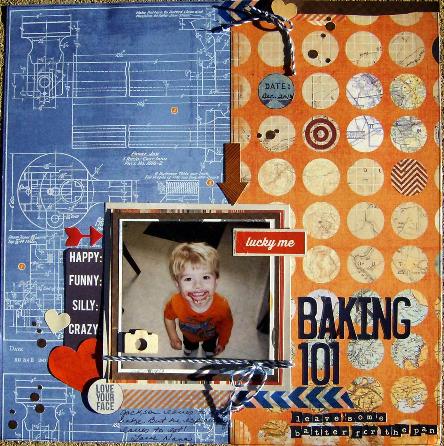
Sometimes not a lot of words are necessary to accurately convey the feeling of a page.
There are other photos of my two youngest grandies "helping" their mommy with some baking. But This one photo...
Well, here it is.
And my brain immediately went to, "How much batter was left for the pan, honey?" Hence the title and subtitle.
The blue and orange papers came from Heidi Swapp's No Limits collection. Layering papers were scraps. Most of the stickers came from Amy Tangerine and Dear Lizzy sticker books. The silly, funny crazy piece is from a Heidi Swap ephemera pack, the little orange epoxy arrow was from a Heidi Swapp sticker set, and the "Love Your Face" is a little stamp from Michaels. Thanks to the tip from Allison (she is goodgriefyou on you tube), I picked up several of these little stamp sets at a whopping $1 each! Stamped it in navy blue and then punched it with an appropriately sized circle punch. Added a wood veneer camera, some navy and white bakers twine and some washi tape in a navy chevron and orange diagonal stripe. Repeated one of the layering papers, the washi, and the twine in the cluster at the top of the page.
Now the alphas used in the title--those are still from an old Little Yellow Bicycle set that I am just nursing along because I cannot find navy blue alphas. Why are navy blue sticker letters so hard to find? (Insert whining here---American Crafts, could you p.l.e.a.s.e. make some navy blue Thickers for us --without glitter?) The little letters in the subtitle are Tiny Type from Cosmo Cricket.
I punched some brown circles in a couple sizes and scattered those on the page in lieu of splatting paint or ink. Which made me think of an idea I saw on Lillith Eckel's blog a while back where she used a border punch from EK, I think it is called Swiss Cheese. She punched it once or twice and had a whole array of little circle confetti to scatter on her page. And I thought what a great idea! That is not a punch I have because when it came out as a border punch I thought, eh, not crazy about it. But using it to punch multi size confetti like circles is an awesome idea! Now I may have to think again about purchasing this punch. I just love blogs and you tube---you never can tell where a great idea is hiding!
That's it for now!
Cheryl
Sometimes not a lot of words are necessary to accurately convey the feeling of a page.
There are other photos of my two youngest grandies "helping" their mommy with some baking. But This one photo...
Well, here it is.
And my brain immediately went to, "How much batter was left for the pan, honey?" Hence the title and subtitle.
The blue and orange papers came from Heidi Swapp's No Limits collection. Layering papers were scraps. Most of the stickers came from Amy Tangerine and Dear Lizzy sticker books. The silly, funny crazy piece is from a Heidi Swap ephemera pack, the little orange epoxy arrow was from a Heidi Swapp sticker set, and the "Love Your Face" is a little stamp from Michaels. Thanks to the tip from Allison (she is goodgriefyou on you tube), I picked up several of these little stamp sets at a whopping $1 each! Stamped it in navy blue and then punched it with an appropriately sized circle punch. Added a wood veneer camera, some navy and white bakers twine and some washi tape in a navy chevron and orange diagonal stripe. Repeated one of the layering papers, the washi, and the twine in the cluster at the top of the page.
Now the alphas used in the title--those are still from an old Little Yellow Bicycle set that I am just nursing along because I cannot find navy blue alphas. Why are navy blue sticker letters so hard to find? (Insert whining here---American Crafts, could you p.l.e.a.s.e. make some navy blue Thickers for us --without glitter?) The little letters in the subtitle are Tiny Type from Cosmo Cricket.
I punched some brown circles in a couple sizes and scattered those on the page in lieu of splatting paint or ink. Which made me think of an idea I saw on Lillith Eckel's blog a while back where she used a border punch from EK, I think it is called Swiss Cheese. She punched it once or twice and had a whole array of little circle confetti to scatter on her page. And I thought what a great idea! That is not a punch I have because when it came out as a border punch I thought, eh, not crazy about it. But using it to punch multi size confetti like circles is an awesome idea! Now I may have to think again about purchasing this punch. I just love blogs and you tube---you never can tell where a great idea is hiding!
That's it for now!
Cheryl
Monday, August 18, 2014
Our boy Jacob moves into his college dorm next week. He was actually home yesterday when we were out at Kim's for dinner, since they had all been at a benefit all day for a friend of his that had been in a very serious motorcycle accident and it struck me again that how grown up he is.
So today's page (page-s) just highlight the changes between freshmen year of high school to graduation day...
They were just skinny, gawky boys here at their very first high school function (homecoming dance, freshmen year). Jacob cracked up over the page---and even commented , "Look how young we looked." Then he whipped out his phone, snapped a pic of the page and sent it to his friend (in the photo). Seemed they especially liked the "studly" part...
Most of the papers I used are super old---the pale blue alpha print and the multi colored strip with the masculine phrases were a lighter text weight and they had a pearlized finish to them. I had kept them for years, cuz I just loved the pattern, the colors and that pearl-y finish. So glad they finally found a home on a page. I still have a bit of each (I printed a couple of these photos, since Nana here wants one in her own album!).
Layered the photo with gold textured paper and vellum, added a bit of metallic washi tape, some paper and chipboard banners and epoxy dots and stars (along with some stamped stars). Then drew in some sketchy lines with a blue pen, not quite a border, but kind of.
The title letters came from a Cloud 9 pack and my very favorite set of Thickers--an Amy Tangerine set that is a pale gray with an off-white grid pattern on them. (I so hope they re-release these or come up with something very similar, cuz I just love this alpha set.)
And this is our Jacob on graduation day before he donned his cap and gown. What a difference four years makes.
This page was done with two partial sheets--one was from DCWV (the tapestry looking one) and the other is the backside of a Basic Grey travel related paper (I just wanted that deep turquoise color). The layering papers are from Prima and Creative Imaginations. (These were clipped together when I cleaned out the last of the scrap bin and made up my own mini page kits.) I outlined the layering pieces and bent the edges up, made a little tear here and there. Then added a few punched butterflies, tucked in a scalloped brown cardstock border, plus a piece of ivory lace. Used a piece of sequin waste as a stencil and applied some beige pearl-y ink. The alpha set is a wood grain print Thickers set, that I kind of snipped and overlapped so the letters would be more joined together.
The journaling piece was a punch out from a My Mind's Eye Christmas sheet, but the color was right, the size was right--and there you go. Also stained the wood veneer chevron pieces and the little camera to balance out the dark brown and hand cut the large brown "photo corner" pieces at the right side of the page. The "hello there" piece was from Basic Grey, but that was it for adding in ephemera, tabs or words. Still wanted a touch more dark brown though, so I splattered some brown paint and added the coppery-brown pearls. Thought I better quit here, before it got over-worked.
My goodness he really is ... all grown up.
Cheryl
So today's page (page-s) just highlight the changes between freshmen year of high school to graduation day...
They were just skinny, gawky boys here at their very first high school function (homecoming dance, freshmen year). Jacob cracked up over the page---and even commented , "Look how young we looked." Then he whipped out his phone, snapped a pic of the page and sent it to his friend (in the photo). Seemed they especially liked the "studly" part...
Most of the papers I used are super old---the pale blue alpha print and the multi colored strip with the masculine phrases were a lighter text weight and they had a pearlized finish to them. I had kept them for years, cuz I just loved the pattern, the colors and that pearl-y finish. So glad they finally found a home on a page. I still have a bit of each (I printed a couple of these photos, since Nana here wants one in her own album!).
Layered the photo with gold textured paper and vellum, added a bit of metallic washi tape, some paper and chipboard banners and epoxy dots and stars (along with some stamped stars). Then drew in some sketchy lines with a blue pen, not quite a border, but kind of.
The title letters came from a Cloud 9 pack and my very favorite set of Thickers--an Amy Tangerine set that is a pale gray with an off-white grid pattern on them. (I so hope they re-release these or come up with something very similar, cuz I just love this alpha set.)
And this is our Jacob on graduation day before he donned his cap and gown. What a difference four years makes.
This page was done with two partial sheets--one was from DCWV (the tapestry looking one) and the other is the backside of a Basic Grey travel related paper (I just wanted that deep turquoise color). The layering papers are from Prima and Creative Imaginations. (These were clipped together when I cleaned out the last of the scrap bin and made up my own mini page kits.) I outlined the layering pieces and bent the edges up, made a little tear here and there. Then added a few punched butterflies, tucked in a scalloped brown cardstock border, plus a piece of ivory lace. Used a piece of sequin waste as a stencil and applied some beige pearl-y ink. The alpha set is a wood grain print Thickers set, that I kind of snipped and overlapped so the letters would be more joined together.
The journaling piece was a punch out from a My Mind's Eye Christmas sheet, but the color was right, the size was right--and there you go. Also stained the wood veneer chevron pieces and the little camera to balance out the dark brown and hand cut the large brown "photo corner" pieces at the right side of the page. The "hello there" piece was from Basic Grey, but that was it for adding in ephemera, tabs or words. Still wanted a touch more dark brown though, so I splattered some brown paint and added the coppery-brown pearls. Thought I better quit here, before it got over-worked.
My goodness he really is ... all grown up.
Cheryl
Friday, August 15, 2014
Page titles... I was talking the other day about how they can convey the feeling of a moment and I think I captured the feeling of this moment!
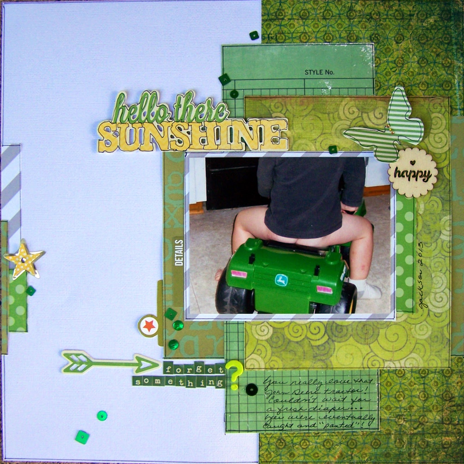
Jackson loves his John Deere tractor riding toy. He also likes to escape without his pants... (He's a bit better now that potty training is well under way...really loves his Jake and the Pirates underpants!)
But this was a moment in time...that just makes me crack up every time I see the page. So, if the title and your finished page make you or the viewer "feel" the moment, then I think what you are doing as the family historian, the scrapbooker, the documenter, is so worth the time we all put into this hobby.
I was still working from the scrap bin when I created this page, so I pulled a whole lotta green patterned paper to pick up the John Deere tractor color and a little bit of gray playing off the color of Jackson's shirt. Once the papers were selected, I started layering them under the photo and when I was happy with the layers, outlined the pieces and glued them together.
The title, the butterfly (both also outlined) and the arrow are from a Jillibean Soup ephemera pack, and the subtitle is made up of Tiny Type letters from Cosmo Cricket. I didn't have a question mark in the Tiny Type pack, so I chose one from a lime green Thickers set and just arranged the words so the question mark lined up with the two lines of type stickers. The file tabs are from Simple Stories, the "happy" wood veneer is from the Michaels $1 bins and the star sticker is from Recollections (I don't usually care for much in the Recollections stickers, but I did like these layered stars--bought several packs of them--on clearance for $.99 yeah!) Last, I sprinkled on some green sequins from my stash.
What are you doing this weekend? We are getting right down to the wire getting this house ready for sale, so I will be cleaning woodwork (ugh). But I will steal away to my scrap room at some point for some R&R and a sanity check!
Happy Friday!
Cheryl
Jackson loves his John Deere tractor riding toy. He also likes to escape without his pants... (He's a bit better now that potty training is well under way...really loves his Jake and the Pirates underpants!)
But this was a moment in time...that just makes me crack up every time I see the page. So, if the title and your finished page make you or the viewer "feel" the moment, then I think what you are doing as the family historian, the scrapbooker, the documenter, is so worth the time we all put into this hobby.
I was still working from the scrap bin when I created this page, so I pulled a whole lotta green patterned paper to pick up the John Deere tractor color and a little bit of gray playing off the color of Jackson's shirt. Once the papers were selected, I started layering them under the photo and when I was happy with the layers, outlined the pieces and glued them together.
The title, the butterfly (both also outlined) and the arrow are from a Jillibean Soup ephemera pack, and the subtitle is made up of Tiny Type letters from Cosmo Cricket. I didn't have a question mark in the Tiny Type pack, so I chose one from a lime green Thickers set and just arranged the words so the question mark lined up with the two lines of type stickers. The file tabs are from Simple Stories, the "happy" wood veneer is from the Michaels $1 bins and the star sticker is from Recollections (I don't usually care for much in the Recollections stickers, but I did like these layered stars--bought several packs of them--on clearance for $.99 yeah!) Last, I sprinkled on some green sequins from my stash.
What are you doing this weekend? We are getting right down to the wire getting this house ready for sale, so I will be cleaning woodwork (ugh). But I will steal away to my scrap room at some point for some R&R and a sanity check!
Happy Friday!
Cheryl
Wednesday, August 13, 2014
Page titles can be a pain, hard to think of something that fits appropriately on the page, uses the size and color of letters you have available, something catchy? something profound? Sometimes a title is just a title, an introduction to the page, to the photo(s). But sometimes the title can be more, I think. Sometimes the title can be part of the embellishment. Sometimes it is a rather small part of the page, just a token to evoke a memory or a feeling.
On this page I wanted the title to be a message to Bella -- I guess it counts as being the journaling itself. And I had a lot of these purple and hot pink glitter letters I felt I could use (those not being colors I reach for an awful lot).
I did include a little bit of handwritten journaling. But the primary message to my granddaughter is the title.
I used a piece of Lily Bee paper from the Emma's Closet line (several years old) and a leftover piece of the old, old Bohemia collection from My Mind's Eye, a piece of paper from one of the 8-1/2x11 Michael's sale packs, and Thickers letter stickers. Border punched pieces are scraps and the hearts are fussy cut from another of the 8-1/2x 11 sale pack papers (I can never remember which paper is from the Dear Lizzy or the Maggie Holmes packs cuz there are no branding strips on them). Stickers are from both Amy Tangerine and Dear Lizzy sticker books. I did a little outlining and scattered some sequins on the page, thought about splattering a bit of ink, but decided against it. Done!
A friend asked me where I came up with my titles from and I really didn't have a good answer for her... I had asked Bella to make some funny faces for me and she was only too happy to oblige. The message (title) came to me when I was looking at the photos later and wondering how long her being happy to oblige me making faces and posing for the camera would last before she gets "too grown up".
Well I'm off to work--got a late start time this morning, which only means a lot more to do in a shorter period of time. I'm focusing on being able to get into my scrap room tonight to keep me going today!
Cheryl
On this page I wanted the title to be a message to Bella -- I guess it counts as being the journaling itself. And I had a lot of these purple and hot pink glitter letters I felt I could use (those not being colors I reach for an awful lot).
I did include a little bit of handwritten journaling. But the primary message to my granddaughter is the title.
I used a piece of Lily Bee paper from the Emma's Closet line (several years old) and a leftover piece of the old, old Bohemia collection from My Mind's Eye, a piece of paper from one of the 8-1/2x11 Michael's sale packs, and Thickers letter stickers. Border punched pieces are scraps and the hearts are fussy cut from another of the 8-1/2x 11 sale pack papers (I can never remember which paper is from the Dear Lizzy or the Maggie Holmes packs cuz there are no branding strips on them). Stickers are from both Amy Tangerine and Dear Lizzy sticker books. I did a little outlining and scattered some sequins on the page, thought about splattering a bit of ink, but decided against it. Done!
A friend asked me where I came up with my titles from and I really didn't have a good answer for her... I had asked Bella to make some funny faces for me and she was only too happy to oblige. The message (title) came to me when I was looking at the photos later and wondering how long her being happy to oblige me making faces and posing for the camera would last before she gets "too grown up".
Well I'm off to work--got a late start time this morning, which only means a lot more to do in a shorter period of time. I'm focusing on being able to get into my scrap room tonight to keep me going today!
Cheryl
Monday, August 11, 2014
More stitched embellishments!
I am so enamored with already stitched embellishments so of course when I found a couple of packs of these stacked and stitched hearts from American Crafts at Tuesday Morning I had to snatch them right up! I thought they were a perfect addition to this layout.
I found this Mother's Day card from 2012 in with a stack of other cards I have kept over the years and decided to scrapbook the card even though I have this photo all by itself. The card has my daughter's scratchy scribbly printing on it (which I love) so I thought I'd scrapbook the card itself. The photo is in a frame in my living room since it is my all time favorite of my grandies.
Papers are from Echo Park, Maggie Holmes, and Prima. The large scalloped pieces are from Bazzill (just wacked them off a partial sheet I had and used the remaining piece to mat the photo card). The bow tie is from Basic Grey (I added a little punched piece in the center, and punched a few more little hearts from brown cardstock as well.) Tucked a doily under the matted photo, then added sticker words and ampersand from Dear Lizzy and Amy Tangerine sticker books. No paint, no mist, although I did do some outlining. But it seemed done, so I stopped!
Spent Sunday with the grandies. They helped frost -- the bars -- and themselves! The best kind of Sunday afternoon.
I will be on the lookout for more stitched embellishments (on the cheap of course) that I can incorporate on my layouts until I can get hold of a sewing machine again (soon, not going to seriously consider acquiring one until after we move).
have a good day
Cheryl
I am so enamored with already stitched embellishments so of course when I found a couple of packs of these stacked and stitched hearts from American Crafts at Tuesday Morning I had to snatch them right up! I thought they were a perfect addition to this layout.
I found this Mother's Day card from 2012 in with a stack of other cards I have kept over the years and decided to scrapbook the card even though I have this photo all by itself. The card has my daughter's scratchy scribbly printing on it (which I love) so I thought I'd scrapbook the card itself. The photo is in a frame in my living room since it is my all time favorite of my grandies.
Papers are from Echo Park, Maggie Holmes, and Prima. The large scalloped pieces are from Bazzill (just wacked them off a partial sheet I had and used the remaining piece to mat the photo card). The bow tie is from Basic Grey (I added a little punched piece in the center, and punched a few more little hearts from brown cardstock as well.) Tucked a doily under the matted photo, then added sticker words and ampersand from Dear Lizzy and Amy Tangerine sticker books. No paint, no mist, although I did do some outlining. But it seemed done, so I stopped!
Spent Sunday with the grandies. They helped frost -- the bars -- and themselves! The best kind of Sunday afternoon.
I will be on the lookout for more stitched embellishments (on the cheap of course) that I can incorporate on my layouts until I can get hold of a sewing machine again (soon, not going to seriously consider acquiring one until after we move).
have a good day
Cheryl
Saturday, August 9, 2014
Why do I not seem to like themed papers? I dunno. I don't have a lot of Christmas paper, or Halloween, or birthday, or zoo or travel papers (well, travel, we don't really go anywhere). I have a little bit of each, but not much.
Anyway, I had zoo pictures that I wanted to scrap, so I dig out the few pieces of zoo paper I had and started cutting it into strips . This is super old Reminisce paper. But I paired it up with some new feathers (got 'em at Michaels--used a coupon; actually kind of impressed that they had theses).
It's not a hugely embellished layout, but I like the simplicity and I especially like the feathers and the wood veneer butterflies against the black background paper.
I did a secondary page to include the rest of the photos I had. It almost looks like a pocket page--which (If I had any) would have been a good place to use one. But, again, I'm liking the simple and straight lines and the pop that the feather and veneer butterfly gives it.
I also used an Amy Tangerine Thickers set for the title. I've had these for awhile and they just never seemed to fit or coordinate with what I was working on, but I gotta say I do love them against the black on this page! I did the outlining and journaling with a white gel pen and said done!
I'm still not ready to go out and buy up a whole big bunch of themed papers--but I am going to start to keep an eye out for a few more themed papers to use.
Have a great weekend!
cheryl
Anyway, I had zoo pictures that I wanted to scrap, so I dig out the few pieces of zoo paper I had and started cutting it into strips . This is super old Reminisce paper. But I paired it up with some new feathers (got 'em at Michaels--used a coupon; actually kind of impressed that they had theses).
It's not a hugely embellished layout, but I like the simplicity and I especially like the feathers and the wood veneer butterflies against the black background paper.
I did a secondary page to include the rest of the photos I had. It almost looks like a pocket page--which (If I had any) would have been a good place to use one. But, again, I'm liking the simple and straight lines and the pop that the feather and veneer butterfly gives it.
I also used an Amy Tangerine Thickers set for the title. I've had these for awhile and they just never seemed to fit or coordinate with what I was working on, but I gotta say I do love them against the black on this page! I did the outlining and journaling with a white gel pen and said done!
I'm still not ready to go out and buy up a whole big bunch of themed papers--but I am going to start to keep an eye out for a few more themed papers to use.
Have a great weekend!
cheryl
Friday, August 8, 2014
My creative space Part 2.
Since we are downsizing, I have been brutal about purging... and I took these pictures as much for me to document my little room for myself as to blog about it. So here we go...
This is my desk, which is really just a hollow core door on top of two stacks of Crop-In-Style cubes.
Under the desk is a plain brown grocery bag inside a white plastic trash bag--I'm a simple person---it works. On the other side on the floor sits my spray box and some page kits from Cropper Hopper that are loaded and ready to scrap. Next to the desk on the floor is my rolling tote, also pretty much all packed and ready to go.
The white three-tiered dish holds a lot of little left-overs, my one and only date roller stamp, odd things. The clear glass bowl (came from Goodwill for $1.49) and holds some of the smaller stamps that have been used recently on layouts, a couple of gift tags, some paper clips, sometimes a stray ink pad. The white milk glass bowl holds some buttons, a couple of clothes pins, some odd punched pieces or die cuts that didn't make it onto a layout, some wood veneer pieces; mostly these dishes help me keep the desk top clear while I am working, as I just put the leftovers in them or toss the stamps in them, until I am at a point where I start putting them away...they are never all the way empty though.
I used to use a lot of plastic bead containers, and boxes and had them in drawers... and never went and pulled them out to use the items they held. I like having things out and within reach, but I am also just enough of a neat freak that I like things contained.
On the left side of my desk is my Cricut (yep, still just got the original machine---when it kicks the bucket, I will probably look at a Cameo, but the old Cricut is still working for me for now).
The drawers under my desk (or supporting my desk--whatever) have from top right down, ink pads and reinkers, ink applicators -- these take up two drawers, the third drawer has my watercolors, mists, water bottle, chalks, baby wipes, stamp cleaner. The bottom drawer has punches in it.
On the left side, the top drawer is for pages in progress, and photos I am currently working with. Second drawer has extra sticky pads for the Cricut, my Gypsy, a Cricut tool kit and cords. Third drawer down is chipboard alphas (not Thickers---these are all in my rolling tote until I find the right sized container for them). The bottom drawer is punches again.
On the wall to my left are a couple of wall shelves and several more Crop-In-Style cubes.
On the shelves, I keep my Cricut cartridges--don't have a lot, never cared for a lot of the cutesy-patootsie stuff they came out with. Just liked some of the basic fonts and some of the flourishes (although I did pop for a Joys of the Season cartridge for Christmas stuff--do still love that one). Then my washi tapes are in a wire egg basket, bakers twine in the aluminum pan, and Stickles in the milk glass bowl. I got all of these containers from Goodwill over several visits. Just had to keep looking--nothing cost over $2.
Right above this on the top shelf is another milk glass dish with my Tombow markers, a divided kind of container that hold binder clips, paper clips, and other office-y sundries, and a candy dish with buttons in it. Next to this are several rectangular tin boxes with watch maker's round tins inside--those hold brads, lots of brads...
Then we have several jars with cut ribbon pieces in them, the first two wire baskets hold flowers and the third holds small dies for my Big Shot. Next to that basket is a stack of long dies and then directly above are the rest of my Big Shot dies and my old tick tock alarm clock. Middle of the top shelf are several empty frames and a photo framed of my three grandchildren.
The cubes and drawers below hold card blanks and envelopes, file drawer holds stencils, keepsakes like newspaper articles, and the original typed articles that I had published, greeting cards from my family to me... stuff like that. The closest set of drawers to my desk holds embellishments, refills for my tape runner(s), craft blades, staples for the Tiny Attacher, a label maker and Dymo tapes. One drawer is designated just for Tim Holtz Idealogy stuff (one day I will make 12 tags of Christmas--I know he isn't doing that anymore--I don't care. I still want to make some of the old ones-- one day), some jewelry making stuff (that's another one day I will make a "junque" bracelet kind of thing), an open cube on this side holds Cropper Hopper paper storage things and that's for cardstock. The spinning thing holds clear stamps and some embellishment packs that didn't fit in the drawer.
Whew... almost done.
The closet-- it holds stamps, finished pages ready to put into albums, photo boxes, a couple of totes and magazines I want to hold onto, some specialty paints and glazes that don't get used too often.
And last my paper rack... I do love my paper rack. Love having things out to see, yet orderly (I must have a weird right vs. left brain thing going on). Before I started this purging of supplies, this thing was full top to bottom. Not so much now. But you know what, I'm still scrapping! And I can find things!
So that's my room. And yeah, I think I will scrap some of these photos.
Cheryl
Since we are downsizing, I have been brutal about purging... and I took these pictures as much for me to document my little room for myself as to blog about it. So here we go...
This is my desk, which is really just a hollow core door on top of two stacks of Crop-In-Style cubes.
Under the desk is a plain brown grocery bag inside a white plastic trash bag--I'm a simple person---it works. On the other side on the floor sits my spray box and some page kits from Cropper Hopper that are loaded and ready to scrap. Next to the desk on the floor is my rolling tote, also pretty much all packed and ready to go.
The white three-tiered dish holds a lot of little left-overs, my one and only date roller stamp, odd things. The clear glass bowl (came from Goodwill for $1.49) and holds some of the smaller stamps that have been used recently on layouts, a couple of gift tags, some paper clips, sometimes a stray ink pad. The white milk glass bowl holds some buttons, a couple of clothes pins, some odd punched pieces or die cuts that didn't make it onto a layout, some wood veneer pieces; mostly these dishes help me keep the desk top clear while I am working, as I just put the leftovers in them or toss the stamps in them, until I am at a point where I start putting them away...they are never all the way empty though.
I used to use a lot of plastic bead containers, and boxes and had them in drawers... and never went and pulled them out to use the items they held. I like having things out and within reach, but I am also just enough of a neat freak that I like things contained.
On the left side of my desk is my Cricut (yep, still just got the original machine---when it kicks the bucket, I will probably look at a Cameo, but the old Cricut is still working for me for now).
The drawers under my desk (or supporting my desk--whatever) have from top right down, ink pads and reinkers, ink applicators -- these take up two drawers, the third drawer has my watercolors, mists, water bottle, chalks, baby wipes, stamp cleaner. The bottom drawer has punches in it.
On the left side, the top drawer is for pages in progress, and photos I am currently working with. Second drawer has extra sticky pads for the Cricut, my Gypsy, a Cricut tool kit and cords. Third drawer down is chipboard alphas (not Thickers---these are all in my rolling tote until I find the right sized container for them). The bottom drawer is punches again.
On the wall to my left are a couple of wall shelves and several more Crop-In-Style cubes.
On the shelves, I keep my Cricut cartridges--don't have a lot, never cared for a lot of the cutesy-patootsie stuff they came out with. Just liked some of the basic fonts and some of the flourishes (although I did pop for a Joys of the Season cartridge for Christmas stuff--do still love that one). Then my washi tapes are in a wire egg basket, bakers twine in the aluminum pan, and Stickles in the milk glass bowl. I got all of these containers from Goodwill over several visits. Just had to keep looking--nothing cost over $2.
Right above this on the top shelf is another milk glass dish with my Tombow markers, a divided kind of container that hold binder clips, paper clips, and other office-y sundries, and a candy dish with buttons in it. Next to this are several rectangular tin boxes with watch maker's round tins inside--those hold brads, lots of brads...
Then we have several jars with cut ribbon pieces in them, the first two wire baskets hold flowers and the third holds small dies for my Big Shot. Next to that basket is a stack of long dies and then directly above are the rest of my Big Shot dies and my old tick tock alarm clock. Middle of the top shelf are several empty frames and a photo framed of my three grandchildren.
The cubes and drawers below hold card blanks and envelopes, file drawer holds stencils, keepsakes like newspaper articles, and the original typed articles that I had published, greeting cards from my family to me... stuff like that. The closest set of drawers to my desk holds embellishments, refills for my tape runner(s), craft blades, staples for the Tiny Attacher, a label maker and Dymo tapes. One drawer is designated just for Tim Holtz Idealogy stuff (one day I will make 12 tags of Christmas--I know he isn't doing that anymore--I don't care. I still want to make some of the old ones-- one day), some jewelry making stuff (that's another one day I will make a "junque" bracelet kind of thing), an open cube on this side holds Cropper Hopper paper storage things and that's for cardstock. The spinning thing holds clear stamps and some embellishment packs that didn't fit in the drawer.
Whew... almost done.
The closet-- it holds stamps, finished pages ready to put into albums, photo boxes, a couple of totes and magazines I want to hold onto, some specialty paints and glazes that don't get used too often.
And last my paper rack... I do love my paper rack. Love having things out to see, yet orderly (I must have a weird right vs. left brain thing going on). Before I started this purging of supplies, this thing was full top to bottom. Not so much now. But you know what, I'm still scrapping! And I can find things!
So that's my room. And yeah, I think I will scrap some of these photos.
Cheryl
Thursday, August 7, 2014
My creative space, Part 1.
It is my happy place. My escape. It is the place where I can put away the other cares of the world and concentrate on those things in my world which are good and satisfying and fulfilling. I mentioned a few days ago that I would post some pictures of the room, so let's go on a little tour.
This is what you see just as you enter the room.
On the right side is a bank of white Crop-in-Style Cubes, two high.
Hanging above the cubes is a framed bulletin board--a mood board of sorts. Really it's just got stuff on it I like. I used a thrift store frame and white washed it and just duct taped a cheapo bulletin board to the opening. Covered the bulletin board with several sheets of scrapbook paper and smeared some gesso across here and there. A Making Memories organizer sits over here instead of on my desk, because it contains things I do not use each and every time I scrap, like my gelatos, watercolor brushes, Teflon sheet, the few copic markers I have, etc. Stuff I want out, so I will use them...just doesn't need to be right smack dab in front of me. Then there is wire card display with some favorite cards (I try to make multiples, just in case I need a card in a hurry). The glass dish has thumbtacks and stick pins in it. A little TV/VCR unit sits at one end (I like to play old movies sometimes when I scrap). The little silver dish by the TV has a couple of old (antique-y) pens and nibs, an old ruler, again just stuff I like. On the curved shelf unit sits a bunch of mini books from swaps and a couple of mini albums from classes I taught, and even an altered book or two. The three drawer units and the file drawers have actually all been cleaned out and sit empty right now waiting for a new home. In one open cube is an old office In (or Out?) basket with rolls of ribbon in it. Next to that are my sets of watercolor pencils, colored pencils and pastels. And in the other two open cubes (below where you can't see in this shot) are albums and a wicker basket to hold my oldie-moldie movies.
Next view is straight ahead as you are coming into the room.
One of the two little shelves hold class samples from when I taught at the public art museum, some published project pieces, and a few tags I was gifted with from some artists I was fortunate to know through doing sample work for Stampington & Co. The other shelf holds a bunch of what we used to call 4x4 books--I had participated in a bunch of those collaborative projects in years past.
Next to the display shelves is a frame displaying my current favorite scrapbook page.
I painted a thrift store frame white and distressed it a bit. Then there is a tack stuck in the middle of the frame, in the back. Next, I took a cork tile, peeled the sticky backing off just enough to tuck the ends of a piece of cording in and then the cord hangs off the tack in the back of the frame. The clothespins hold the page on top of the cork tile. I saw a post over at the Crate Paper blog about decorating clothespins--I'm not sure what they were doing with theirs...but I am definitely gonna give this a go for this display!
There is a lotta, lotta white in my room. White walls, white cubes, white shelves, white frames, white sheers. I figure there is enough color and pattern going on in my supplies, project samples, keepsakes, pages and cards. I did add a splash of color in the window topper. Kind of like a scrapbook page, I wanted something to lead the eye back up. More on that later.
This brings us to the end of Part 1. Next up will be my desk and the storage units where I actually do keep stuff, fancy that!
Cheryl
It is my happy place. My escape. It is the place where I can put away the other cares of the world and concentrate on those things in my world which are good and satisfying and fulfilling. I mentioned a few days ago that I would post some pictures of the room, so let's go on a little tour.
This is what you see just as you enter the room.
On the right side is a bank of white Crop-in-Style Cubes, two high.
Hanging above the cubes is a framed bulletin board--a mood board of sorts. Really it's just got stuff on it I like. I used a thrift store frame and white washed it and just duct taped a cheapo bulletin board to the opening. Covered the bulletin board with several sheets of scrapbook paper and smeared some gesso across here and there. A Making Memories organizer sits over here instead of on my desk, because it contains things I do not use each and every time I scrap, like my gelatos, watercolor brushes, Teflon sheet, the few copic markers I have, etc. Stuff I want out, so I will use them...just doesn't need to be right smack dab in front of me. Then there is wire card display with some favorite cards (I try to make multiples, just in case I need a card in a hurry). The glass dish has thumbtacks and stick pins in it. A little TV/VCR unit sits at one end (I like to play old movies sometimes when I scrap). The little silver dish by the TV has a couple of old (antique-y) pens and nibs, an old ruler, again just stuff I like. On the curved shelf unit sits a bunch of mini books from swaps and a couple of mini albums from classes I taught, and even an altered book or two. The three drawer units and the file drawers have actually all been cleaned out and sit empty right now waiting for a new home. In one open cube is an old office In (or Out?) basket with rolls of ribbon in it. Next to that are my sets of watercolor pencils, colored pencils and pastels. And in the other two open cubes (below where you can't see in this shot) are albums and a wicker basket to hold my oldie-moldie movies.
Next view is straight ahead as you are coming into the room.
One of the two little shelves hold class samples from when I taught at the public art museum, some published project pieces, and a few tags I was gifted with from some artists I was fortunate to know through doing sample work for Stampington & Co. The other shelf holds a bunch of what we used to call 4x4 books--I had participated in a bunch of those collaborative projects in years past.
Next to the display shelves is a frame displaying my current favorite scrapbook page.
I painted a thrift store frame white and distressed it a bit. Then there is a tack stuck in the middle of the frame, in the back. Next, I took a cork tile, peeled the sticky backing off just enough to tuck the ends of a piece of cording in and then the cord hangs off the tack in the back of the frame. The clothespins hold the page on top of the cork tile. I saw a post over at the Crate Paper blog about decorating clothespins--I'm not sure what they were doing with theirs...but I am definitely gonna give this a go for this display!
There is a lotta, lotta white in my room. White walls, white cubes, white shelves, white frames, white sheers. I figure there is enough color and pattern going on in my supplies, project samples, keepsakes, pages and cards. I did add a splash of color in the window topper. Kind of like a scrapbook page, I wanted something to lead the eye back up. More on that later.
This brings us to the end of Part 1. Next up will be my desk and the storage units where I actually do keep stuff, fancy that!
Cheryl
Subscribe to:
Posts (Atom)


.png)