Showing posts with label titles. Show all posts

Friday, October 21, 2016

Crashing My Stash - a Challenge Page!

There are challenges on various website and FB pages and sometimes it's a good thing to play along to get you to try something new, to use some of your stash, to get over a scrapper's block.

But sometimes, it's just plain old fun.  On one of my favorite FB pages, Mercy Tiara's 27 day challenge page, another gal added yet another challenge by way of a tic tac toe board, and you needed to choose a line and go for it.


I chose the line which included the use of vellum, two photos, and stencils.  After looking about at the material I had at hand (items that were already out and right at hand--I've always said I am at heart a lazy scrapper!), it turned out I was following the same line that our fearless leader, Tracy used, although I didn't set out to use the same one...  honest, I didn't!

The  background paper was one that I had stenciled quite some time ago for a different page and then never used; it was laying on the floor!  The vellum scraps were laying out, left from a page I put together a week or so ago!  And these two photos didn't seem to fit on any other paper that was within easy reach!  So, that's how this decision was made.  Nothing but pure laziness! 

The stencil pattern had been applied using two different stencils and a couple of different colors of chalk inks.  I trimmed it down some to to clean up the edges and then sewed the two pieces of vellum into place and continued sewing around the perimeter of the page.

I did the gold splatters next, since I wanted those to dry before anything else went onto the page (I've smeared gold paint or ink on too many occasions---not today!).


While the gold ink was drying I went to work layering paper scraps, tags, and journaling cards under the photos.  Once I placed my photo block in place, I could see where to add in extra pieces of paper to fill it out and also tucked in a couple of stickers from my stash. 


Next was to create a line or base for my title to sit on, so out came some washi tape, one of which I repeated in two other areas. 

  
The other additions to the page were some Raindots.  Remember those---they came out way before enamel dots came into play...and yes I still had a few...had being the operative word.  They're gone now!!!  Ya-hoo!

It makes me ridiculously happy to fulfill a challenge, use up some stash, as well as a piece of paper I had previously stenciled and not used, and get rid of old product (er, I mean use it up!).


Try a challenge to get you moving, use up some stash, finish off partial packs of older product...   See if this doesn't make you ridiculously happy!

in other words, crash your stash!

Cheryl 


Tuesday, October 11, 2016

Choosing a Kit Club - New Club; New Look

Since I procrastinated too long to be able to order my second Gossamer Blue kit, I moved ahead to some Citrus Twist to play with.  I need to order one more kit from Gossamer Blue and now one more from Citrus Twist (cuz, I said I'd work with two kits from each club I listed....) 


On first appraisal of the contents of my Citrus Twist September kit; it's pretty, the product selection seems to coordinate well, they are a bit embellishment heavy, six patterned papers and two card stock choices, one alphabet.

Since the kit seemed embellishment rich, I ripped right into the various packages and applied a bunch of things on this layout.  This is not my usual motis apparendi!!!!  Don't get me wrong, I love embellishments as much as the next scrapper, I just usually go for smaller clusters or one grand statement piece with a few small supporting pieces.


But here as you can see, I just went for it and lined a bunch of elements up.  I think the reason it still fits with my desire for some structure, is that everything is contained on the horizontal band of pink patterned paper.  I cut the pink pattern to stretch across one of the card stock pieces, the vanilla one (seemed like the word vanilla was more appropriate given the sweet goodness of the candies in my photo!) and this preserved the remainder of the pink piece to use on another page.   


For the title I used one of the (many--since we got en entire pack!) wood veneer pieces and I remembered that I had a Thickers set in this kind of peachy-pinky hue!  Yeah!

 
I felt that I needed to carry a bit of interest up to the top and back down at the bottom of the page, so I added a cut doily and a couple more small embellishment pieces.  Last, was to sprinkle on some pretty Heidi Swapp gold mist and then drool over the chocolates in the photo!!!!


This kit is proving fun to work with...looking forward to seeing how it all plays out!


happy scrappin'!
Cheryl

Friday, October 7, 2016

Choosing a Kit Club Research Updates! --or-- Which Clubs Give You What Goodies!

So today will be a brief update on what I have perceived thus far in my "research"!  And it did kind of surprise me as to what made me "happiest" with a kit. 

The page here is my second "boy" page made from the September Scrapbook Circle kit.  There were a lot of florals and pastels in the kit, so at very first glance it struck me as a more feminine kit.

But, as I began to put photos next to various papers, it became clear that I could easily translate the stronger navy blue colors into a boy page.  Which is exactly what I did!  The floral piece under the photos is from the center of that paper I used on a previous layout (Training Day). 


But here's the update on my kit club research... as applies to the style and content type of the clubs I've played with so far. 

Scraptastic                    (out of the running, since they no longer offer scrapbook kits)

Studio Calico:        (worked with two kits)
Alphas:                   No Thickers, thin, thin thin stickers (hard to see to peel off the backing sheet), and
                                a larger set (I think they are trying to be "original and "artsy") but difficult to use

Embellies:              Not feminine or masculine, but again I found some things difficult to translate
                                to my subject matter, and again I found them to be pretty slight in what
                                was included in a kit (not a lot to choose from)  chipboard words, cut a parts,
                                roll of washi (usually highly specific to the kit), acetate pieces, stamp set

                               No enamel dots, no flair, no stencils,

Paper:                     6 printed sheets, three sheets card stock (eh, I can live without more card stock) 


Scrapbook Circle:
  (worked with two kits)
Alphas:                   One puffy set, or a chipboard set, or Thickers and one smaller sticker
                                style alpha

Embellies:               full pack or two of ephemera, partial packs of chipboard or enamel shapes,
                                acrylic word(s), cut a parts, partial packs of decorative metal clips, tassels 

Paper:                     9 printed sheets (heavy on the printed paper!  fine by me!) 


Gossamer Blue:  (worked with one kit so far)
Alphas:                 One set puffy alphas or Thickers (or similar set)

Embellies:            enamel dots or shapes, sticker set, wood veneer pieces, flair, vellum tapes,
                             stamp set, stencil, metal clips, cut a parts, acrylic shapes, acrylic word(s) 

Paper:                   9-11 printed sheets! 

Citrus Twist:        (worked with one kit so far)
Alphas:                  one Thickers (or similar style)

Embellies:             enamel shapes, metal decorative paper clips, cut a parts, full set ephemera pack,
                              full set wood veneer pack, chipboard set, stamp set, acrylic words

Paper:                   6 sheets printed paper, plus two sheets cardstock

So, by comparison, I've found that Scrapbook Circle and Gossamer Blue are about even on embellishments included...but Gossamer Blue is paper heavy (which I like).   Citrus Twist is heavy on embellishment, a little slim on papers and only one set of alphas. Again...I stress, what I like is not gonna be necessarily what others are going to like to work with.  This is simply supposed to give you an overview of what I am receiving and what I like to work with. And while I like embellishments, I am, always have been, and probably always will be, a paper person first! 

OK, moving on to details on this page:

The photos were matted on plain white card stock and layered with a gray (scrap from my stash) and that diagonal green-blue stripe, with a strip of the navy/white stripe tucked in as kind of a base on which the photos sit. 

I gessoed and water-colored the white supporting card stock (something I am enjoying more and more!).  And after the water color was dry, I added splatters of navy (Heidi Swapp), medium blue (water color), aqua green (Studio Calico) and white (Studio Calico). 


Stapled a couple small strips of coordinating papers at the top and bottom of the page.  


And then added just a very few of the little banner stickers (included in the kit), as well as the title.  The navy blue alpha is from Pink Paislee (not included) and the aqua mini alpha is from the kit.


The blues picked up wonderfully with the color of Jackson's coat and the gold and aqua accents worked well with the background colors in the photo without highlighting them or overpowering anything.  

I've had a good time with this kit and am looking forward to more from Scrapbook Circle!  (Yep, I am going ahead and getting a third kit!!!) And, sadly due to my lack of internet at times, I again missed ordering Gossamer Blue before they sold out.  Harummmph!!  So, I'll probably go ahead with the second Citrus Twist kit now and then try Gossamer Blue again for November (sigh--I'm not good at waiting). 

hmmmm, I see on this page that I so could use the added texture sewing on page gives you.  Maybe instead of ordering a second kit from anyone, I order the mini sewing machine I've had my eye on! 

I've also noticed that MANY of my Jackson pages are of him.... eating...  I mean, that boy is serious about his food!!!

later,
Cheryl

Wednesday, October 5, 2016

Kit Clubs---A little Bit About Included Embellishments

This is a another one of those easy pages to assemble. I absolutely loved the background paper (from Pink Fresh Studio) that was included in my September Scrapbook Circle kit.  There was a nice mix of strong navy blue patterns and pretty pastels.  Here I used leftover strips cut from one of my previous pages (the Hello Cuties page)  and just laid these on the background paper to aid in directing your eyes to the photo. 


I added more of the black ink splatters.  There was some printed on the paper -- I just added the splatters at the bottom right corner for balance.  And, after layering up my photo, I did some outlining. 


What I really wanted to talk about was embellishments that are often included in kit clubs.  I've seen a lot of words and phrases and frequently I find the chosen words a bit over-used, almost common.  And I don't want my pages to be common.   Although many of the phrases are popular and I do  understand the thinking behind manufacturer's choice to produce them, I want my page titles a bit more specific, a bit more personal (and that would be difficult for a manufactured title).


So, I change them!  Cut apart the various words and put together something more meaningful for your page.  Rearrange the letters and make a new word.  Just don't look at the embellishment pack and settle for an over-used title.   Or worse, don't look at a pack of words and titles and think these don't fit me, stick them in a drawer and leave them unused!

The mirror words were included in the September kit and I think they are awesome!  However, I wanted something just a little different for my page.  The words "Sweet" and "Life" were provided and as you can see I did use them...but the word "Our"  I made by confiscating the R from the word Dream; the U came from Fun, and the O was from ______ (gosh, I don't even remember which word the "O" was from!).   


Maybe this is something that everyone actually already does...but the teacher part of me just wouldn't let it rest till I put it down into words.  So, if this is old  school, well then thanks for just hanging out with me for a bit~!  And if not, well, think about the embellishments included in your kit(s);even if at first you think they are not quite right for your page, think about taking them apart, or adding a word or item from another embellishment pack to get the look you want.  After all, you paid for them,  I want you to be able to make use of them!

later all!
Cheryl

Thursday, August 21, 2014

Still blathering on about page titles... 

Sometimes not a lot of words are necessary to accurately convey the feeling of a page. 

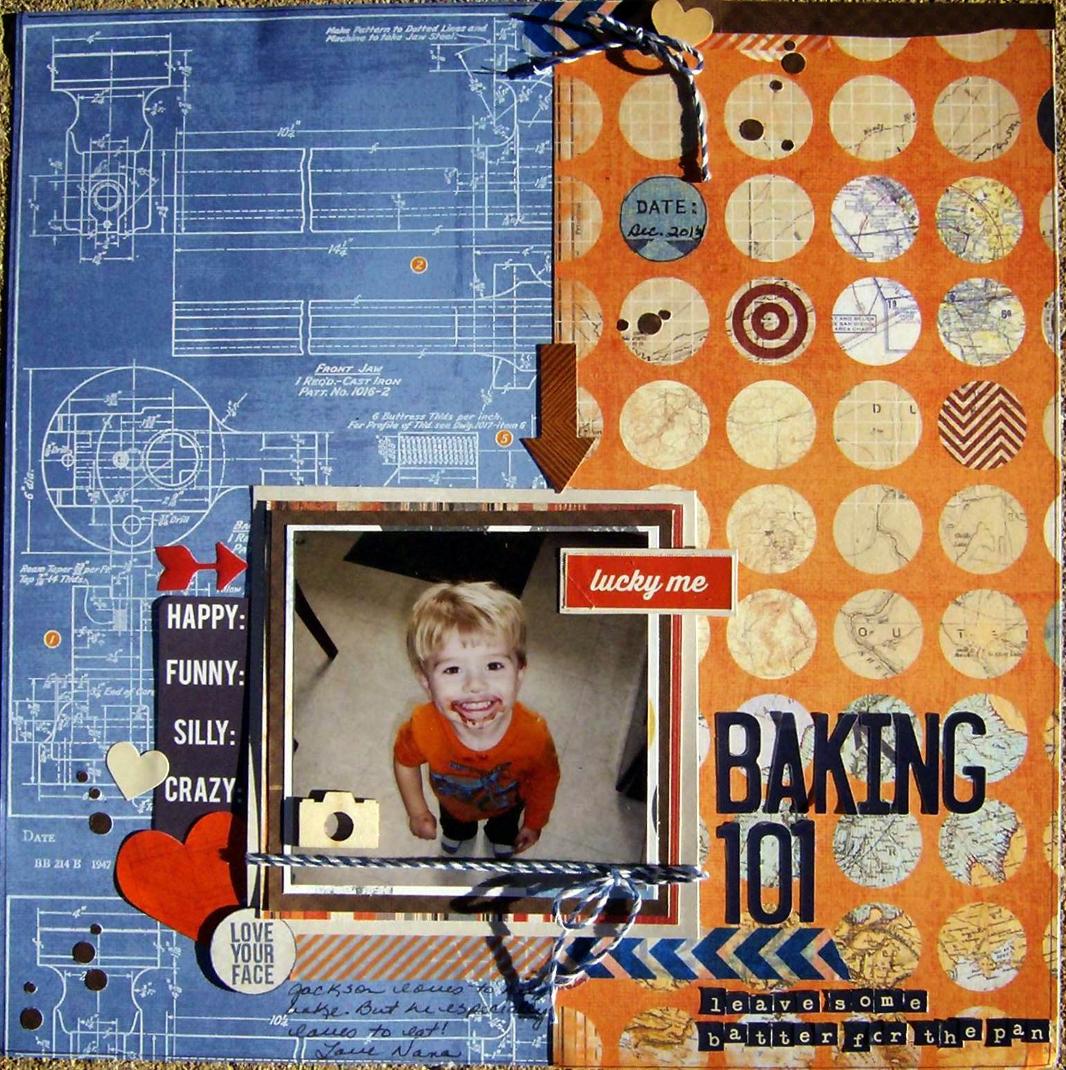
There are other photos of my two youngest grandies "helping" their mommy with some baking.  But This one photo...

Well, here it is. 


And my brain immediately went to, "How much batter was left for the pan, honey?" Hence the title and subtitle. 

The blue and orange papers came from Heidi Swapp's No Limits collection.  Layering papers were scraps.  Most of the stickers came from Amy Tangerine and Dear Lizzy sticker books.  The silly, funny crazy piece is from a Heidi Swap ephemera pack, the little orange epoxy arrow was from a Heidi Swapp sticker set,  and the "Love Your Face" is a little stamp from Michaels.  Thanks to the tip from Allison (she is goodgriefyou on you tube), I picked up several of these little stamp sets at a whopping $1 each!  Stamped it in navy blue and then punched it with an appropriately sized circle punch.  Added a wood veneer camera, some navy and white bakers twine and some washi tape in a navy chevron and orange diagonal stripe.  Repeated one of the layering papers, the washi, and the twine in the cluster at the top of the page. 

Now the alphas used in the title--those are still from an old Little Yellow Bicycle set that I am just nursing along because I cannot find navy blue alphas.  Why are navy blue sticker letters so hard to find?  (Insert whining here---American Crafts, could you p.l.e.a.s.e. make some navy blue Thickers for us --without glitter?)   The little letters in the subtitle are Tiny Type from Cosmo Cricket. 

I punched some brown circles in a couple sizes and scattered those on the page in lieu of splatting paint or ink.  Which made me think of  an idea I saw on Lillith Eckel's blog a while back where she used a border punch from EK, I think it is called Swiss Cheese.  She punched it once or twice and had a whole array of little circle confetti to scatter on her page.  And I thought what a great idea!  That is not a punch I have because when it came out as a border punch I thought, eh, not crazy about it.  But using it to punch multi size confetti like circles is an awesome idea!  Now I may have to think again about purchasing this punch.  I just love blogs and you tube---you never can tell where a great idea is hiding! 

That's it for now! 
Cheryl

Monday, August 18, 2014

Our boy Jacob moves into his college dorm next week.  He was actually home yesterday when we were out at Kim's for dinner, since they had all been at a benefit all day for a friend of his that had been in a very serious motorcycle accident and it struck me again that how grown up he is. 

So today's page (page-s) just highlight the changes between freshmen year of high school to graduation day...


They were just skinny, gawky boys here at their very first high school function (homecoming dance, freshmen year).  Jacob cracked up over the page---and even commented , "Look how young we looked."  Then he whipped out his phone, snapped a pic of the page and sent it to his friend (in the photo).  Seemed they especially liked the "studly" part... 

Most of the papers I used are super old---the pale blue alpha print and the multi colored strip with the masculine phrases were a lighter text weight and they had a pearlized finish to them.  I had kept them for years, cuz I just loved the pattern, the colors and that pearl-y finish.  So glad they finally found a home on a page.  I still have a bit of each (I printed a couple of these photos, since Nana here wants one in her own album!).

Layered the photo with gold textured paper and vellum, added a bit of metallic washi tape, some paper and chipboard banners and epoxy dots and stars (along with some stamped stars).  Then drew in some sketchy lines with a blue pen, not quite a border, but kind of. 

The title letters came from a Cloud 9 pack and my very favorite set of Thickers--an Amy Tangerine set that is a pale gray with an off-white grid pattern on them.  (I so hope they re-release these or come up with something very similar, cuz I just love this alpha set.) 

And this is our Jacob on graduation day before he donned his cap and gown.  What a difference four years makes. 


This page was done with two partial sheets--one was from DCWV (the tapestry looking one) and the other is the backside of a Basic Grey travel related paper (I just wanted that deep turquoise color).  The layering papers are from Prima and Creative Imaginations.  (These were clipped together when I cleaned out the last of the scrap bin and made up my own mini page kits.)  I outlined the layering pieces and bent the edges up, made a little tear here and there.  Then added a few punched butterflies, tucked in a scalloped brown cardstock border, plus a piece of ivory lace.  Used a piece of sequin waste as a stencil and applied some beige pearl-y ink.  The alpha set is a wood grain print Thickers set, that I kind of snipped and overlapped so the letters would be more joined together.

The journaling piece was a punch out from a My Mind's Eye Christmas sheet, but the color was right, the size was right--and there you go.  Also stained the wood veneer chevron pieces and the little camera to balance out the dark brown and hand cut the large brown "photo corner" pieces at the right side of the page.  The "hello there" piece was from Basic Grey, but that was it for adding in ephemera, tabs or words.  Still wanted a touch more dark brown though, so I splattered some brown paint and added the coppery-brown pearls. Thought I better quit here, before it got over-worked.   

My goodness he really is ... all grown up. 

Cheryl


Friday, August 15, 2014

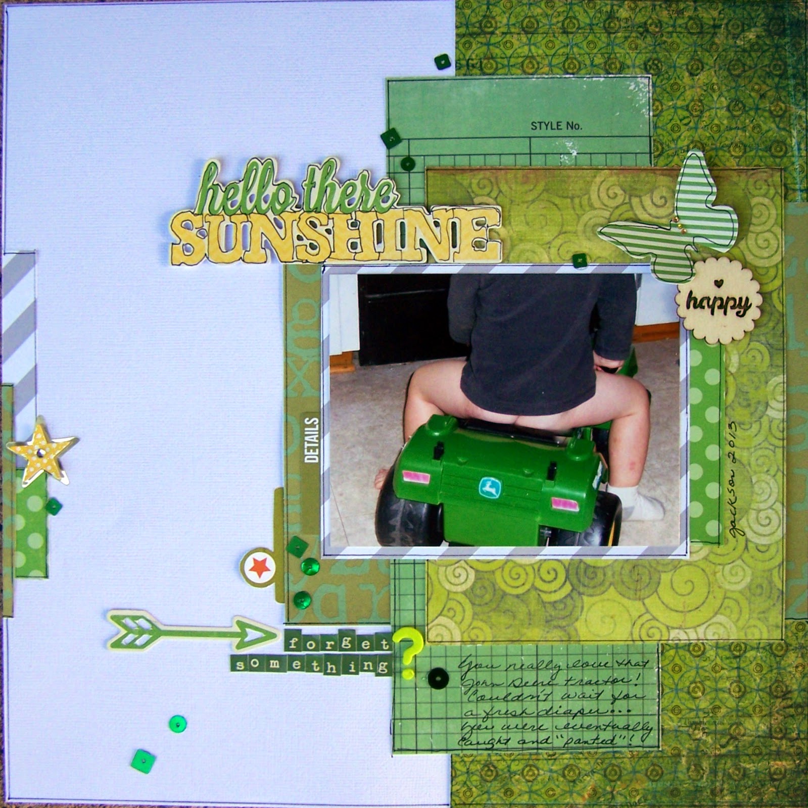
Page titles... I was talking the other day about how they can convey the feeling of a moment and I think I captured the feeling of this moment! 

Jackson loves his John Deere tractor riding toy.  He also likes to escape without his pants...  (He's a bit better now that potty training is well under way...really loves his Jake and the Pirates underpants!) 


But this was a moment in time...that just makes me crack up every time I see the page.  So, if the title and your finished page make you or the viewer "feel" the moment, then I think what you are doing as the family historian, the scrapbooker, the documenter, is so worth the time we all put into this hobby. 

I was still working from the scrap bin when I created this page, so I pulled a whole lotta green patterned paper to pick up the John Deere tractor color and a little bit of gray playing off the color of Jackson's shirt.  Once the papers were selected, I started layering them under the photo and when I was happy with the layers, outlined the pieces and glued them together. 

The title, the butterfly (both also outlined) and the arrow are from a Jillibean Soup ephemera pack, and the subtitle is made up of Tiny Type letters from Cosmo Cricket.  I didn't have a question mark in the Tiny Type pack, so I chose one from a lime green Thickers set and just arranged the words so the question mark lined up with the two lines of type stickers.  The file tabs are from Simple Stories, the "happy" wood veneer is from the Michaels $1 bins and the star sticker is from Recollections (I don't usually care for much in the Recollections stickers, but I did like these layered stars--bought several packs of them--on clearance for $.99 yeah!)   Last, I sprinkled on some green sequins from my stash. 

What are you doing this weekend?  We are getting right down to the wire getting this house ready for sale, so I will be cleaning woodwork (ugh).  But I will steal away to my scrap room at some point for some R&R and a sanity check! 

Happy Friday! 
Cheryl